Most of the information about the world is visual impressions, and color plays a huge role in the perception of visual images. The ability to notice the slightest shades contributed significantly to the survival and development of the human species. Almost all people experience a subconscious reaction to color: the soft colors of nature pacify, while unnaturally bright ones cause anxiety. Given this fact, to create a comfortable interior, it is important to understand the principles of influence on the psyche of both individual colors and their combinations.
The effect of color in the interior on a person
Physicists argue that colors really do not exist - these are just waves of light of various lengths that the brain interprets in one way or another. To believe in this thesis is quite difficult, because we can definitely determine the shade of any object in the material world, and it remains unchanged regardless of the place or time of stay. Be that as it may, each person feels the influence of the surrounding color palette. The mechanism of this effect is not fully understood, but psychologists are still aware of some common features.
For convenience, the colors are divided into categories according to the main characteristics: dark and light; pastel and saturated; bright and muffled. Depending on the temperature, warm, cold and neutral colors are emitted. Black, white and gray are called achromatic, all the rest are called chromatic. The latter include three main colors: red, green and blue, as well as all the options resulting from mixing them together or with a black and white palette. The result is amazing - a person is able to recognize up to ten million shades.
Considering the psychological influence of color, it is worth noting that we are talking primarily about pure colors. Any impurity changes the quality of perception. So, for example, soft coral will have a calming effect, while saturated scarlet will excite the nervous system.
In general, warm colors such as red, yellow and orange are considered tonic: they accelerate the heartbeat, improve appetite, and increase attention. Cold shades of blue, blue, green relax, lower blood pressure and somewhat slow down the reaction. The body subconsciously perceives an abundance of light (white, pastel tones) as a sunny day, automatically increasing the level of energy, while gray, black, dark blue and gloomy purple set a person up for an upcoming dream.
In order not to be mistaken when choosing a color for the interior, it is necessary to take into account their inherent optical effects. For example, if you put two objects of different colors of the same size next to each other, then a brighter one will always seem larger. Dark muted tones visually reduce volume, light and glossy ones increase. Using these features, you can adjust the width of the walls, the height of the ceiling, to emphasize and zoning the space.
How to choose "your color"?
Throughout life, each person forms his own attitude to the color palette. The choice can be influenced by personality traits, individual experience, mental associations, mood and even health status.
Making the interior, you should carefully consider the sensations that arise when interacting with certain colors. For example, it is recommended to recall the design of the most comfortable places for you: your favorite restaurant, friends' apartment, grandmother’s house, finally. You can borrow a palette from nature - it can be the sea coast, the edge of the forest, a flowering garden or a mountain landscape.
Beautiful pictures from the Internet can be a wonderful source of inspiration.Find the image you like and try to mentally repeat it in the interior - transfer the background to the walls and ceiling, reflect the bright details in the furniture elements, textiles and decor. In this case, it is advisable to observe the proportions of colors inherent in the picture, so that in the end the same harmony is obtained. It is not necessary to choose a design photo - take anything: a bouquet of tulips in a jug, a rural landscape, seashells on the seashore or chocolate cream dessert. This method allows you to independently create a very natural and pleasing look composition.
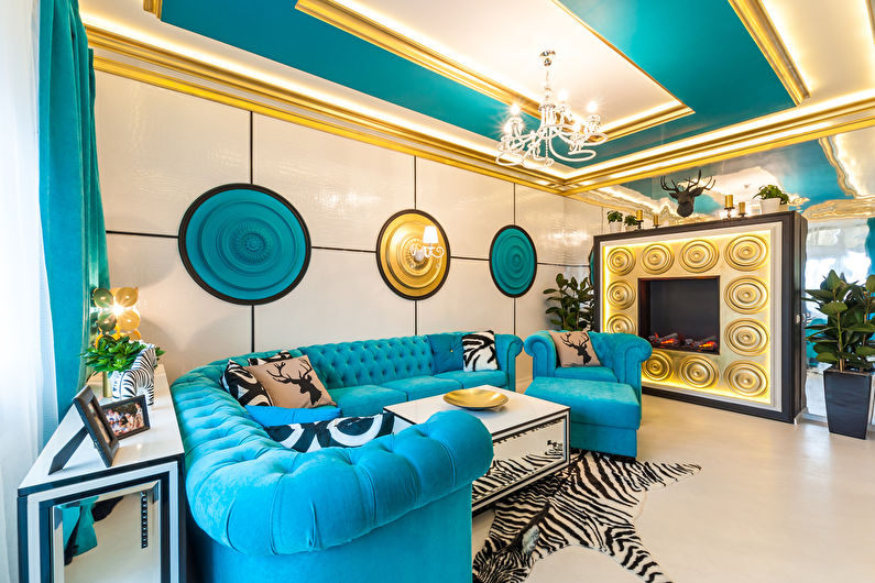
Table color combination in the interior
The combination of colors is a science. It is necessary to understand the basic rules, the observance of which the colors located together will complement and emphasize each other, enhancing the sense of style. The best color combinations in the interior are obtained using the following methods:
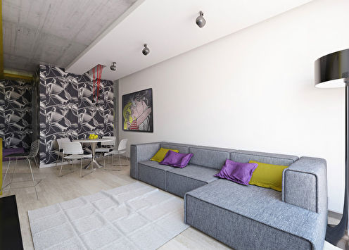
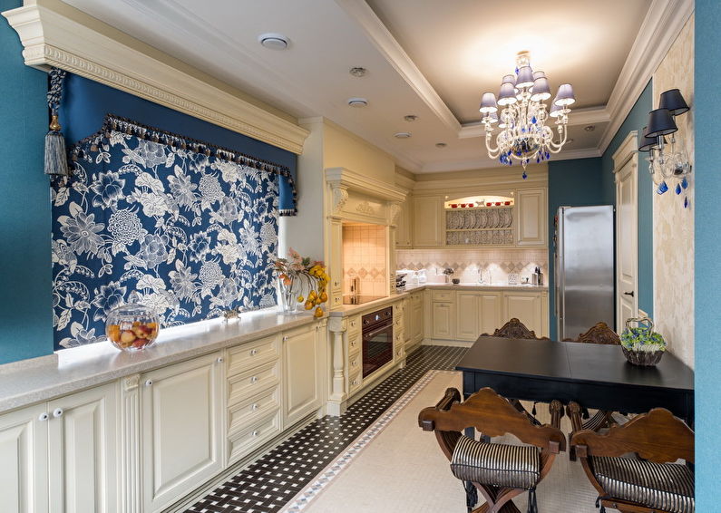
1) Monochrome - shades of the same color, different in depth and saturation, are used. For example, red - it can be a pastel pink background with brick and burgundy accents. In the blue palette - a combination of light blue, turquoise and ultramarine is possible. In green, they are the colors of lime, olives and moss.
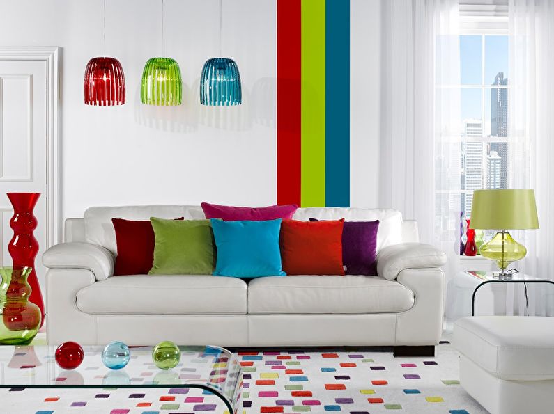
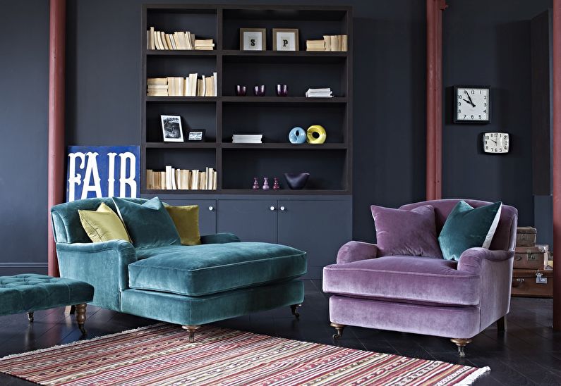
2) Related shades. Close tones are located in the neighborhood, in one quarter of the color wheel. Examples are blue, purple, pink; yellow, orange, red; blue, green, yellow.
3) Contrasting colors. Here, harmony is built on the opposite - in the color wheel, the shades are strictly opposite each other, and their dissimilarity creates a dynamic and noticeable pair.
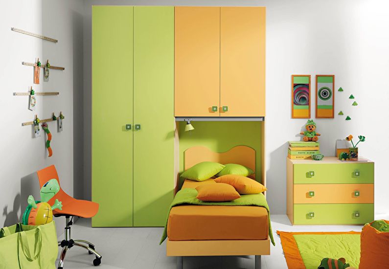
4) Related contrasting combination. In this case, the shades are combined due to an impurity in them of some third color. So, for example, in light green and orange there is yellow that unites them, and this triangle looks great together.
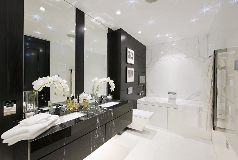
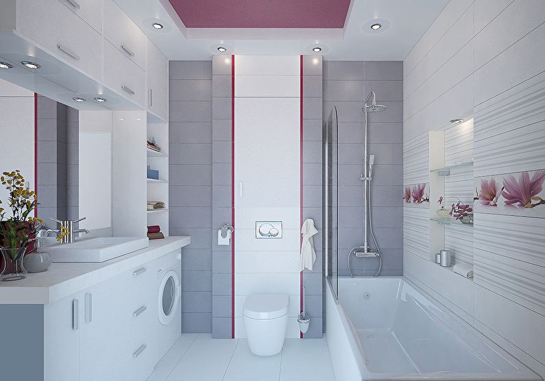
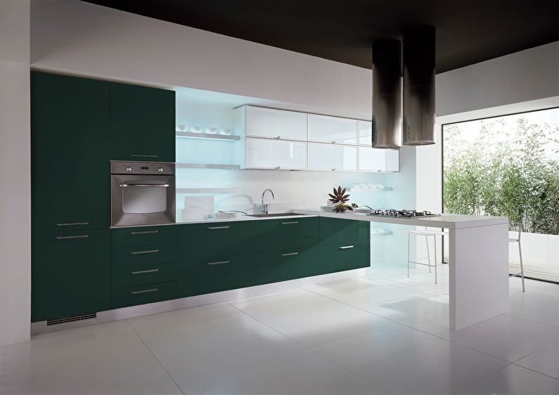
White
It is combined with flowers: all pastel and pure bright colors, black, gray, gold; with warm it is better to use cream, with cold - snow-white.
Not compatible with colors: no (combined with all).
Color effect: creates a feeling of cleanliness, spaciousness and daylight. A glossy snow-white room may seem too sterile, and also resemble a laboratory.
Suitable for: interior of a bathroom, bedroom, hall.
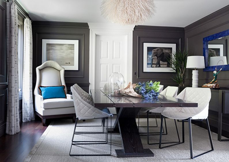
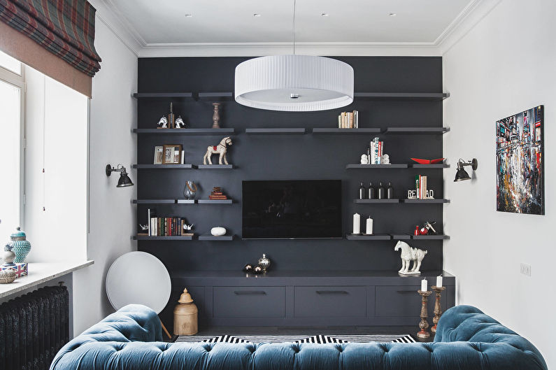
Gray
It is combined with flowers: yellow, red, orange, green, purple, pink, blue, black, white.
Not compatible with colors: golden, brown.
Color effect: psychologically neutral, in itself does not cause emotions. Associated with shade, rainy weather, winter. A monochrome gray interior can cause depression.
Suitable for: studio apartments, bedrooms, kitchens, home office.
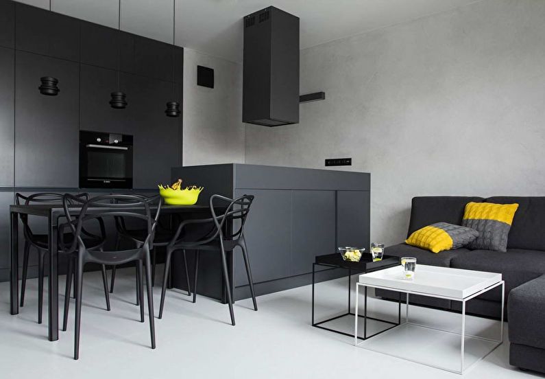
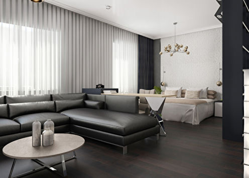
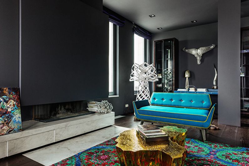
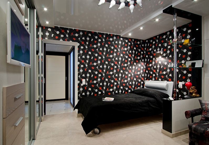
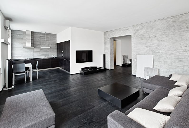
The black
It is combined with flowers: white, gray, gold, red, green, orange, purple.
Not compatible with colors: all pastel, blurry, shaded; with yellow - danger sign (road signs, warning signs of radiation and high voltage of the power supply network).
Color effect: status, suitable for creating an atmosphere of luxury. Reminds a deep night, visually reduces space.
Suitable for: studio apartments, large halls.
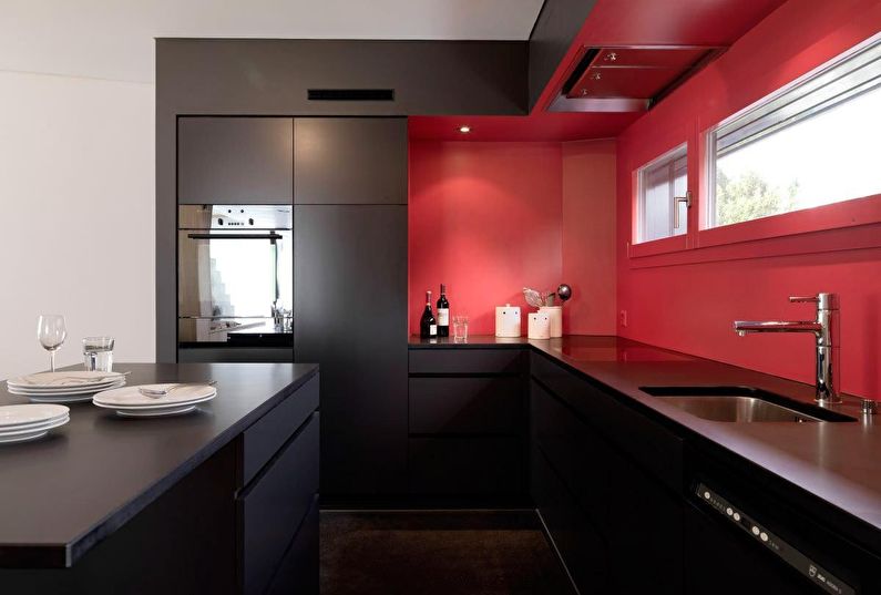
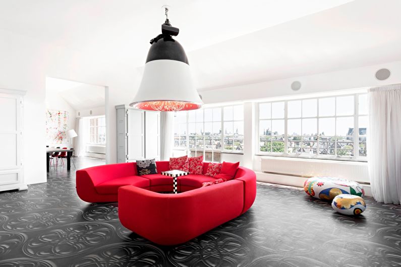
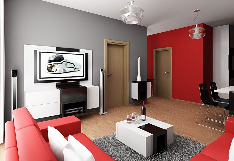
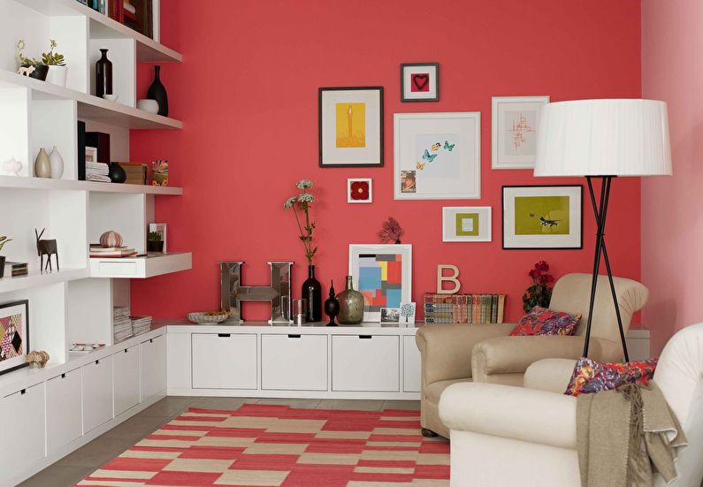
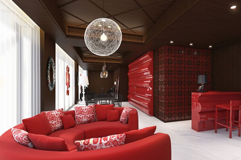
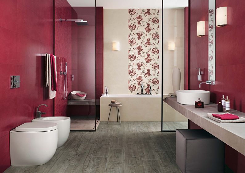
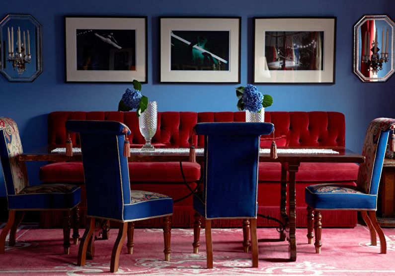
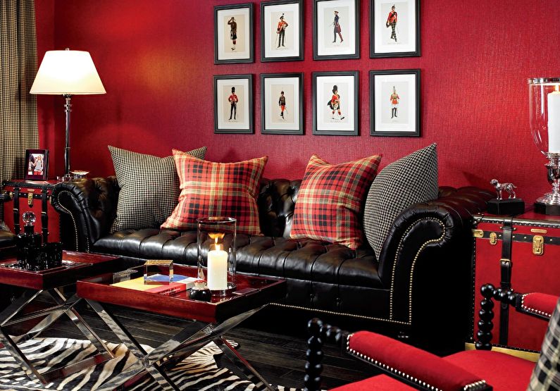
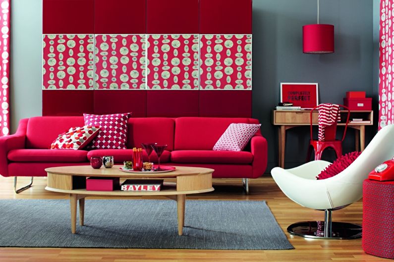
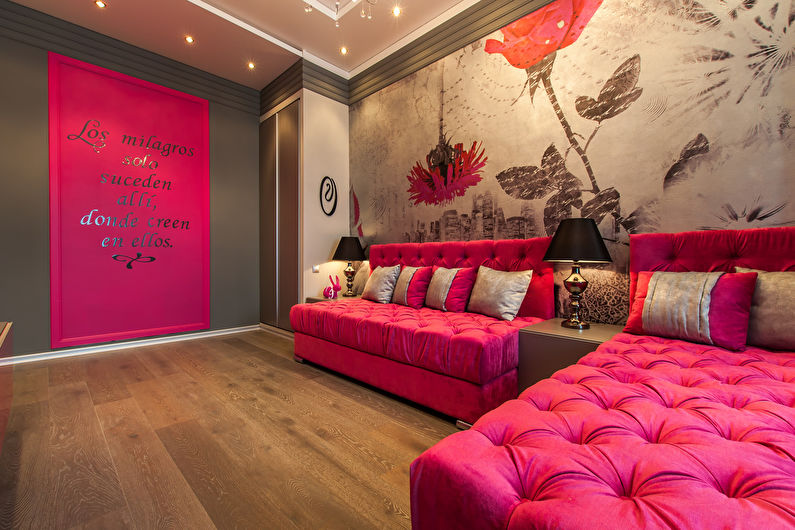
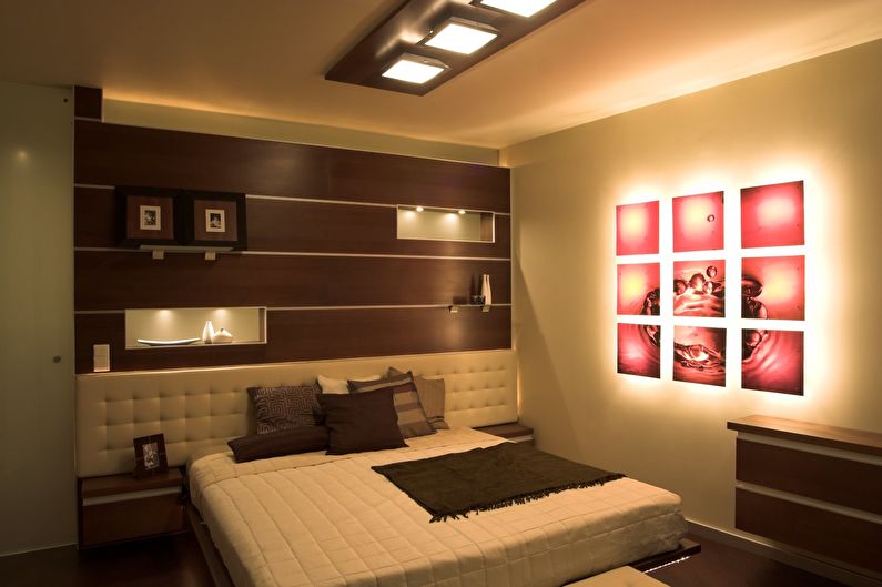
Red
It is combined with flowers: black, white, gray, gold, brown.
Not compatible with colors: purple, pastel shades; with blue and green looks extravagant.
Color effect: excites the nervous system, increases activity. In children, it can cause aggression and anxiety.
Suitable for: the interior of the kitchen, living room.
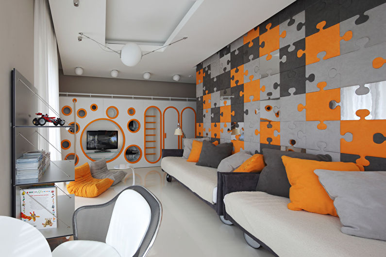
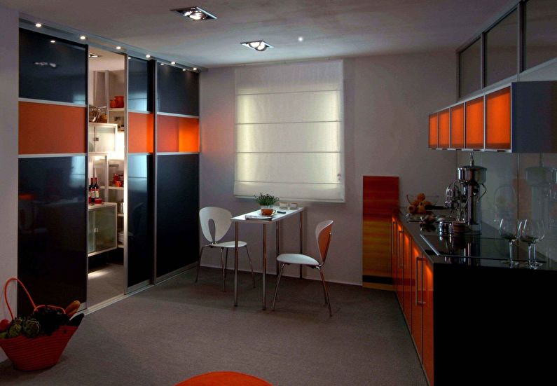
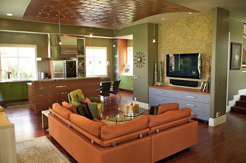
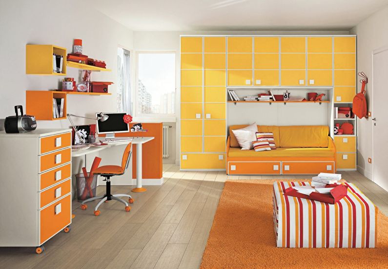
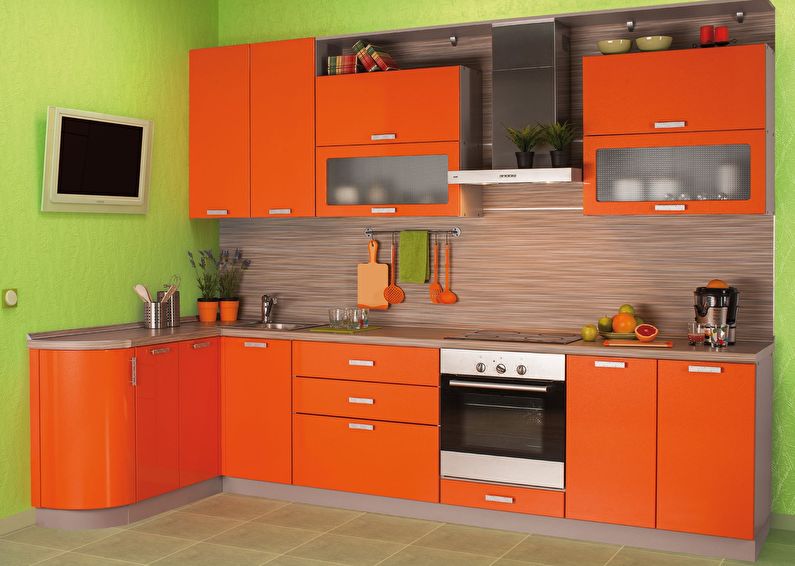
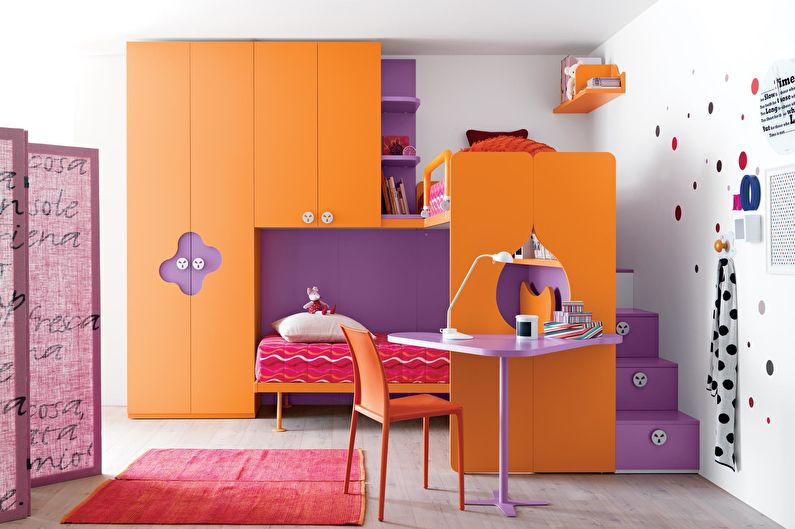
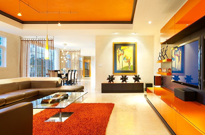
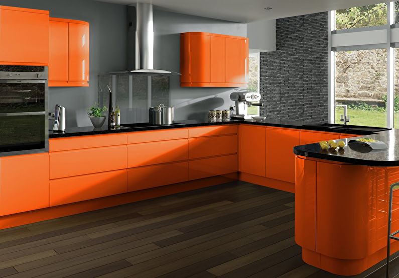
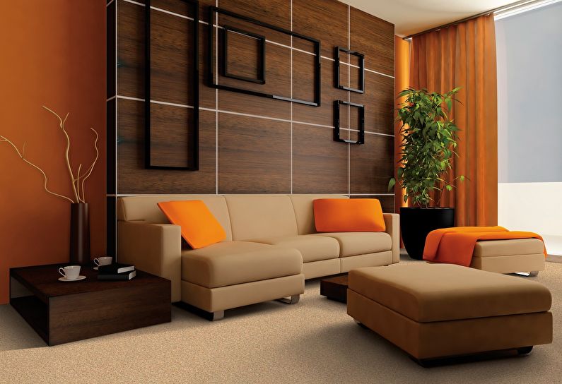
Orange
It is combined with flowers: brown, green, purple, pink, blue.
Not compatible with colors: no (combined with all).
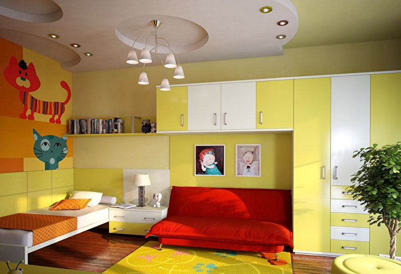
Color effect: friendly, warming color. Reminds of summer, sun and oranges. Increases interpersonal skills, energy, creates a good mood. It does not contribute to relaxation, is contraindicated in hot climates.
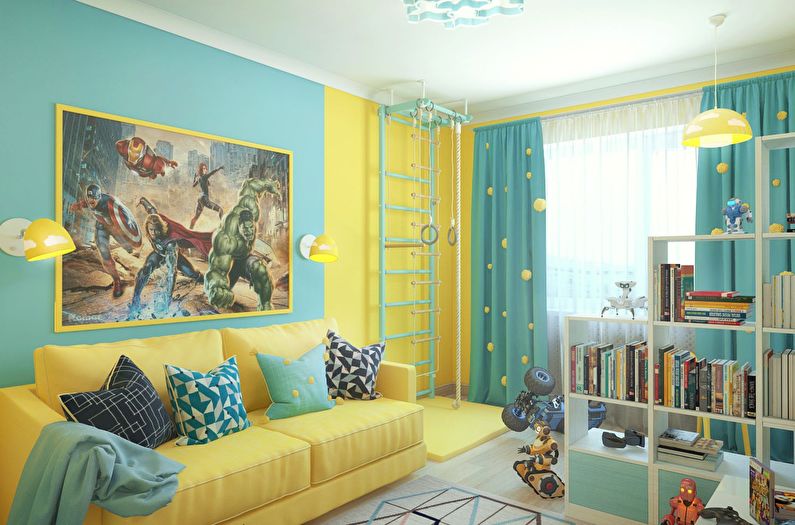
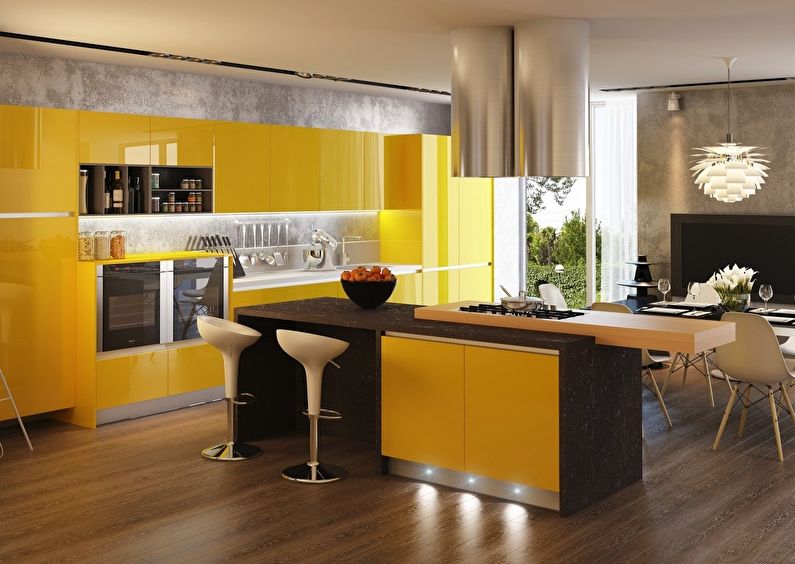
Suitable for: kitchen, children's room, living room with windows to the north side.
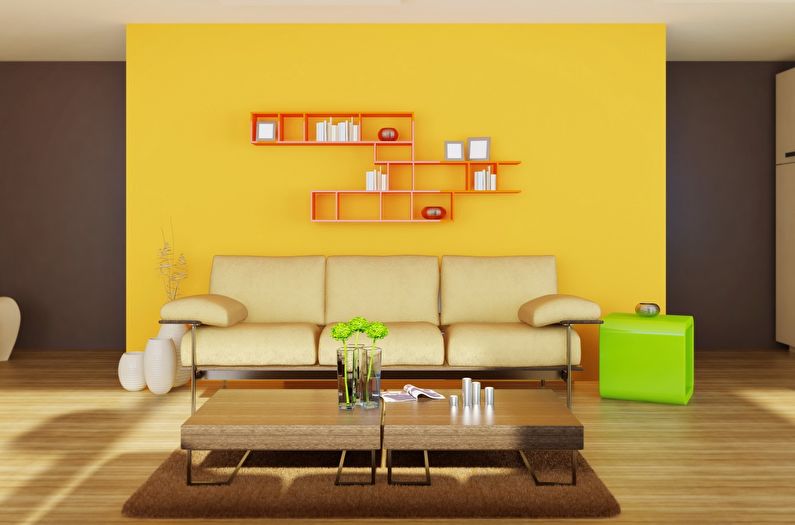
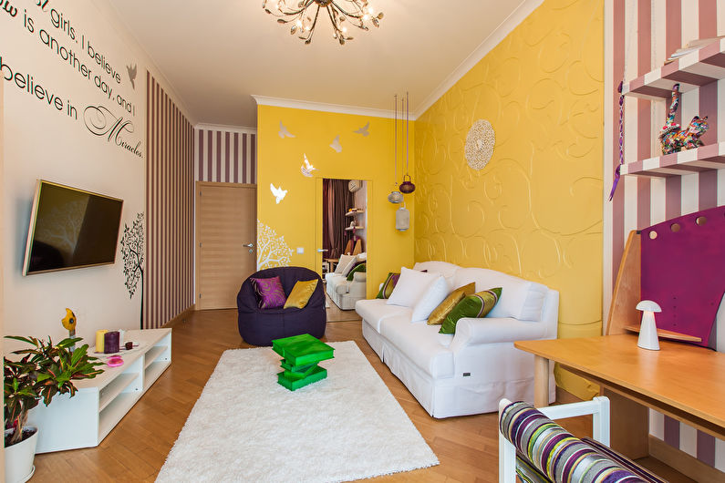
Yellow
It is combined with flowers: brown, orange, light green, white, gray, purple.
Not compatible with colors: no (combined with all).
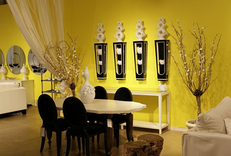
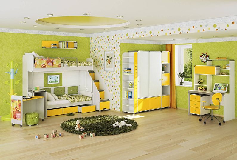
Color effect: warm, open, joyful. Sunny yellow gently illuminates the room, gives vigor, promotes concentration, increases curiosity. Prolonged exposure to a saturated hue can overwork.
Suitable for: kitchen, children's room, office.
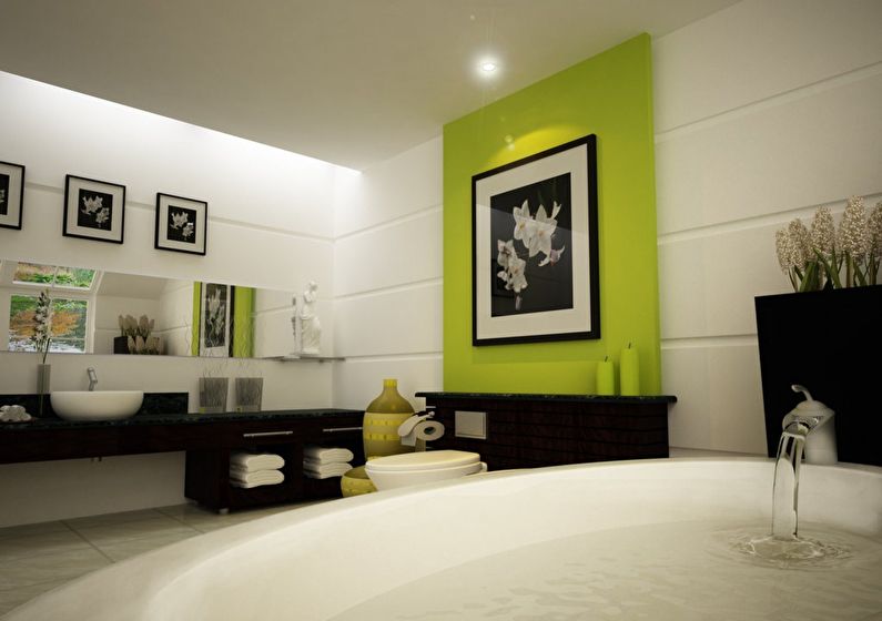
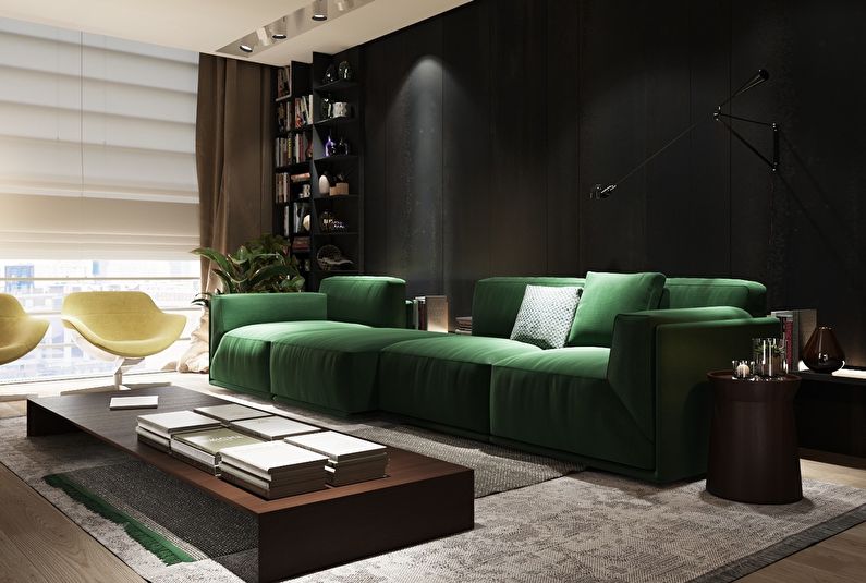
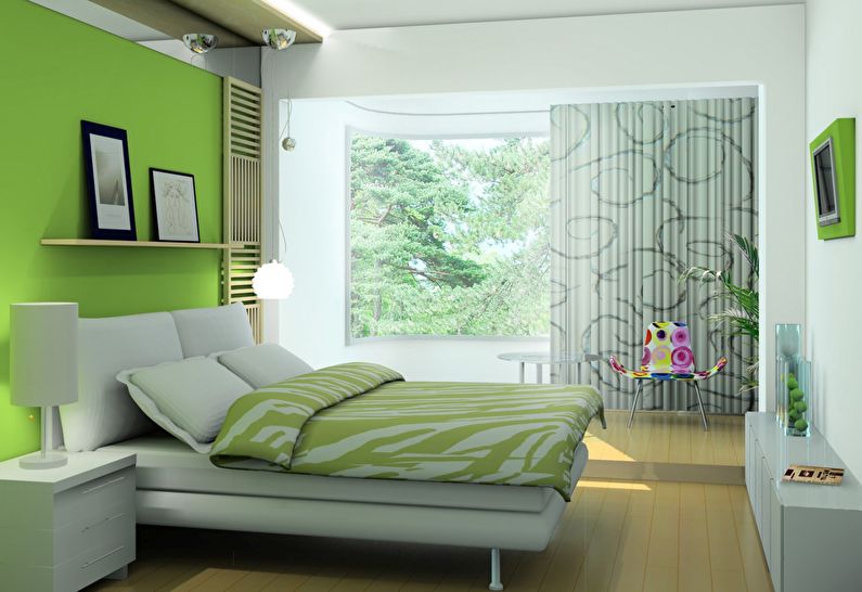
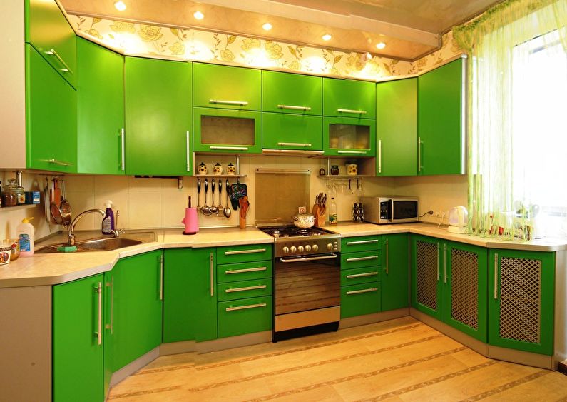
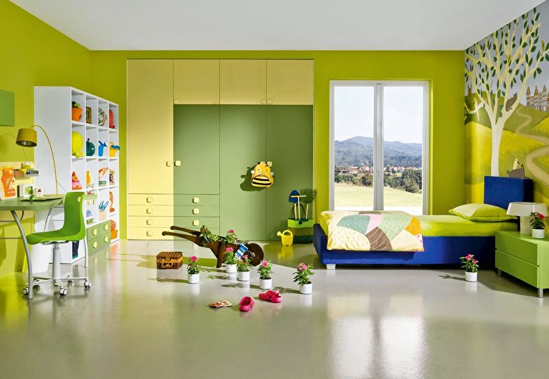
Green
It is combined with flowers: brown, gray, white, black, yellow, pink.
Not compatible with colors: red.
Color effect: the most natural color, harmonious and pacifying. Refreshes, rests the eyes, restores strength. Pale shades of green in large quantities can cause longing.
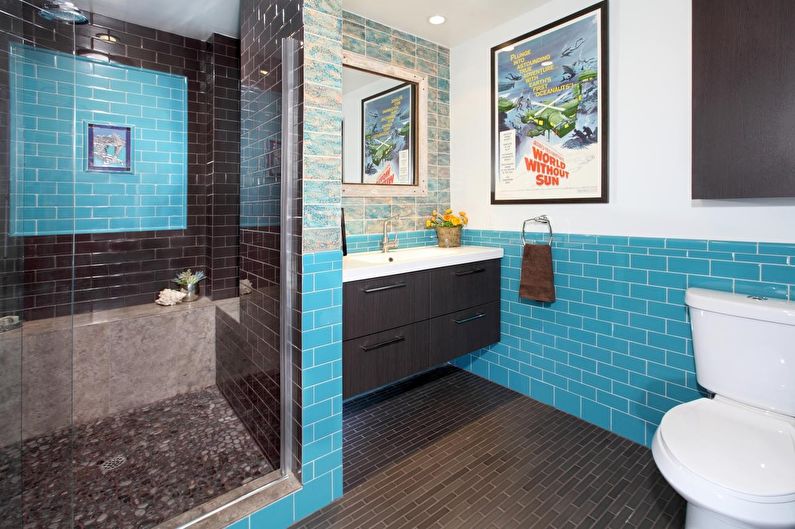
Suitable for: bathroom interior, nursery.
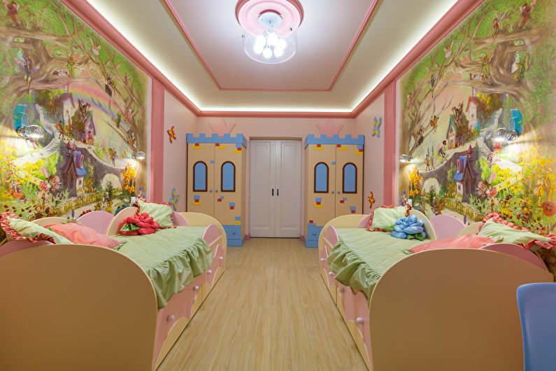
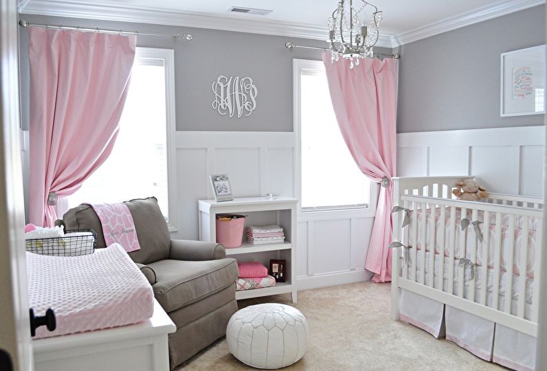
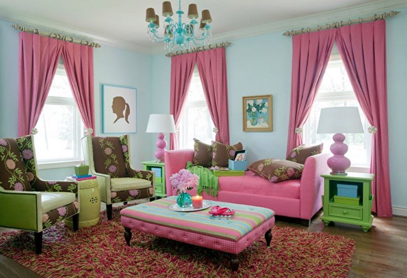
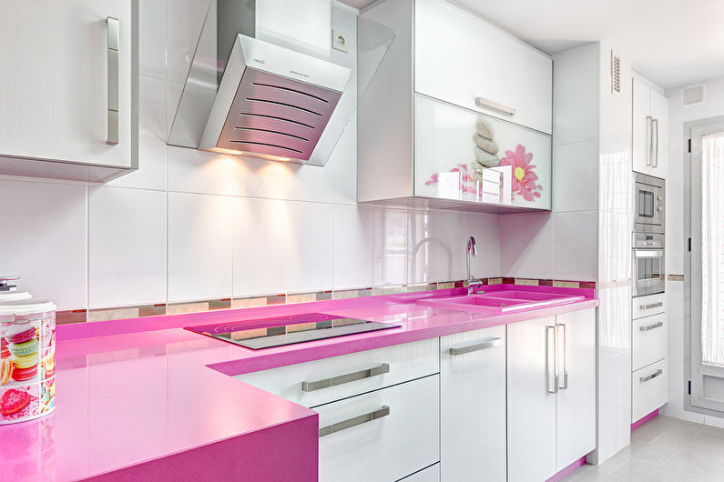
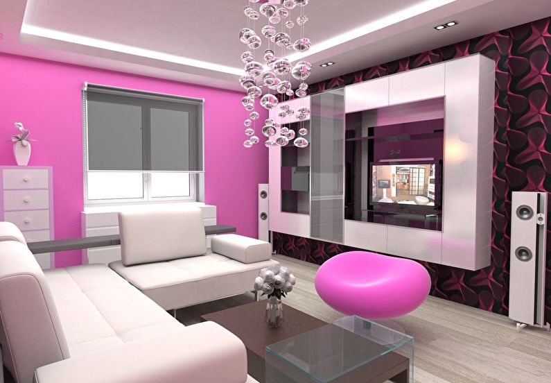
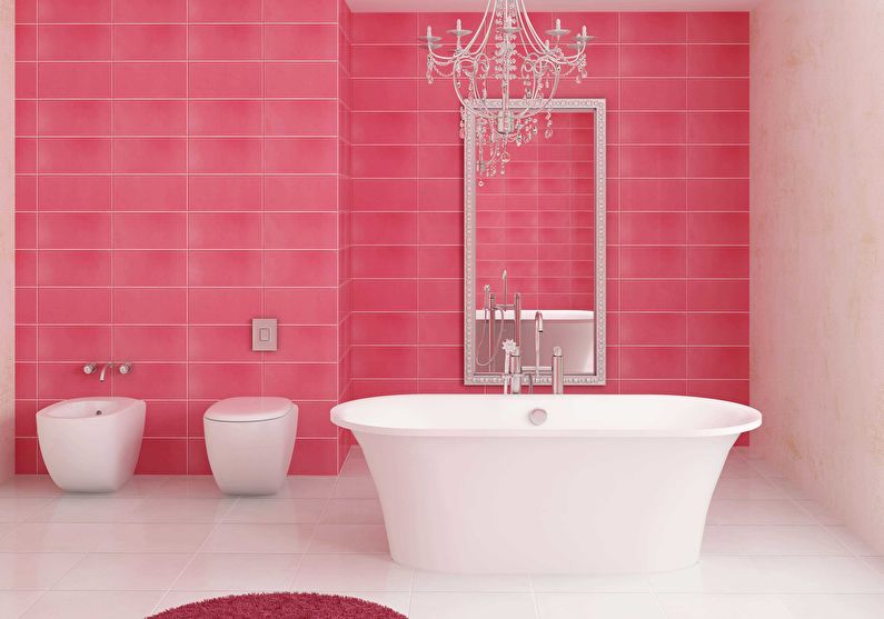
Pink
It is combined with flowers: white, beige, gray, pastel blue.
Not compatible with colors: red.
Color effect: feminine pink creates a soft and serene atmosphere, eliminates depressive thoughts. Active and overly stressed people this color can be annoying.
Suitable for: living room, bathroom, nursery, bedroom.
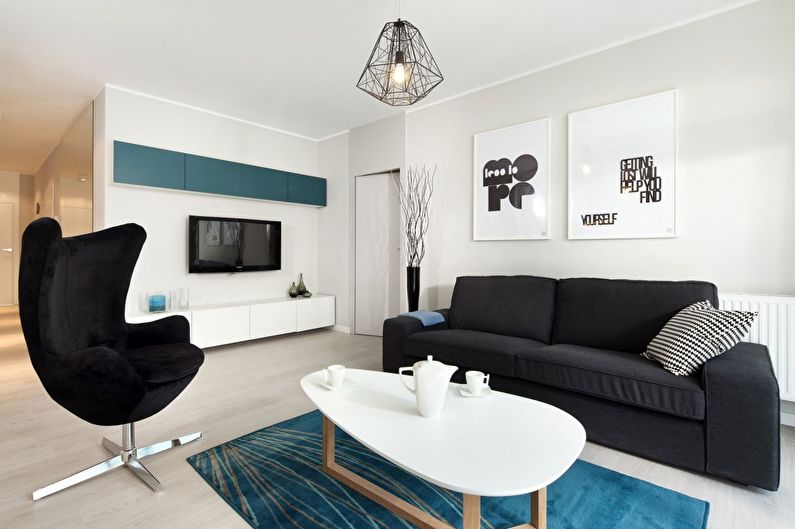
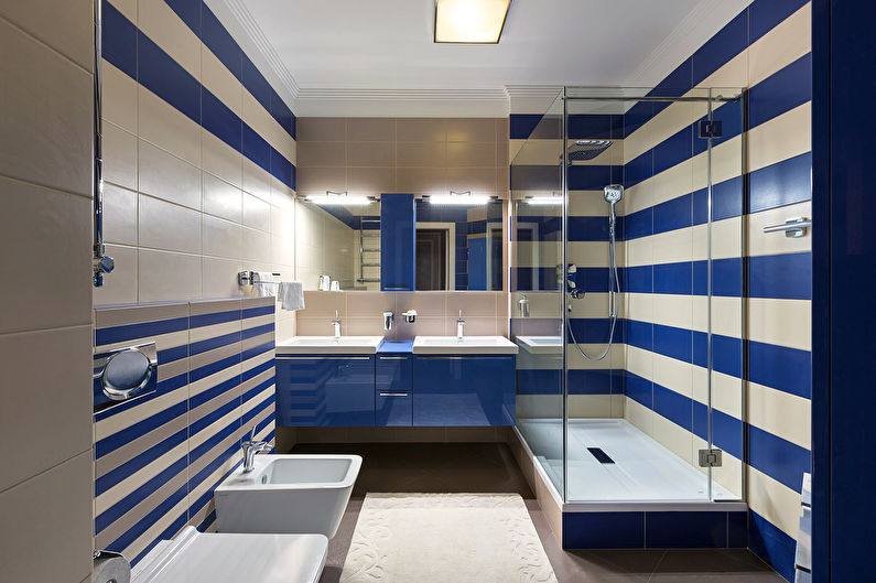
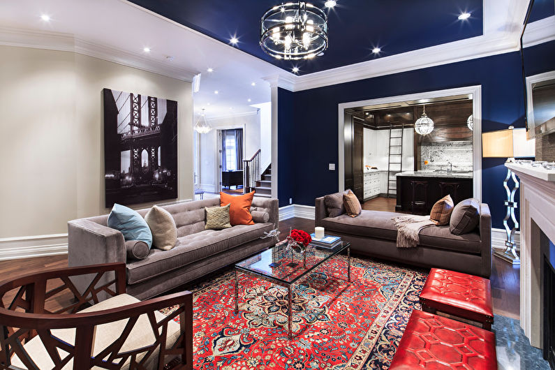
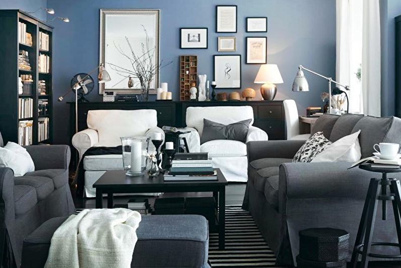
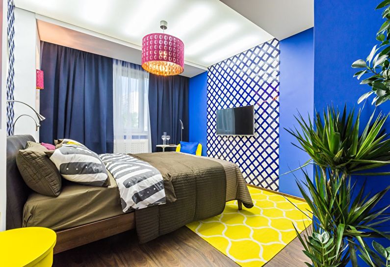
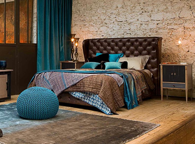
Blue
It is combined with flowers: white, orange, gray.
Not compatible with colors: black, purple.
Color effect: in nature, it is the color of a darkening sky, late twilight, thunderstorms, and the sea before a storm. Relatively calm, it is perceived in a “marine” design, and in other cases it may look gloomy, albeit extraordinary.
Suitable for: the interior of the bathroom, living room, bedroom.
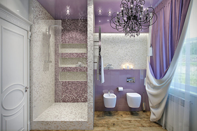
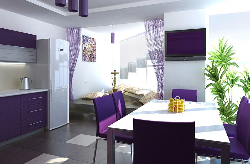
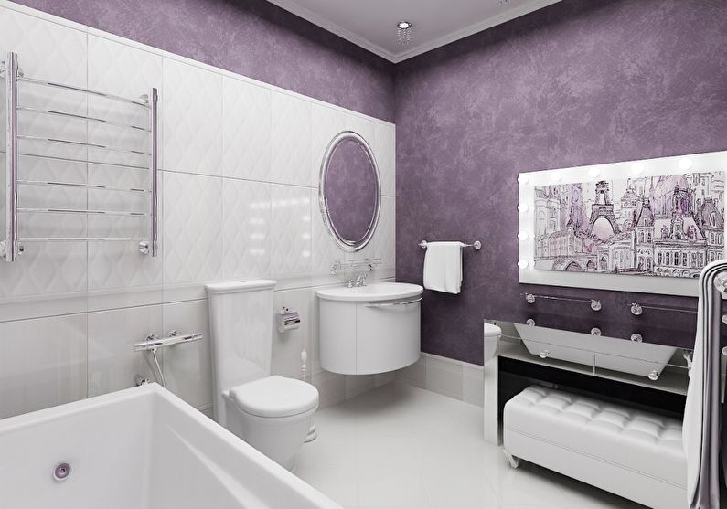
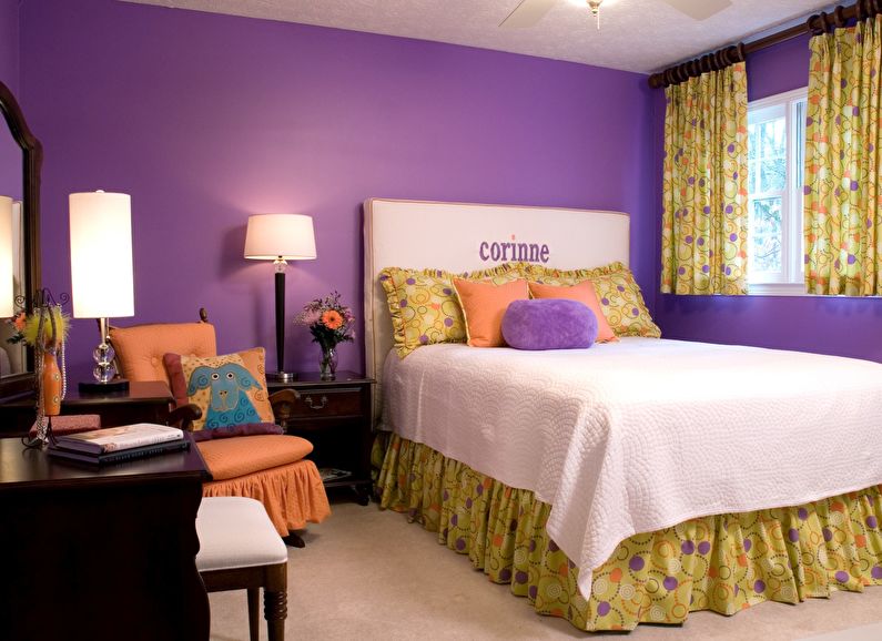
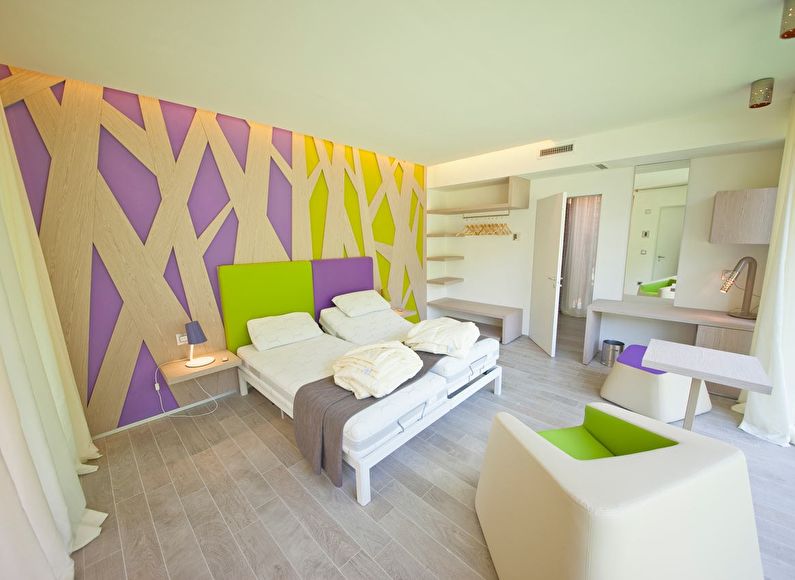
Violet
It is combined with flowers: white, green, beige, yellow, orange.
Not compatible with colors: red, brown.
Color effect: not very common in interiors. This mysterious, irrational color is chosen by dreamers, romantics and fantasy lovers. Violet reduces appetite, and in large quantities can depress.
Suitable for: bathroom, bedroom, living room.
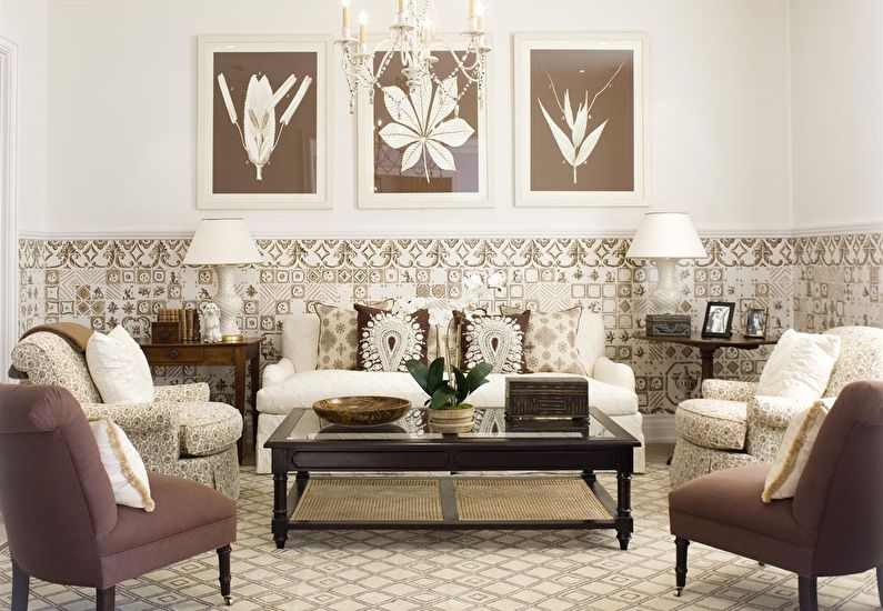
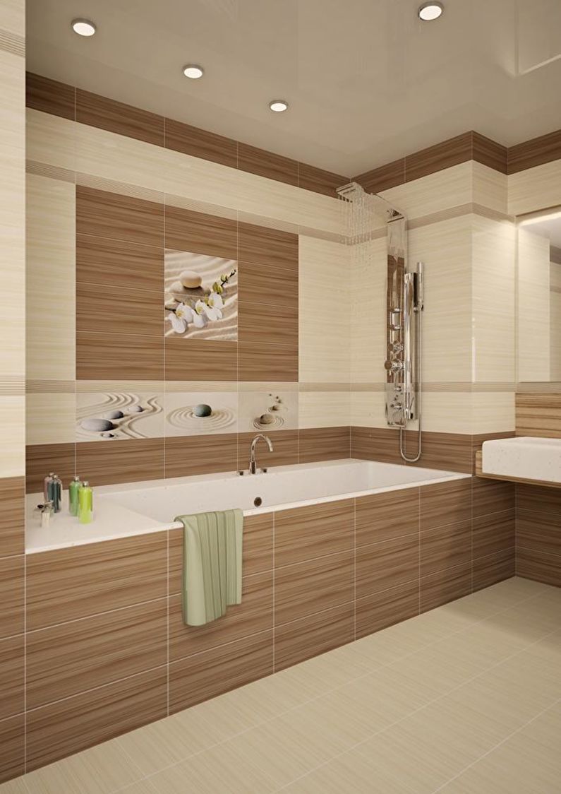
Brown
It is combined with flowers: beige, yellow, green, orange, turquoise.
Not compatible with colors: GREY-black.
Color effect: denotes stability, reliability, connection with nature, as well as the preservation of family traditions. By neutrality, brown is similar to gray, but the admixture of yellow makes it warmer and more homely.
Suitable for: interior living room, kitchen, bathroom.

Video: 15 perfect color combinations in the interior