Coloring is an important component of interior design, which determines its nature. Some combinations visually increase the space, filling it with light, while others give it rigor. You can choose the color combinations necessary for your room for floor, walls, ceiling and furniture by considering the options that we will analyze in detail in this article!
Color matching ideas
Colors in the interior play several roles. Firstly, they are a means of artistic expression. Secondly, they help to design the space in accordance with its dimensions, layout, as well as style. Thirdly, they have an effect on the human psyche, activate certain parts of the brain and affect well-being. Therefore, when choosing them, it is recommended to rely not so much on personal tastes as to follow canonical combinations.
For colorization, it is necessary to harmonize the color elements of the room, which include walls, ceiling, floor and furniture. This will help create a holistic artistic ensemble.
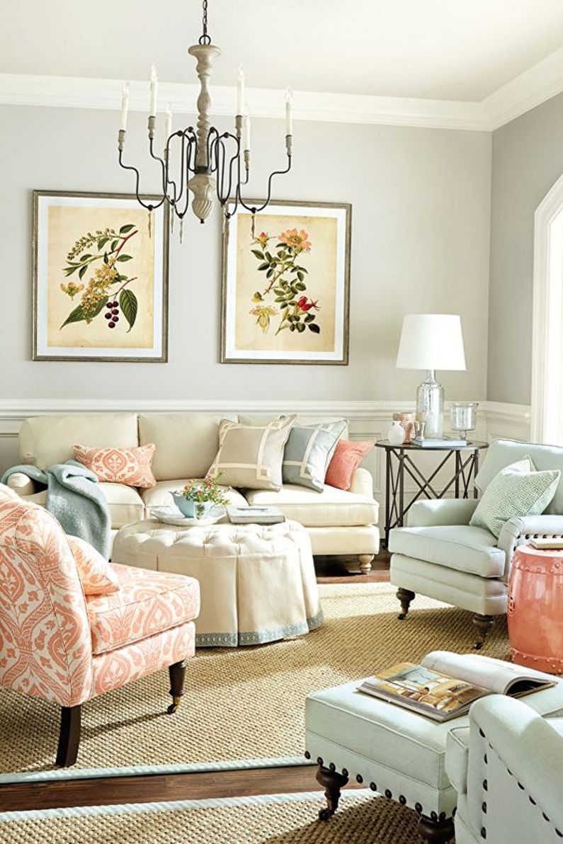
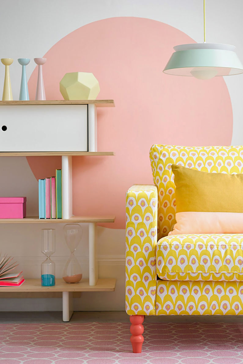
Pastel shades
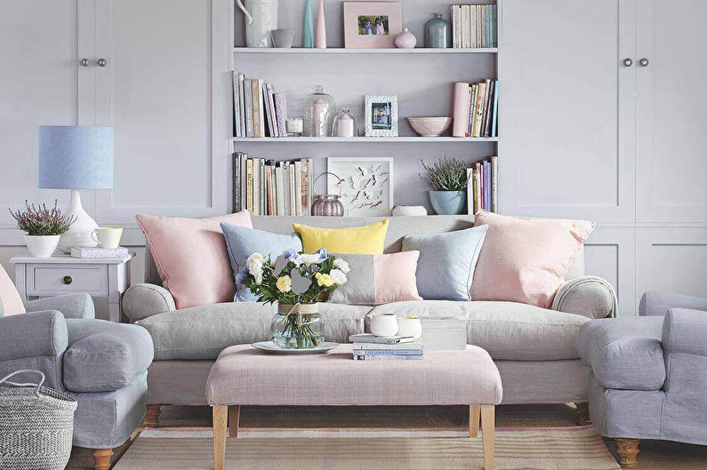
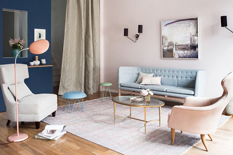
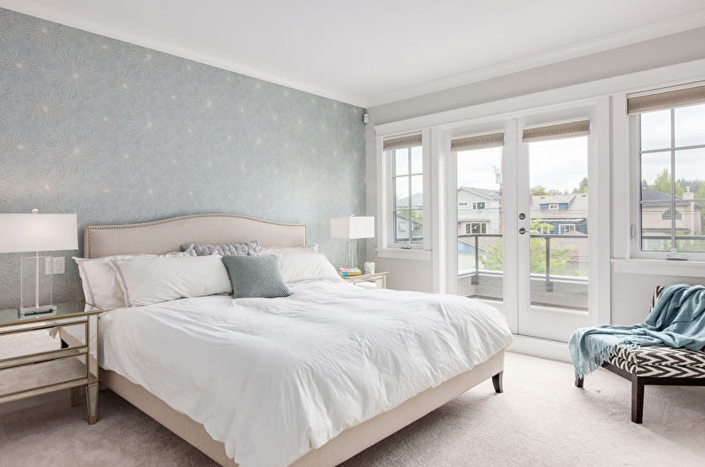
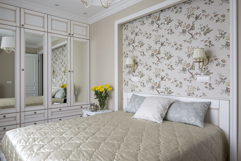
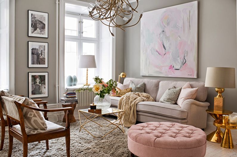
You can save eternal spring in the house with the help of pastel colors. They mean muffled, as if faded in the sun derivatives from more saturated colors: for example, from blue it turns out blue, from red - light pink and so on. Such a palette in the interior has the following properties:
- Gives the room a bright and airy appearance, visually expanding it;
- It gives a light, airy mood, devoid of rigor and seriousness. The solution is difficult to fit into the "men's" room, but it is indispensable for a girl's room;
- Helps to diversify the design. The palette may include three or more colors, the combination of which will not overload the interior.
The design of the room details in the corresponding gamut largely depends on its purpose. So, in the bedroom I want to limit myself to calm combinations, and in the living room to surprise visitors with a memorable design. To achieve color harmony, follow a few guidelines:
1. The flooring may not be included in the pastel palette at all, since its practical characteristics are often more important than aesthetics. Wood, which continues the spring theme, goes well with delicate shades. Sand and nut are universal options. To balance the colorful ensemble, choose more natural tones for the floor.
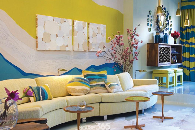
2. The pink, blue, lilac and turquoise walls, which combine well with each other, have a beneficial effect. But yellow and orange derivatives can be used as bright details.
3. Furniture located against the wall should harmoniously fit its color scheme. With a central arrangement, it is better to dwell on a more neutral solution.
4. Even high ceilings should not be highlighted with another pastel color. The main rule of design says that the upper part should be several tones lighter than the walls, but the white coating was and remains the best choice.
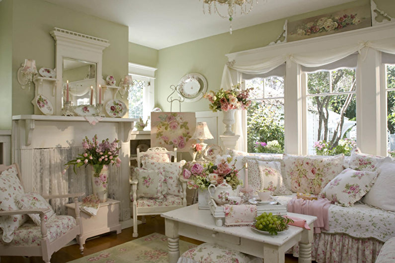
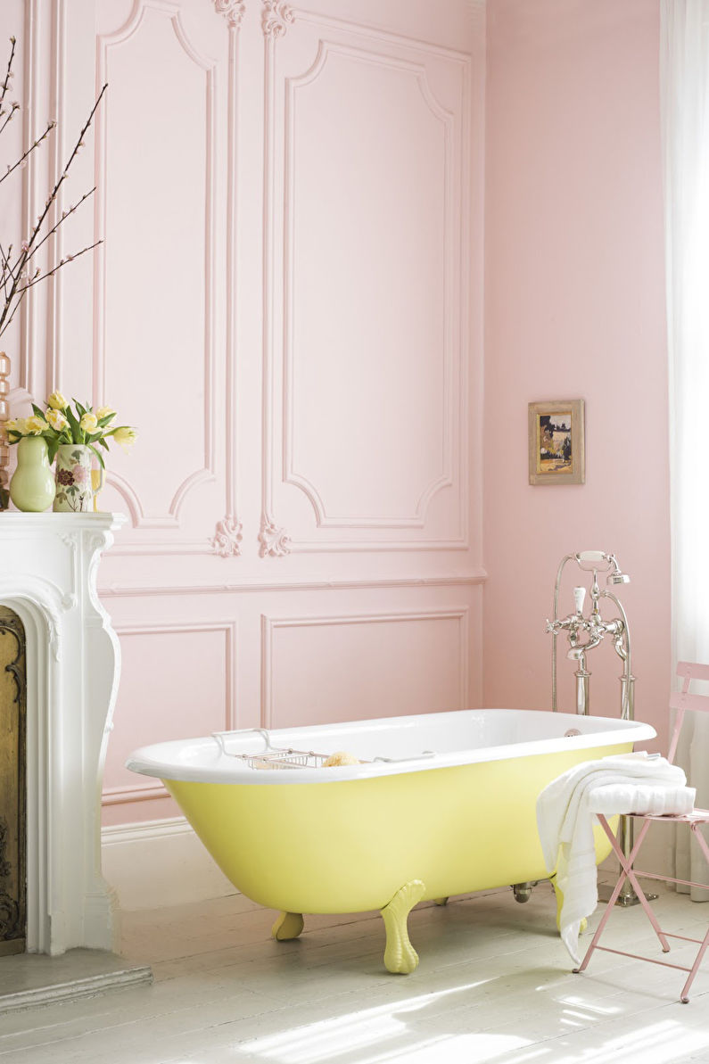
Pastel colors will fit well into a modern style or classic, but are absolutely indispensable in Provence, which is characterized by “burned out” surfaces. It is recommended to use peach, sand, pink shades in rooms where the sun is rare, and vice versa - focus on blue, turquoise or lilac in "sunny" spaces.
Contrasting combinations
Opposites are said to attract and complement each other. On this principle, you can build not only relationships, but also the whole interior, endowing it with a bright, memorable design.
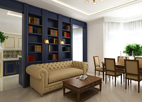
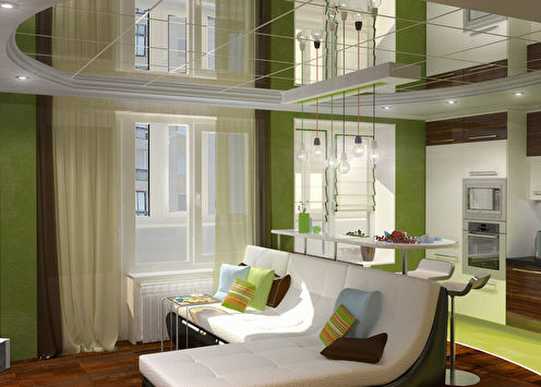
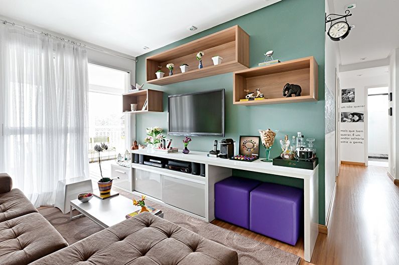
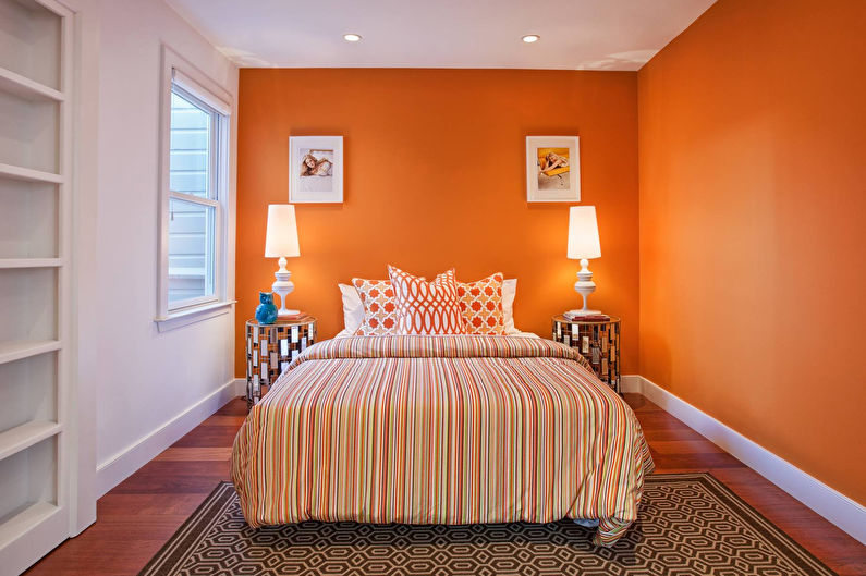
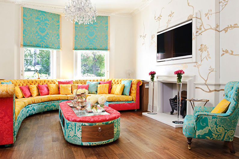
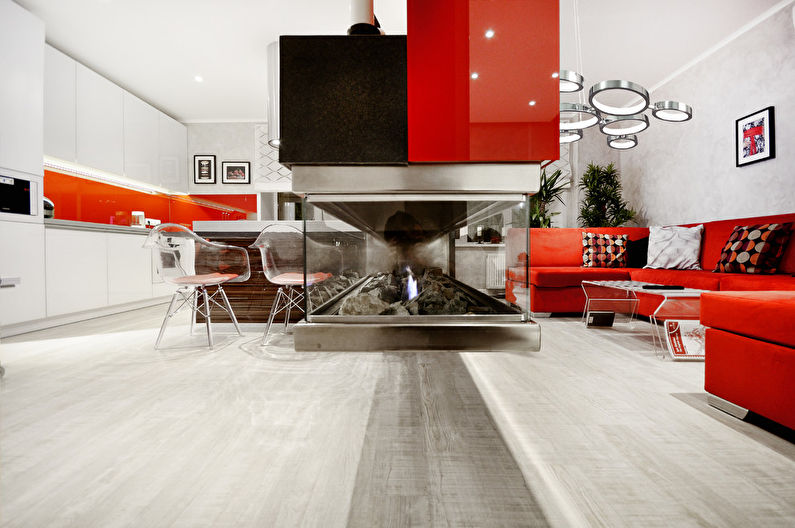
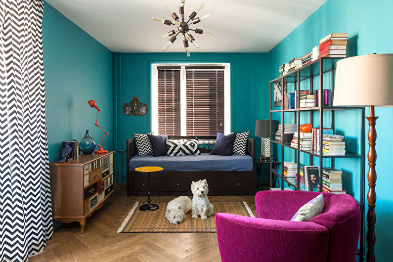
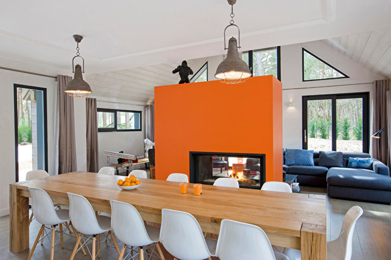
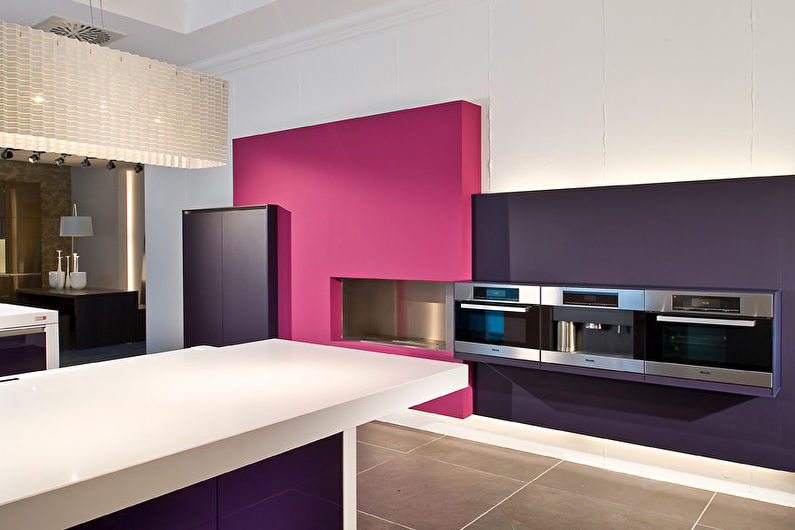
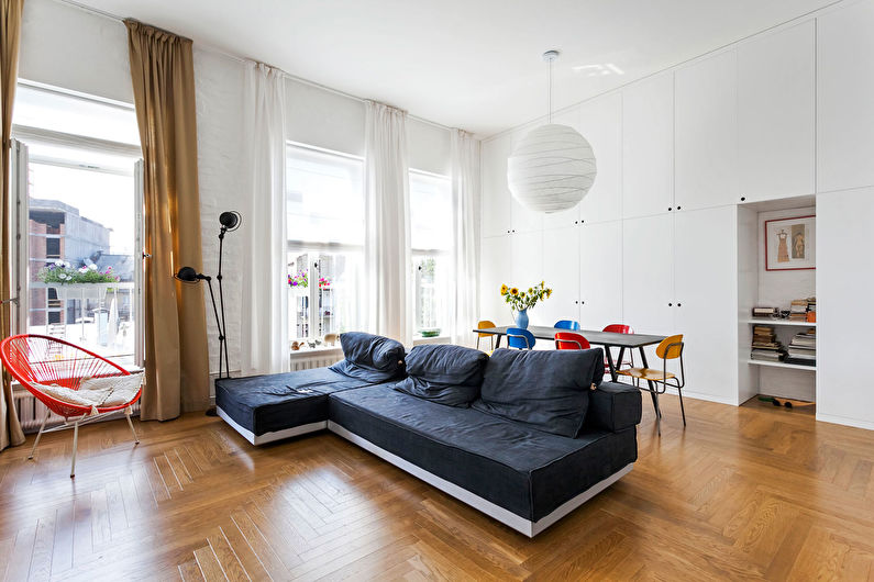
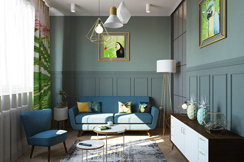
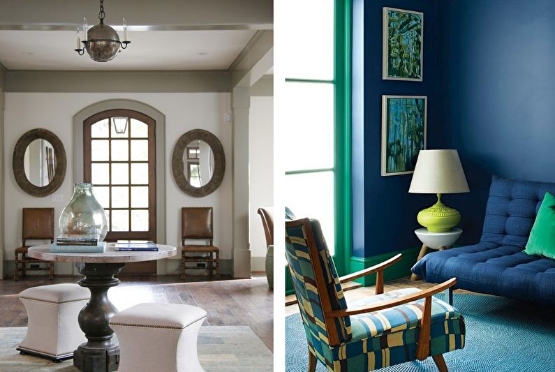
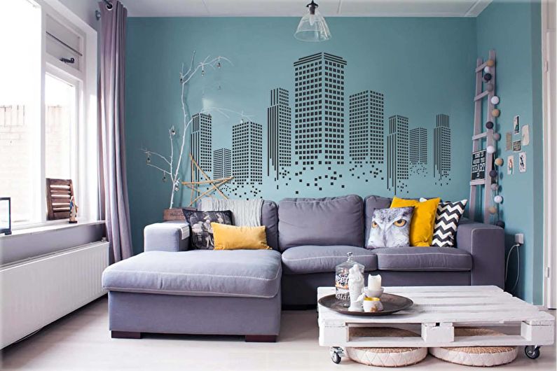
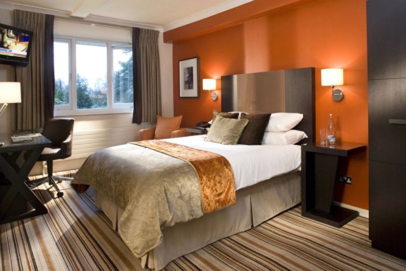
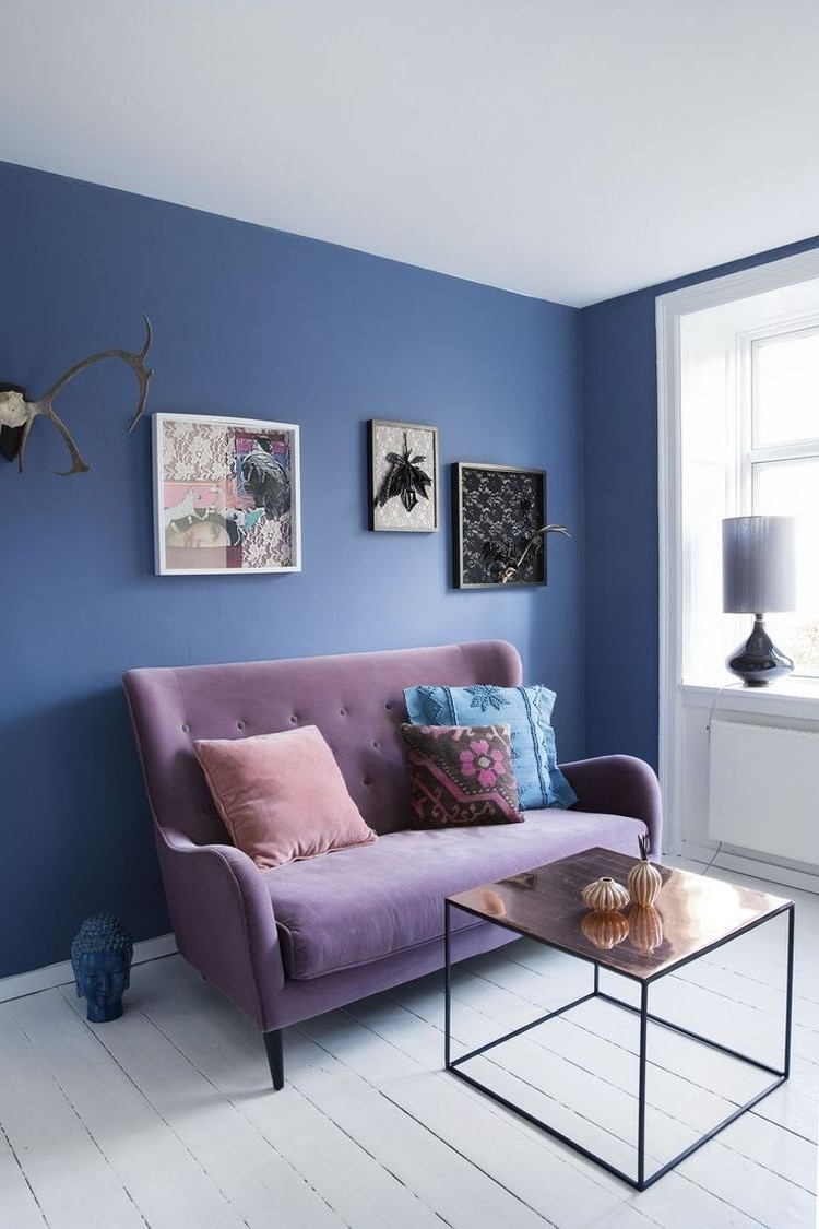
Contrasting colors are a fairly broad concept. Firstly, these are shades that are opposite each other in the color wheel - they are also called complementary. The most popular pairs are considered yellow with purple, red with green, orange with blue. But you can pick up other opposites, the main thing is that they stand out in the palette.
Secondly, contrasting colors can be considered colors on a neutral background, which act as a bright accent in space.
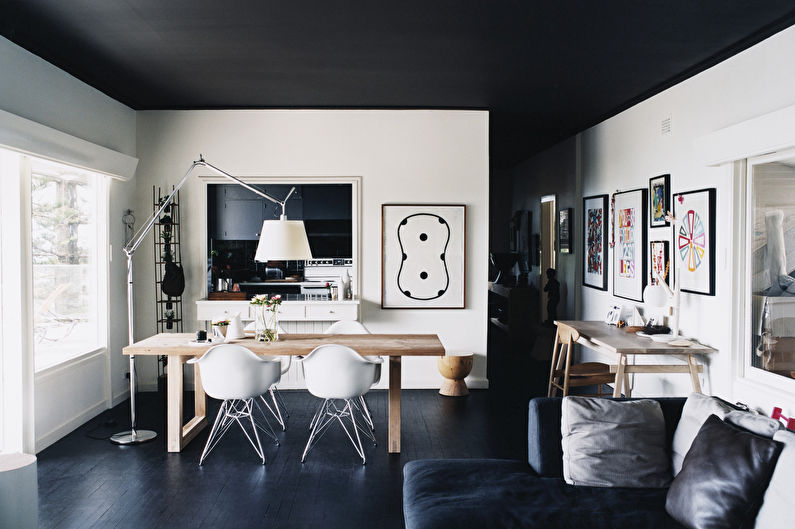
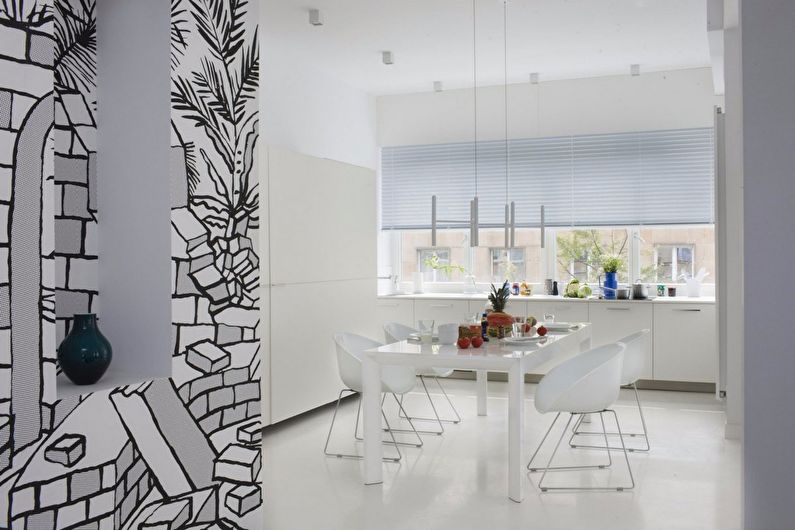
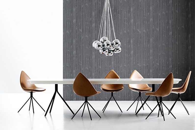
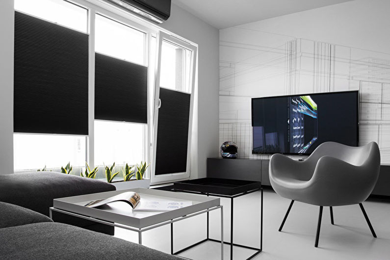
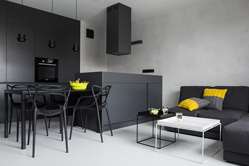
Thirdly, on the principle of complementarity a very popular pair is built today - black and white. Their dominant position in the interior allows you to create a stylish, modern, minimalistic look that can be diluted with more saturated details.
The following design options look good:
- Dark wooden floor, white ceiling and bright walls. Allows you to vertically "raise" the area, but at the same time "narrow" the layout.
- Dark floor, white walls and ceiling, bright furniture. For accessories, you can take yellow with blue, red with green - they will balance the finish.
- Light finish, several contrasting details. The set acts as a kind of museum object, which they try to demonstrate and emphasize.
Such coloring is suitable for a modern style that is not afraid of experiments, and in more traditional directions it is better to choose a muted palette.
Light gamma
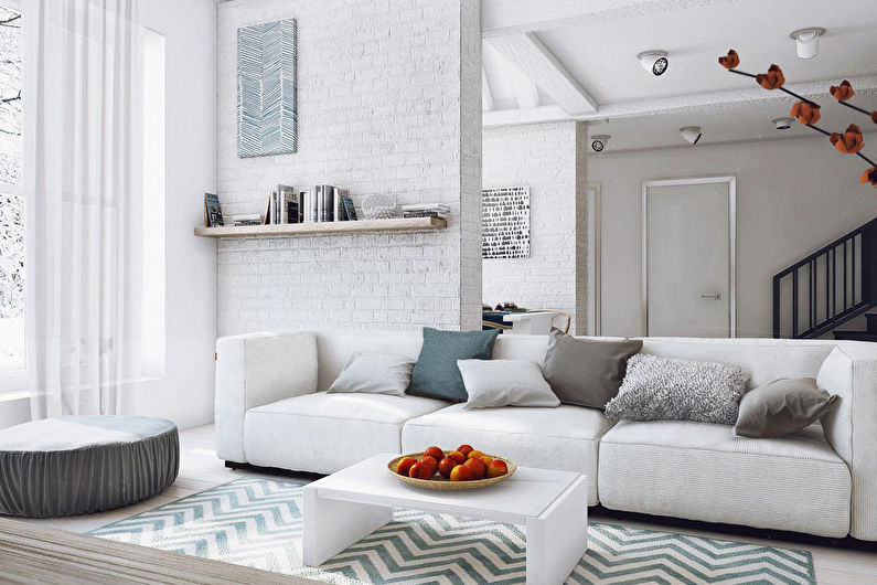
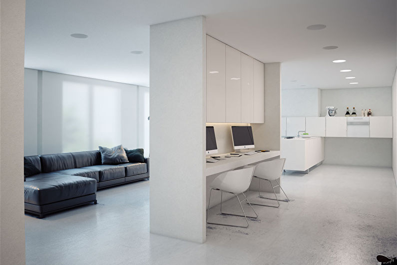
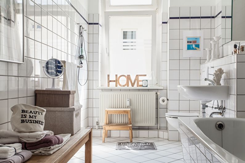
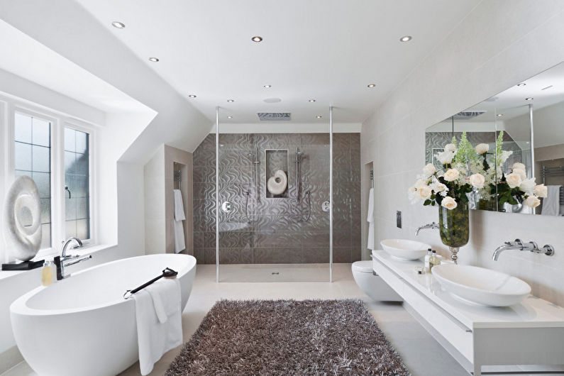
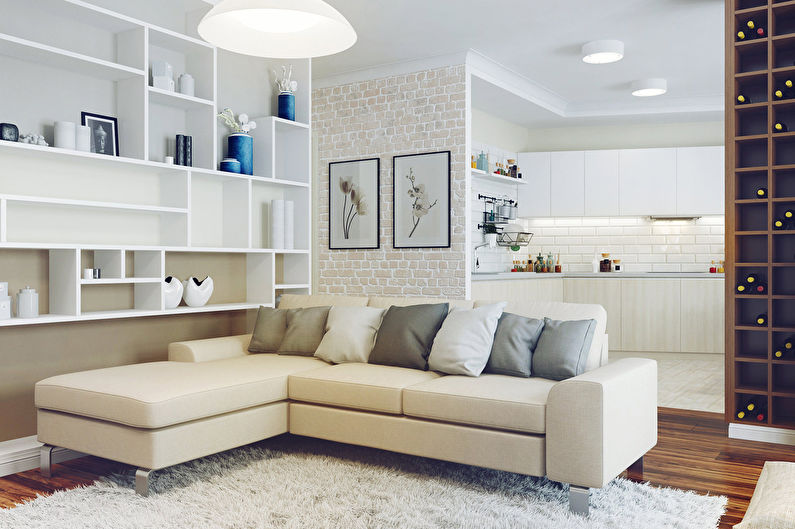
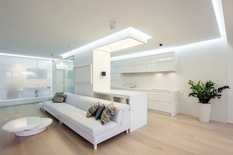
The house should be light and airy - these are the main signs of a comfortable interior, in which the color scheme is given not the last role. Modern trends tend to minimalism in the means of artistic expression, which is reflected in the growing popularity of bright rooms. By this is meant not just the use of muted shades, but literally the dominance of white in each element.
A room with light colors can look stylish, and can create a sense of sterility. To avoid the last effect, we advise you to select surfaces with a texture and patterns that will bring variety.
The main design tool will be a game with tones in the design of furniture and decoration. For the floor, you can choose a wooden coating, and the walls with the ceiling "painted" in white. Restrained details look good on such a "canvas": a gray sofa, a walnut cabinet or pale blue textile.
In the light design, the walls, a few tones darker than other sections, do not limit the area, but emphasize its geometry. The dominant position of white is characteristic of the Scandinavian style, but may be present in other styles.
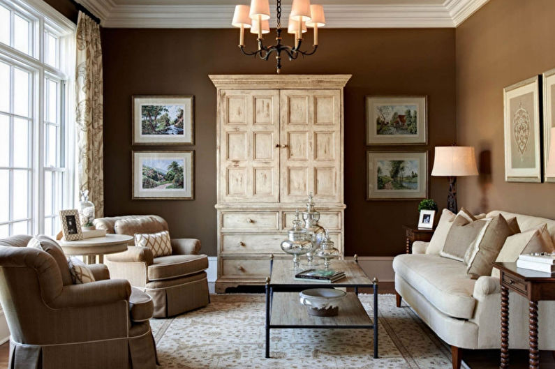
Natural gamma
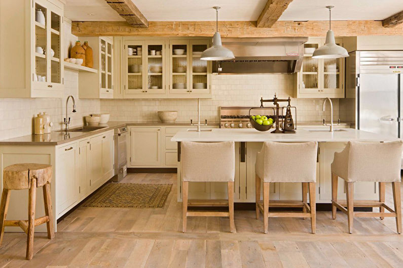
Concerned with the problems of the technogenic world, designers strive to create the most natural conditions in the personal space of a person, thanks to references to the natural environment. It is not so much about eco-design, but about natural colors that enhance the desired effect.
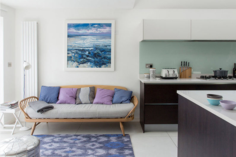
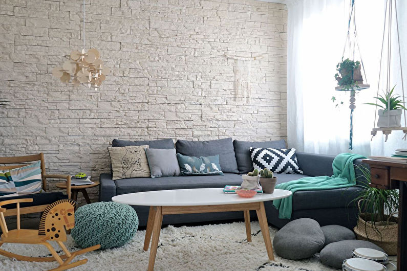
You can enter a similar combination using materials and shades. In the first case, the interior is built on the texture of wooden, marble or stone coatings. They are used as finishes, bases for furniture, as well as decorative elements. In this environment, green plants look good, which have a direct connection with nature.
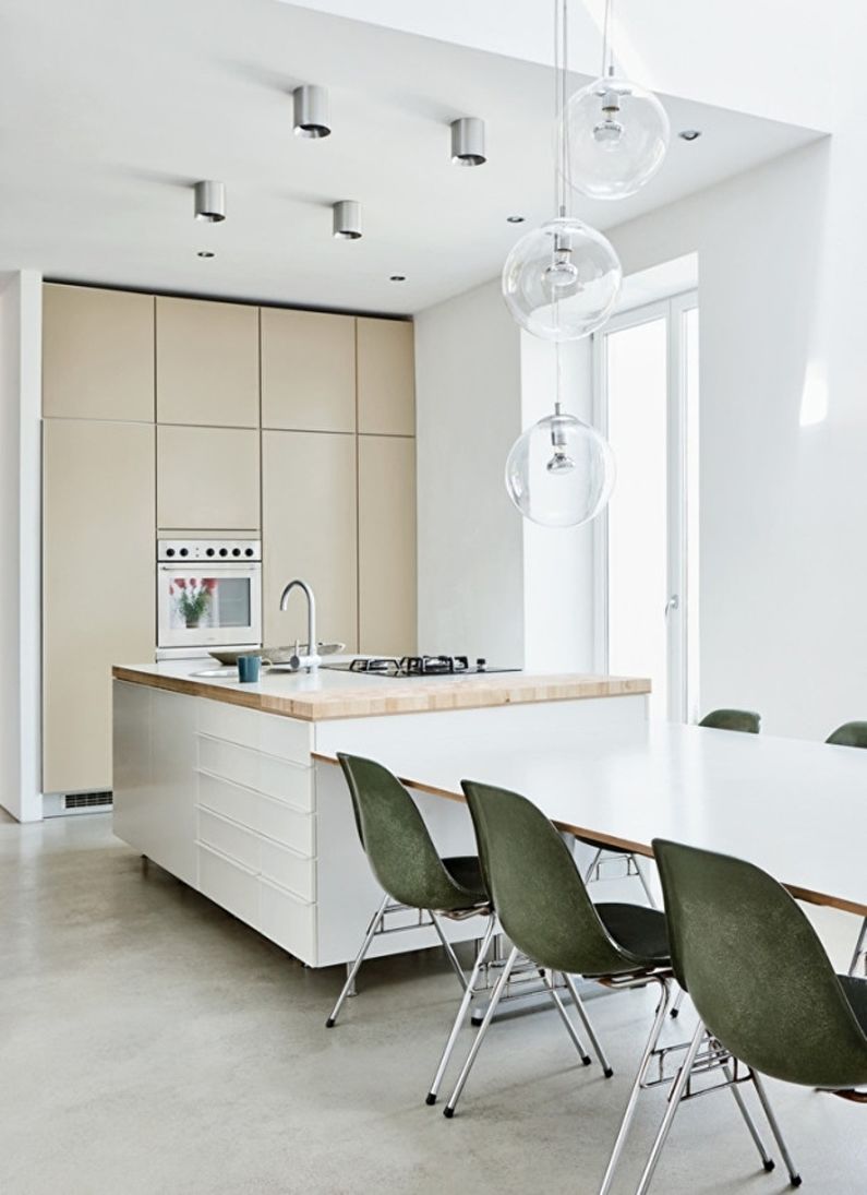
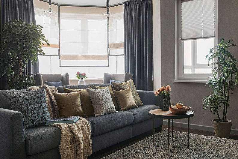
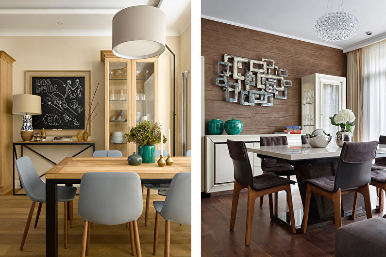
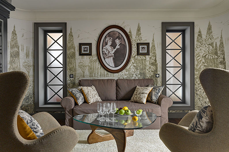
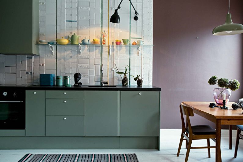
In the second case, you can bring the desired feeling with the help of natural colors. These include: brown, sand, gray, coniferous, less often - blue. All of these species can be combined with white elements.
What does a design with a natural gamut look like? Consider the popular options:
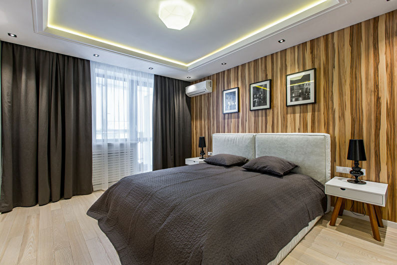
- Dark wood flooring, beige walls, white ceiling and furniture in gray muted colors. A strict, classic space with a strong atmosphere that can act as a living or dining room.
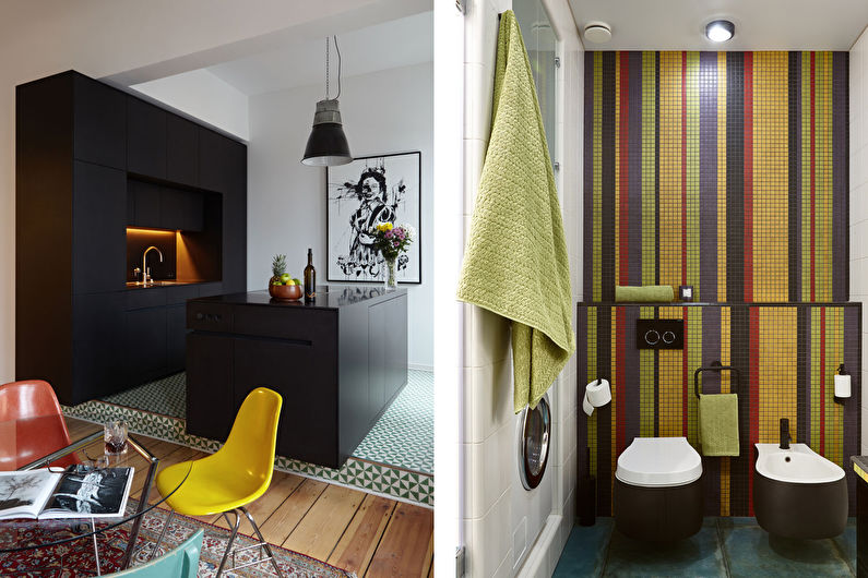
- Wooden floor, gray walls (concrete or stone), white ceiling, headsets of different colors, among which there is coniferous or beige. Suitable for modern areas, such as a loft or Scandinavian style.
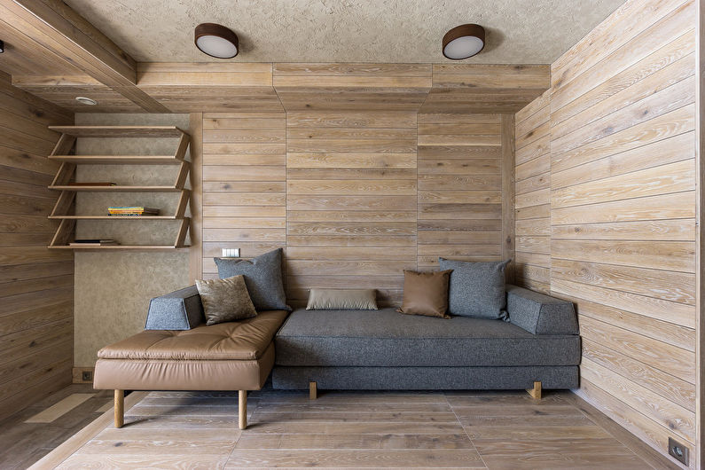
- The minimalistic look of the interior can be created using a monolithic floor and ceiling made of wooden panels, which are equipped with laconic objects with restrained color.
The natural palette is applicable in the classical style, but here it is diversified by decorative elements.
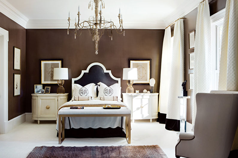
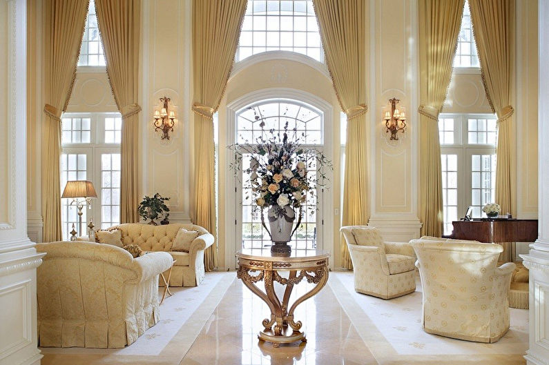
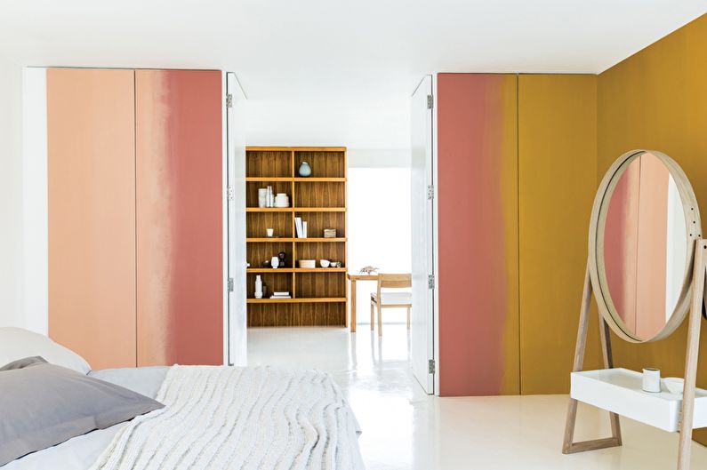
Monochrome design and halftone
Another great option for creating a harmonious and holistic interior. The principle of this design is based on a combination of shades of one color, which are much more than it seems at first glance. For example, only red has more than fifty variations, while purple has seventy-five! Such a room will definitely not be boring.
Of course, it will not work to be limited to one color, nor can control, for example, the shades of pillows or other household elements that will eventually appear in the living room. It is important to focus on the dominant color, which creates a general impression of the interior.
You can organize a monochrome combination of colors by choosing one of three main options:
- You can go the easy way using the lightest shades for large volumes (floor, walls, ceiling), the darker ones in the furniture design, and leave the deepest one for accessories.
- In the second version, the walls will become dark, and the rest of the room will acquire a light "color".
- The third principle, which is based on a combination of shades that differ by only a few tones, is considered the most difficult. The direction of gradation depends on the desired effect.
Such a solution will fit perfectly into any style: chromatic colors for classic directions, and achromatic colors for modern ones.
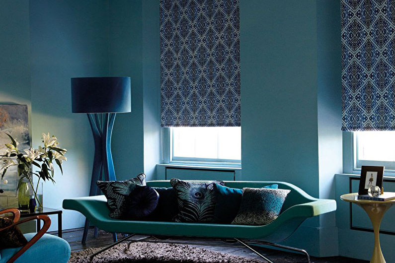
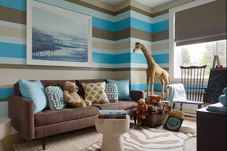
Cold and warm combinations
To create a harmonious interior, you need to understand the differences between cold and warm colors, as well as the possibility of their combinations.
These tones are based on the characteristics of perception, when some colors seem more sunny, while others spread freshness. At first glance, it might seem that the former refers to red, orange, and yellow, and the latter to blue and violet. But each of them can be warm or cold, depending on the shade. How does this knowledge help in design? We will analyze in more detail.
When choosing a palette, be guided by the location of the windows - if they are facing north, then the room needs to be built around warm colors, and in the case of the south side, try to enter cold shades.
Warm gamut creates comfort and coziness, activates mental activity, positively affects well-being. But you should carefully use it for wall decoration, as such combinations make them visually closer.
Cold tones, on the contrary, expand the space, helping to create depth. They have a calming effect and improve concentration.
It was once believed that shades of a different nature cannot be combined, but modern design uses this contradiction to create interesting effects. You can take one saturated color (for example, indigo) and dilute it with another (for example, sand).
Use the color features to enlarge a small area, lower too high ceilings or achieve other effects.
Video: How to combine the color of the ceiling, walls and floor