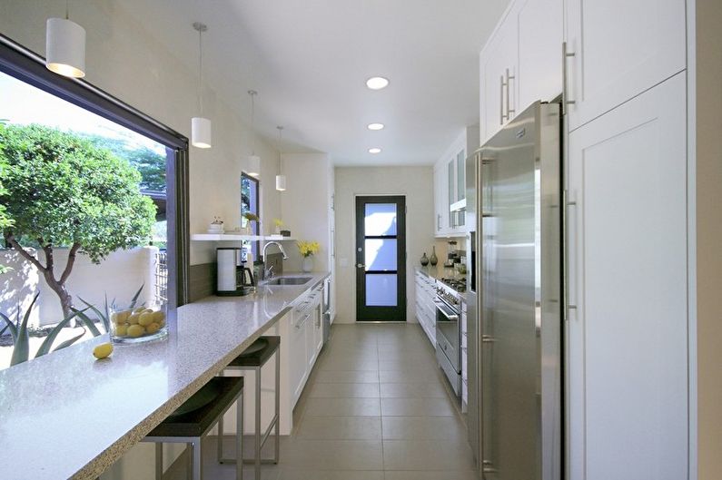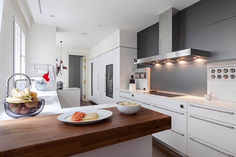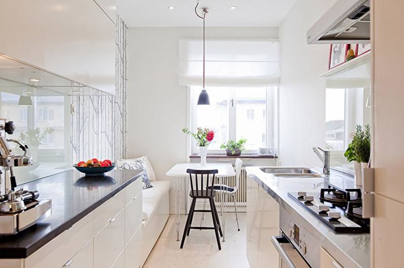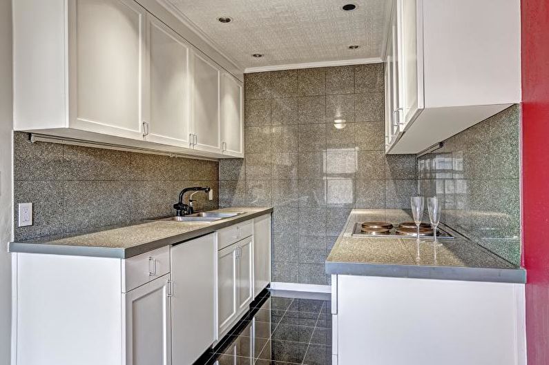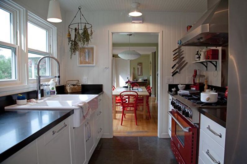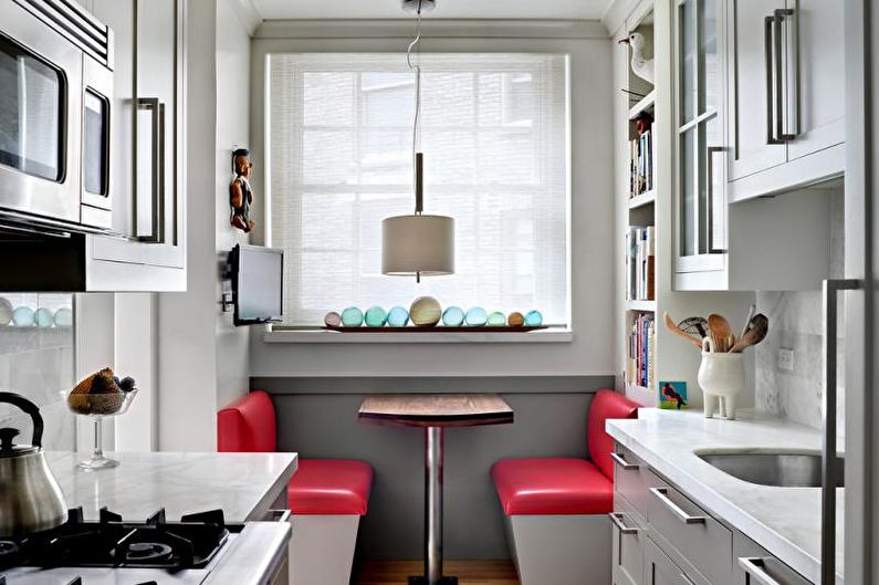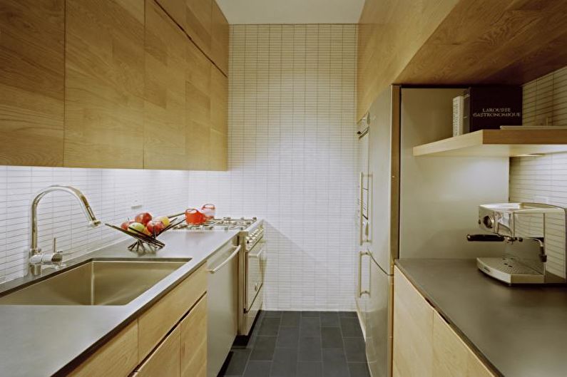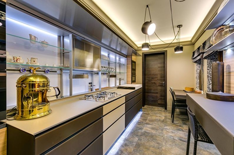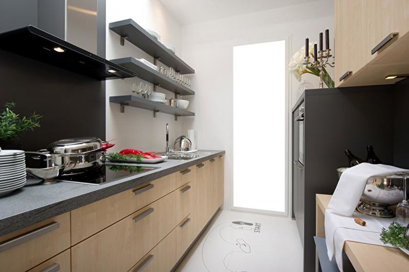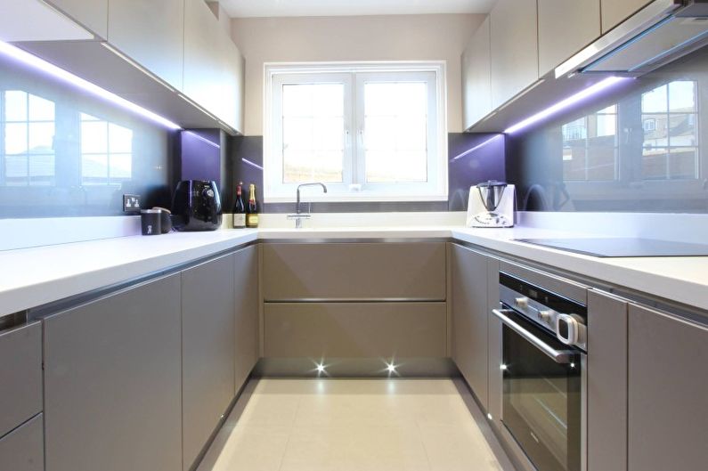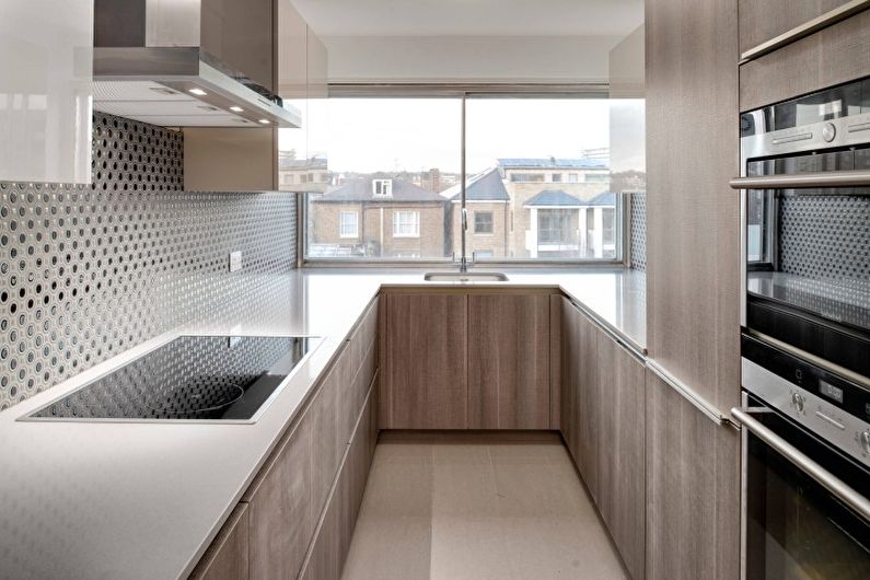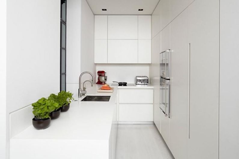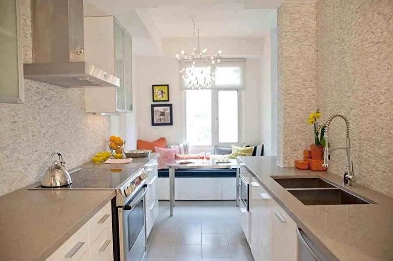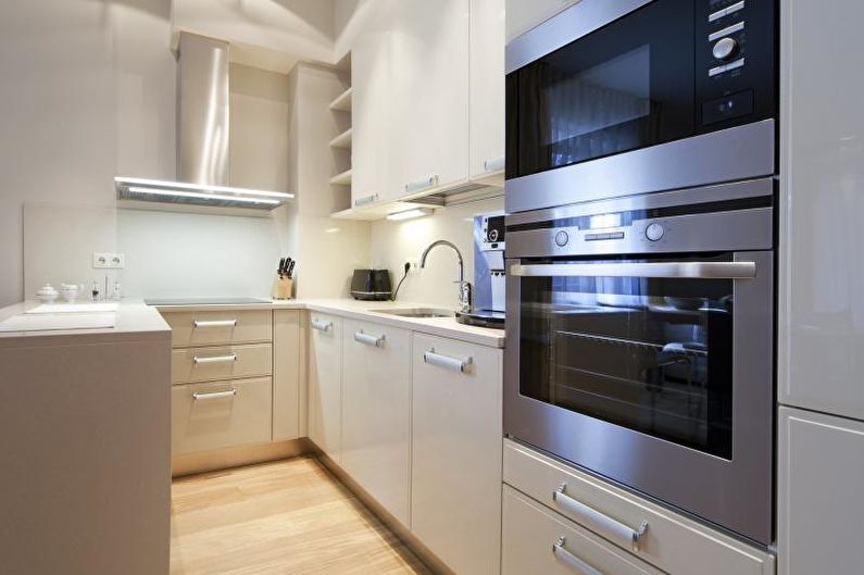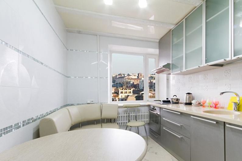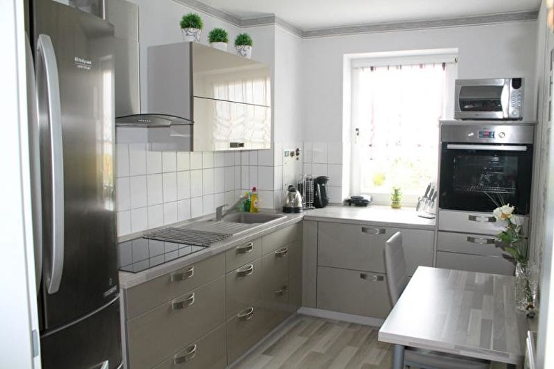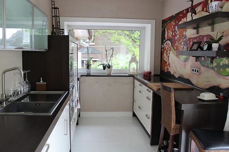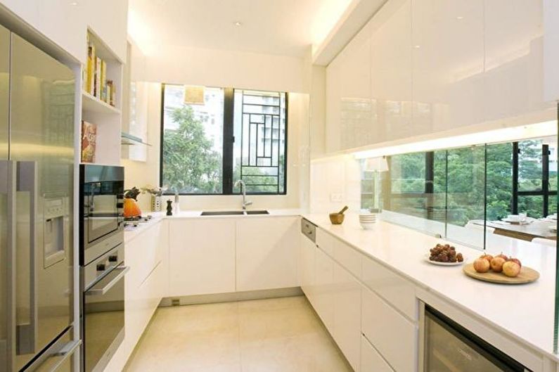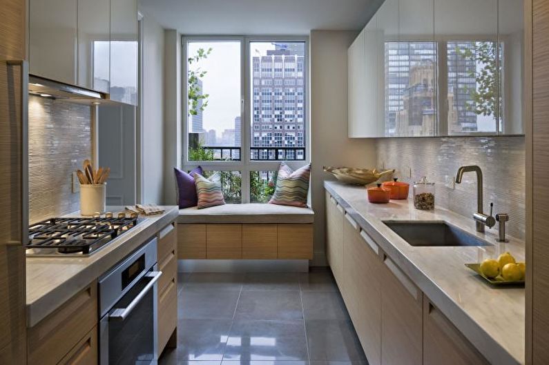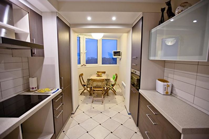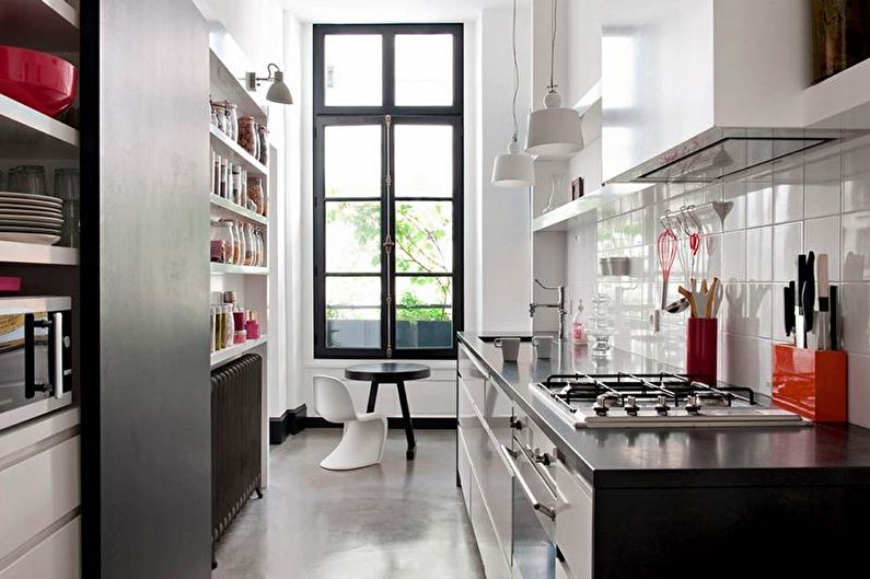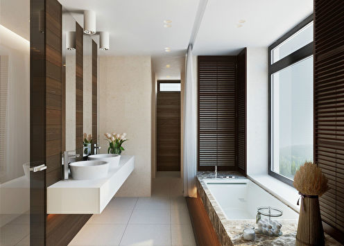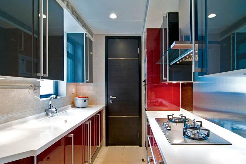
In standard city apartments, the kitchen area does not always meet the wishes of the owners. Residents of high-rise buildings often encounter the problem of cramped space, but in the cooking zone it is felt most acutely. You can improve the situation with the help of special design techniques that make the narrow kitchen as comfortable and beautiful as possible.
Features of a narrow kitchen
A room two or more times its length is more like a corridor than a living room. This is especially true for the options "window opposite the door." The only exceptions are open areas in studios, but completely different design laws apply to them.
The area of a narrow kitchen can be different - somewhere a miniature set will hardly fit, in others there will be enough square meters for a full dining table. Sometimes the space can be expanded a little by combining with the living room or balcony, but in most cases you have to put up with what is. To be in a narrow kitchen was comfortable, it is very important to properly equip it.
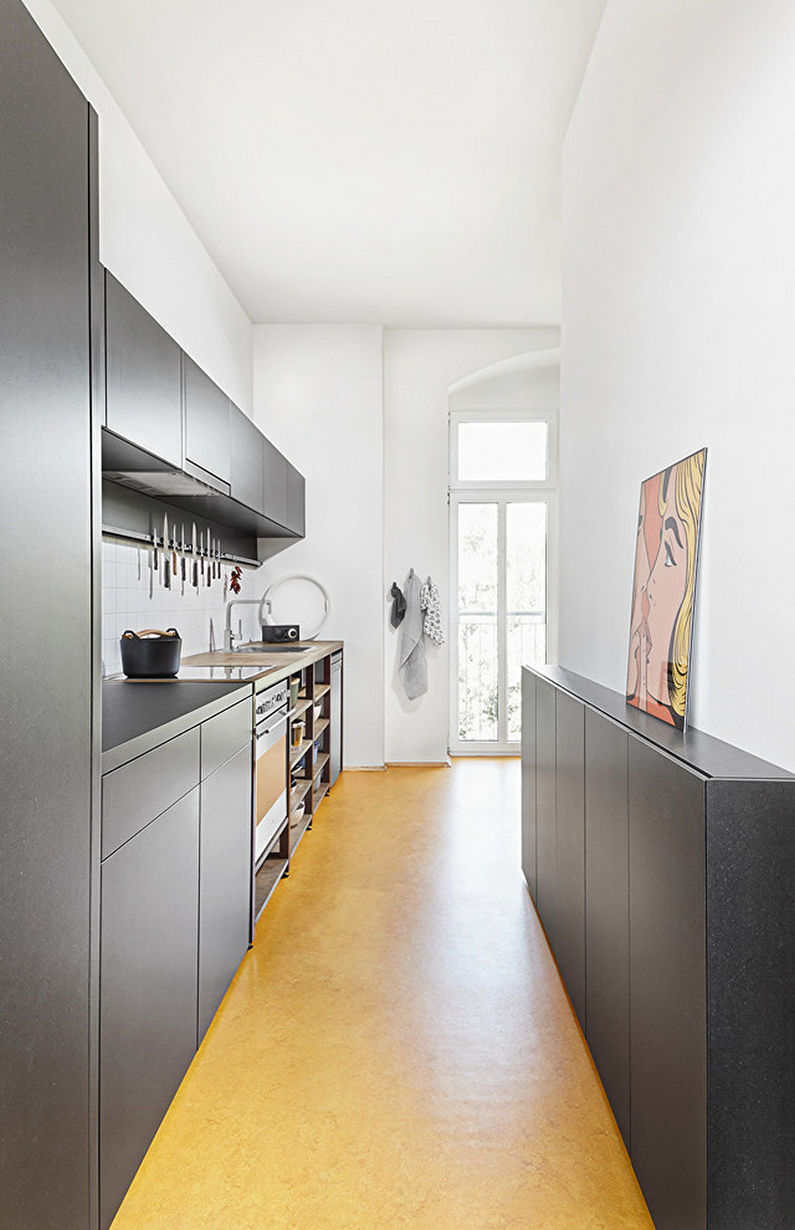
An elongated room presents a list of requirements for a design project. Firstly, it is necessary to balance the proportions, visually push the walls and raise the ceiling; secondly, in such a kitchen it should be easy to cook, that is, attention should be paid to the ergonomics of processes; thirdly, the esthetic side is of great importance. Only an integrated approach is able to satisfy all these criteria, when every little thing is thought out in advance, and the choice of finishes, furniture and appliances is carried out according to a previously approved plan.
Interior styles
Given the specifics of the corridor-type kitchen, not so many style decisions are suitable for its design. The smaller the dimensions of the room, the more modest the interior should look. A discreet color palette, smooth textures, a minimum of protrusions and all kinds of decor are the keys to a space that is not overloaded with details, in which all family members will have a good time.
Narrow kitchen in a modern style
It reflects the fast pace of life and the high development of technologies of the 21st century. In such an interior, everything is clear and concise: kitchen utensils and products are hidden behind the neat facades of the headset, the built-in appliances perfectly and quietly perform their functions, and without exception, all surfaces remain perfectly clean. A minimalistic design in light achromatic colors is the best choice for a narrow kitchen of the most compact sizes, thanks to which the cooking process will become an easy and enjoyable task.
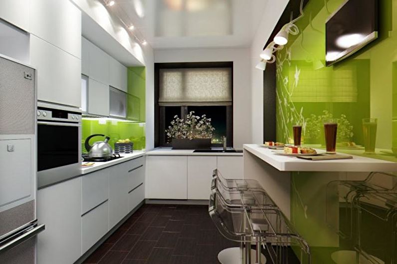
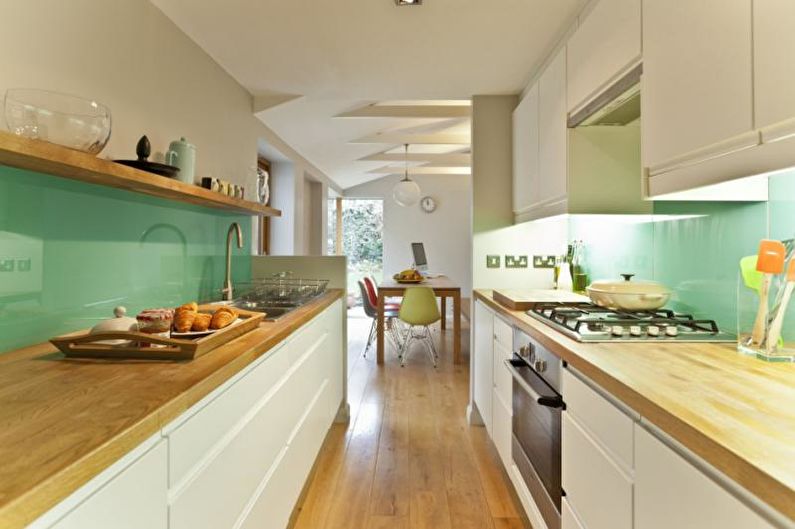
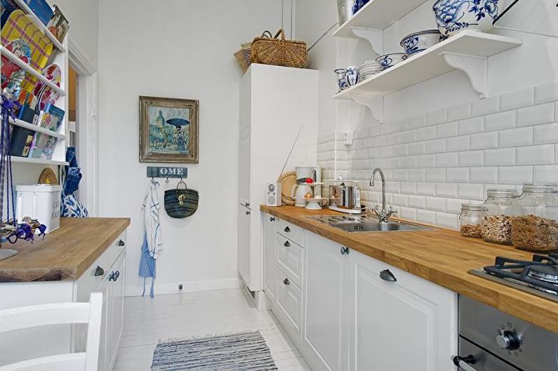
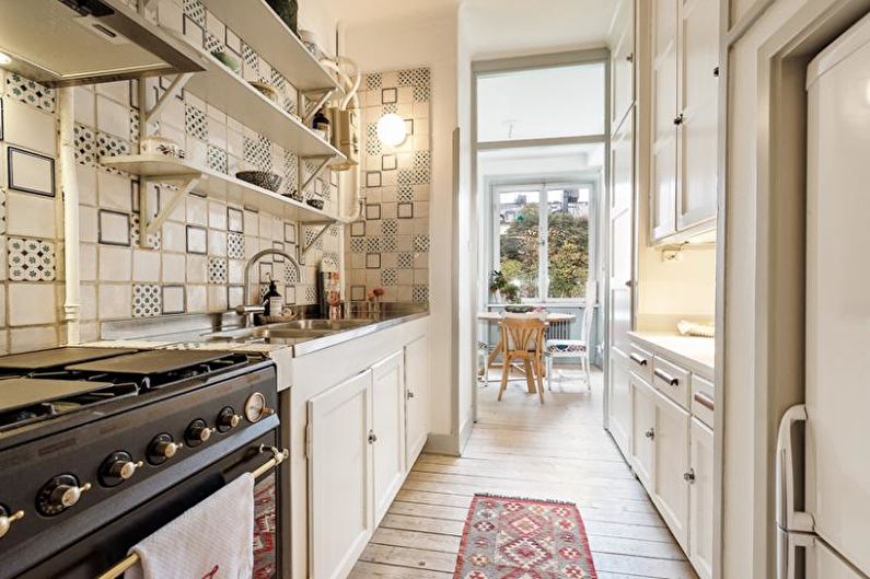
Narrow Scandinavian style cuisine
It was borrowed from the traditional home environment of the inhabitants of the northern countries - Sweden, Denmark and Norway. Due to the abundance of white and gray-blue color, it leaves the impression of limitless spaciousness of snow-capped mountains, and interspersed with natural wood and ethnic motifs create a warm homely atmosphere. The narrow Scandinavian-style kitchen looks airy and bright, so being in it is a real pleasure for any housewife.
Narrow loft style kitchen
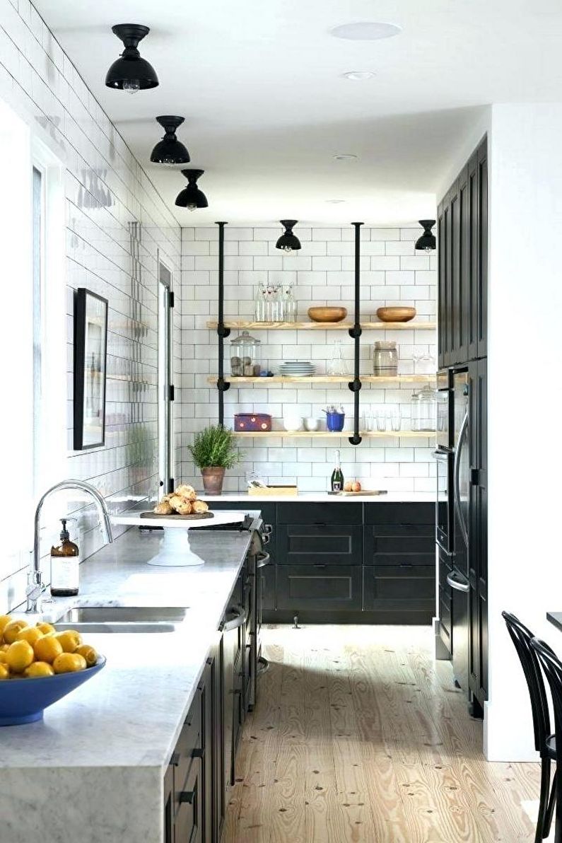
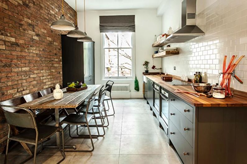
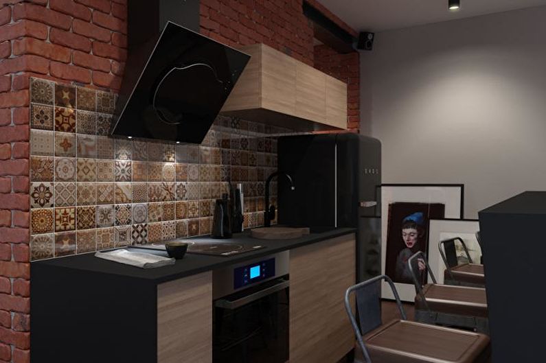
One of the most organic solutions for an extended room. Industrial features in the design fully justify the non-standard layout. It may seem that in the place of this strange kitchen there used to be an industrial workshop, a pantry or a corridor. Simple finish in the form of brickwork and concrete, open steel pipes, roughly processed boards, home-made furniture from improvised materials will make the cooking place completely individual, and the owners will be able to show creative inclinations and the courage to go against the generally accepted standards.
Narrow Provence style kitchen
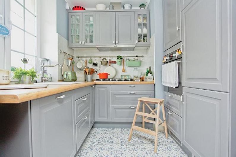
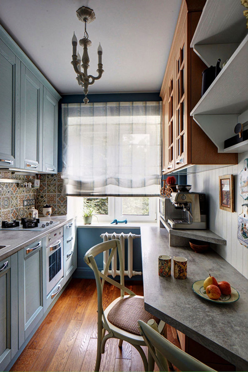
Provencal style, with its delicate pastel shades and vintage modest decor, will help to create a soft atmosphere of a French village in the kitchen.Here, wooden furniture painted with light matte enamel, bleached walls and ceiling, porcelain services on open shelves, unobtrusive prints in the form of wildflowers, birds, lace will be appropriate here. However, it is better to save the drawings for small elements - window curtains, an apron, sets of dishes, and it is advisable to leave the remaining surfaces monophonic.
Combinations of colors in the interior of a narrow kitchen
The choice of colors for a narrow kitchen is one of the most crucial moments. Combining tones according to all the rules of decoration, a long room can be visually expanded, bringing its geometry closer to the desired shape. But the more modest the dimensions of the room, the more carefully you should handle bright and saturated colors. So that the kitchen does not seem motley, it is recommended to avoid contrasts, even if we are talking about a banal black and white chess. Eye-catching elements should be located near narrow walls, but sometimes an emphasis in the center is necessary for zoning the space, for example, dividing it into a working and dining part.
Achromatic
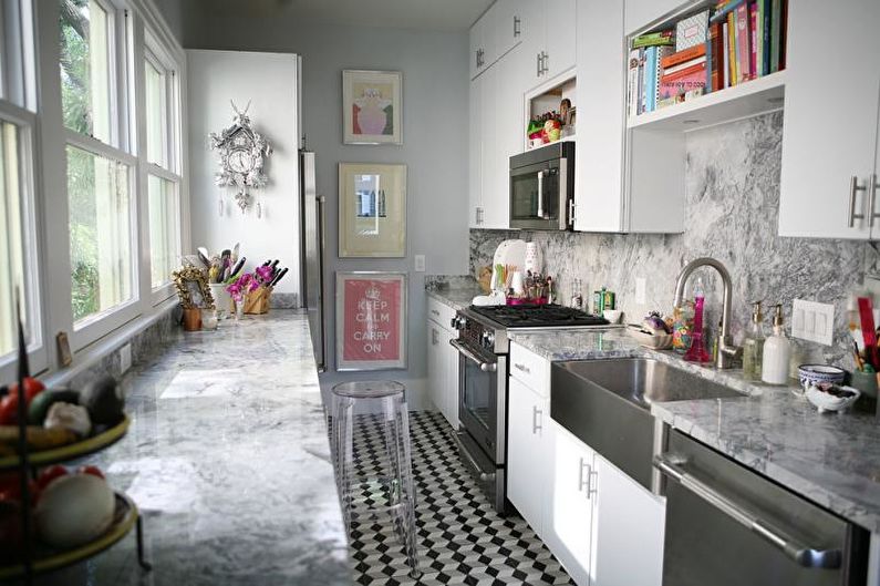
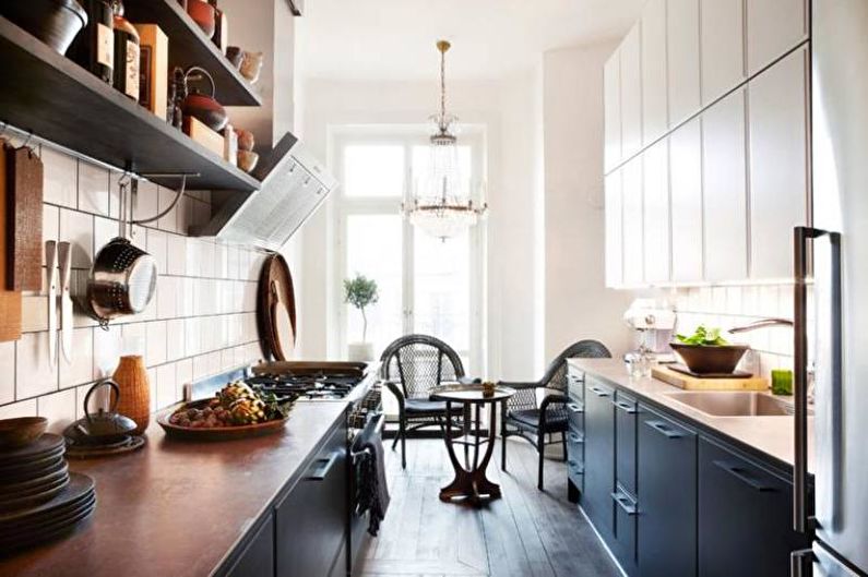
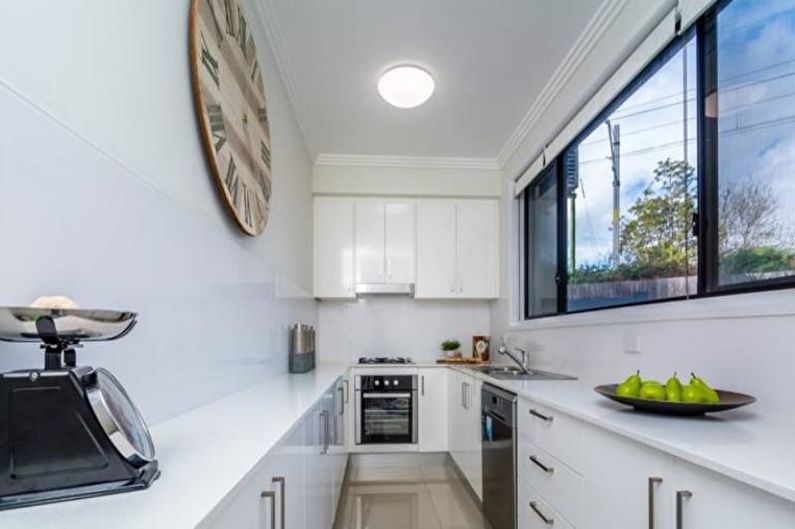
The combination of white, gray and black in an elongated kitchen always looks very stylish. They can be diluted with natural wood worktops, small bright details (an apron, separate cabinet doors, a refrigerator), colored dishes and decor.
Cold
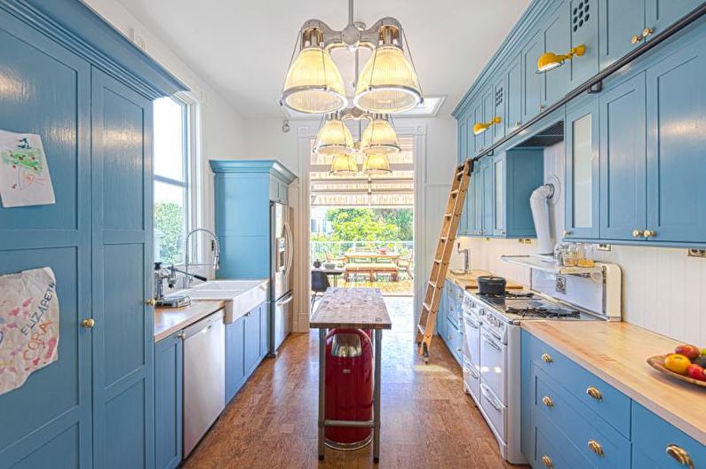
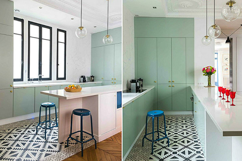
Quite often used in the design of narrow rooms. Pastel blotches on a matte white background - a good option for air provence, country, sea, Scandinavian style. However, the base may well be colored: light gray, pale blue, olive, lavender, beige will look beautiful in a long kitchen. All these shades are easily combined with each other, but no more than 2-3 in one room.
Warm
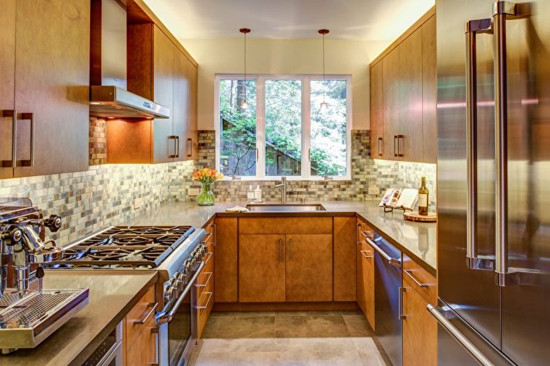
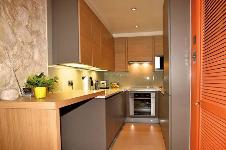
It is best to create them using wooden textures and ocher, brick tones. In such a palette, the lightest shades can be represented by milky white, lemon, peach, greenish khaki, and the darkest - brown coffee and chocolate. Well complement the warm gamut of red, yellow, green, from metals - gold and bronze.
Finish
In addition to standard requirements regarding quality, safety and durability, materials used for finishing narrow kitchens must meet certain aesthetic requirements. In such rooms, colorful drawings, large decor and rich contrasts are completely undesirable. All this is best left for overly spacious rooms, and the small cooking area is elegantly and restrained.
Ceiling
The optimal solution for finishing the ceiling area in a narrow space is a flat, light surface. Depending on the chosen style, you can stay on a matte, satin or mirror texture. Volumetric drywall constructions, as well as two-tier perimeter frames, are usually not suitable for such cases. The only exception is a large narrow kitchen with a high ceiling, which can be visually zoned with a square shape and soaring lighting.
Walls
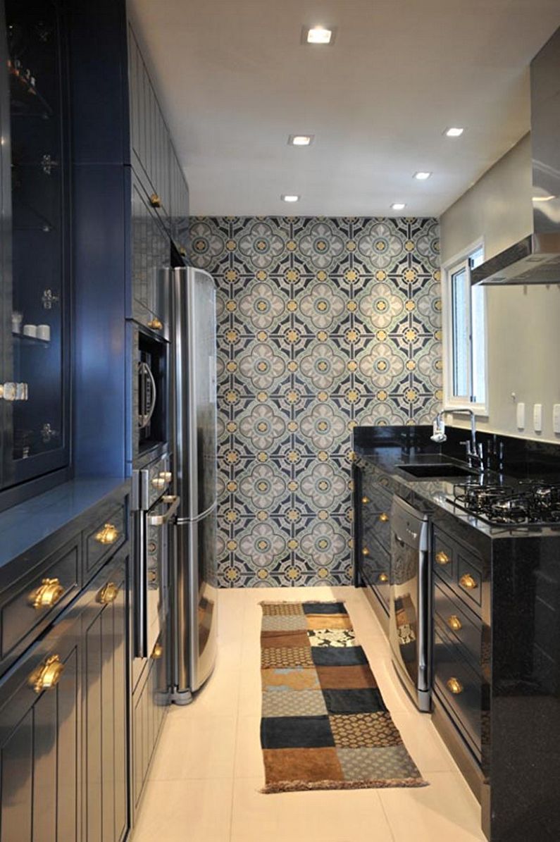
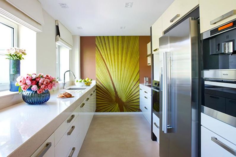
If it is a small space, the walls in it should be as simple as possible. Light monophonic painting or the same wallpaper is an excellent basic option. To avoid the effect of the “train”, it is not recommended to use horizontal patterns, including stripes, on long walls. At the same time, a pronounced vertical, whether it is an insertion of a saturated shade, any large image, or, for example, a red refrigerator against a white headset, will help to balance the geometry of the kitchen. A free wall can be visually moved aside by sticking on it a mural with a realistic perspective directed inward.
Apron
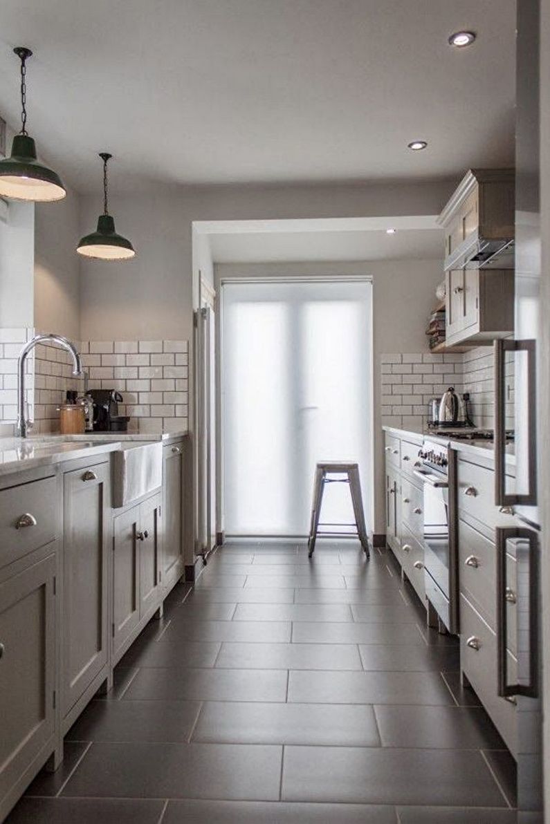
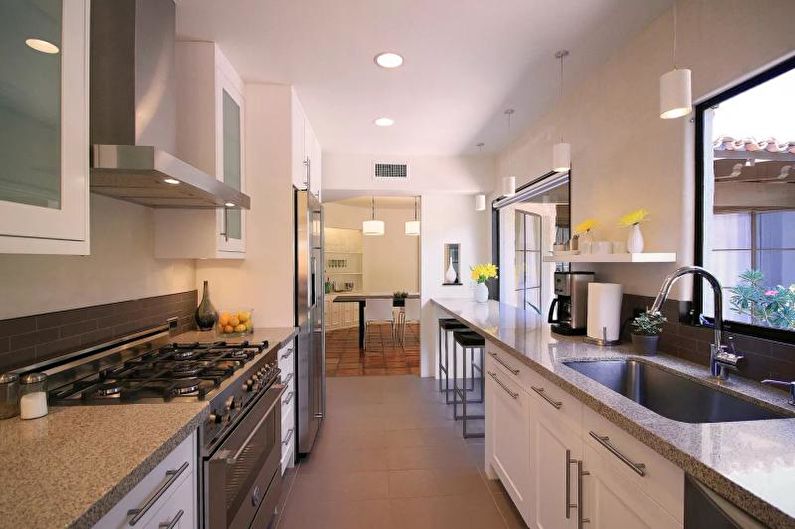
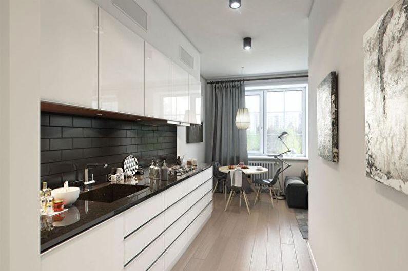
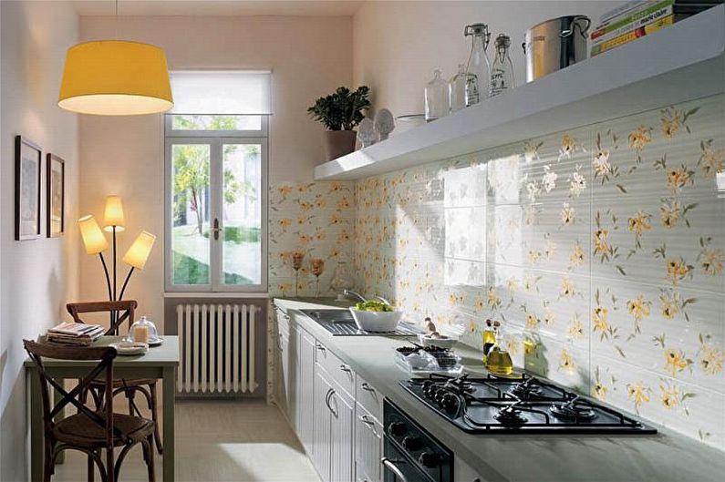
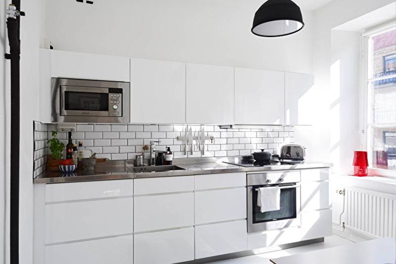
In addition to its direct purpose - to protect the wall near the stove, sink and worktop from spray - this element serves as one of the most significant decorations of the kitchen.There are no special rules for its design in narrow rooms - it all depends on the preferences of the owners and the style as a whole. However, it is advisable to avoid placing horizontal borders and catchy patterns on the apron. Medium-sized brick or masonry, tile of related shades, square mosaic, fashionable patchwork, glass with mirror illumination will look much better.
Floor
When finishing the floor in a narrow room, preference should be given to non-contrasting small and medium-sized textures. They should be in harmony with the rest of the design, be comfortable in operation and not attract special attention.
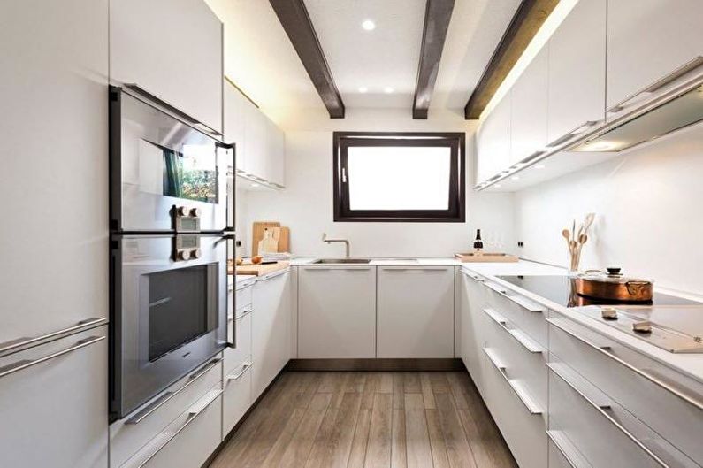
A parquet board and a rectangular tile should be laid parallel to narrow walls - so the room will seem more spacious. Square elements are best placed diagonally, in the form of rhombuses, but they should be close in color, and not resemble a chessboard. Interestingly enough, on the floor of a narrow kitchen, a stylized “path” made of tiles, laminate or linoleum may look, but, again, colorful contrasts should be avoided.
Kitchen furniture
There are few options for arranging furniture in a compressed space. One way or another, the headset is installed along one or both long walls. In very rare cases, if the footage allows, an island layout is found. However, the place near the window deserves special attention - it is too often ignored, and yet from the point of view of design it is one of the most interesting segments of the narrow kitchen.
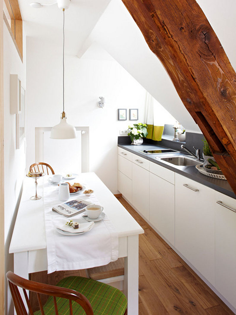
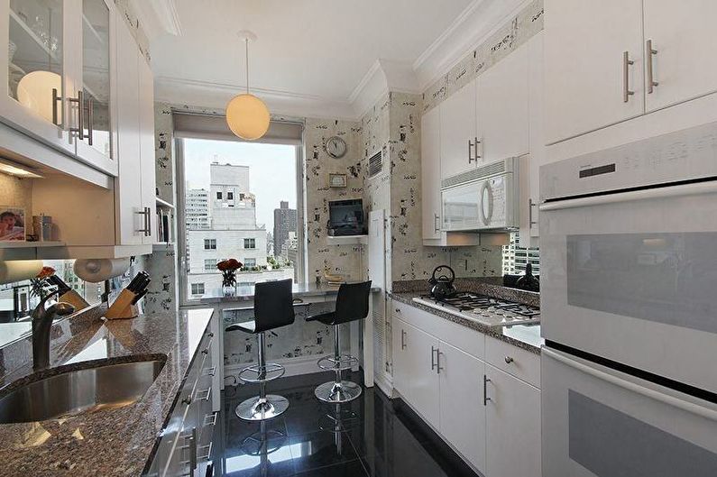
So, the first thing to consider is the possibility to equip at least a minimal dining area near the window. In the role of a table, a transforming window sill may well act. If desired, it can be easily turned into a comfortable sofa, and for serving dishes use the protruding countertop of the L-shaped headset. A rather interesting option for using a place near a window is a dining area resembling a side reserved seat in a train.
In the event of a lack of free space in the kitchen, folding, pull-out, mobile furniture items will become a real salvation. Instead of large-sized stools, compact bar stools can be purchased, bulky table-tops can be replaced with lightweight constructions attached to the wall.
The ideal set for a long cramped kitchen should be with smooth facades, without elaborate decor and sharp contrasts. Options without handles with magnetic mounts will look very modern. Compensate for the narrowed format of the cabinets will help the height to the ceiling. The built-in storage system with a mezzanine can be equipped around the window opening - this way the place will be used even more efficiently.
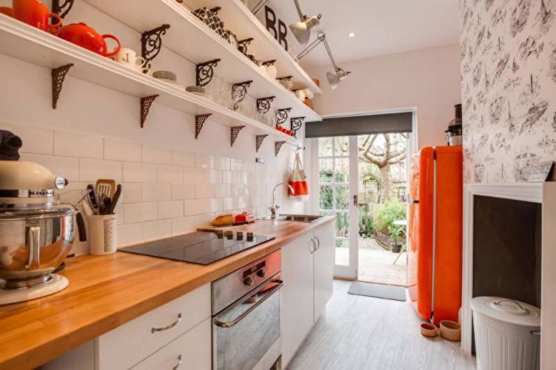
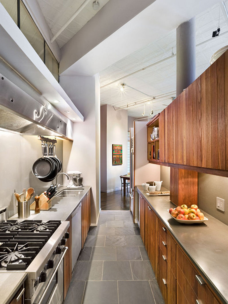
Narrow kitchen design - photo
Making a narrow kitchen is a real challenge for designers, craftsmen and just owners of this type of premises. But a huge number of implemented projects proves that it is more than realistic to remake the “corridor” room into a stylish and comfortable cooking zone. To verify this and find inspirational ideas for the upcoming repair, the photo gallery on our website will help you. Choose the option you like, and let the new kitchen turn out to be better than in the most beautiful pictures.
