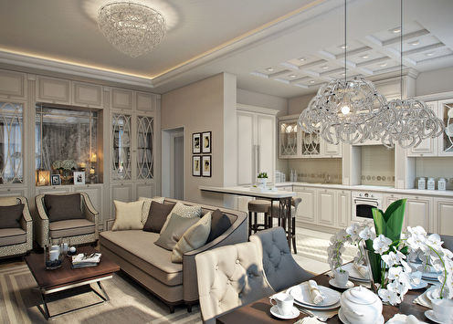
Every housewife dreams of a cozy and stylish kitchen, so that it would be nice to cook there, get together as a family at a common table or just arrange warm friendly gatherings. The first step towards fulfilling this desire is the choice of shades by which surfaces and objects will be “decorated”. A well-composed palette will become a constant source of positive emotions and will help create a joyful atmosphere in the heart of the house.
Color psychology
The influence of colors on the human subconscious is inherent in nature itself. Receiving up to 80% of information about the world through vision, people have learned to instantly recognize the features of things not only in their size and shape, but also in color. And although in the modern world there is no need to look for edible berries or to distinguish among the foliage of a crouching beast, the reactions to color combinations have largely remained at the level of instincts.
In addition to genetic heritage, likes and dislikes for certain tones are formed individually, depending on personal experience. Each person has certain colors associated with some kind of memory and can cause different emotions. That is why it is so important to choose the design of the kitchen yourself or, at least, to indicate your own preferences when discussing a project with a designer.
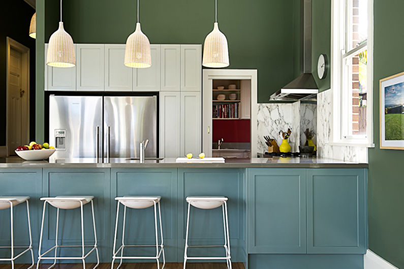
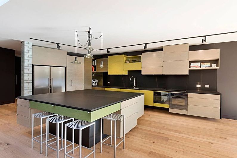
How to choose shades for the kitchen?
In order for the finished interior to look harmonious and thoughtful, it should be visualized even before the repair begins. It is best to build on the color of the headset, and choose the decoration of the walls, ceiling and floor in addition, as the background for the most dimensional part of the composition. Furniture in the dining area, large appliances (oven, refrigerator, microwave), the surface of countertops, all kinds of metal elements, textiles also play a rather important role.
Be sure to pay attention to the compatibility of textures. So, gloss is perfect in tandem with tinted glass and chrome steel, the nobility of the tree will beautifully shade the raw stone, and whitewashing will look very nice next to small chintz flowers and enamel in pastel colors.
Color circle
For several centuries, artists and designers around the world have been using the so-called color wheel - a multi-colored circle divided into 12 segments. Three basic colors - red, blue and yellow - are located on it at opposite points, forming an isosceles triangle. An intermediate place is occupied by shades obtained by mixing neighboring paints in equal proportions.
Equal in brightness and saturation, all 12 colors combine well with each other. If you choose shades placed opposite each other, you get a complementary contrast. Adjacent segments are called analog - such smooth transitions are usually found in nature. On the color wheel, you can also "draw" triangles, squares and rectangles - the corners of the figures will show the most balanced combinations.
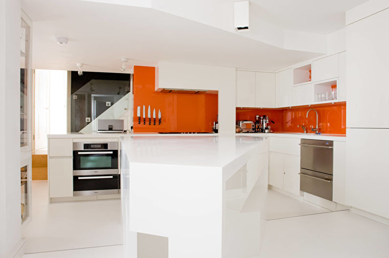
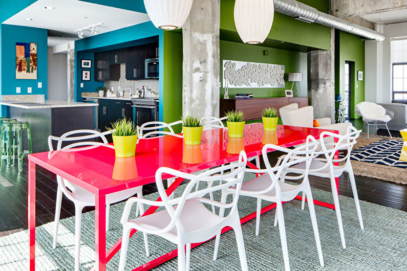
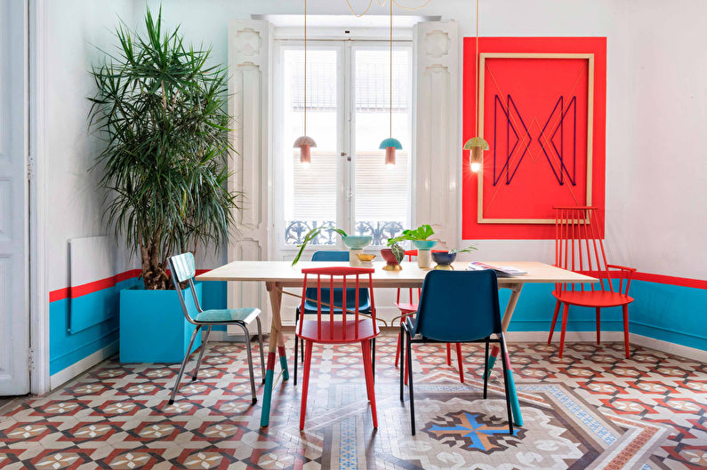
Palette from the picture
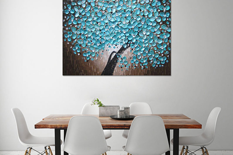
Creating a kitchen design “from scratch”, you can use another rather unusual method of selecting colors - from a photo or picture. It can be a landscape, still life, flowers or any other beautiful image. Instantly analyze the shades in their percentage ratio will help a special program or online service - a color palette generator.
This technique will work if you need to find a suitable frame for existing fragments of the kitchen.No one forbids taking pictures, for example, of headsets, and after precisely defining its color code, see complementary, contrasting, process options for the best design of an apron or walls.
Neutral combinations
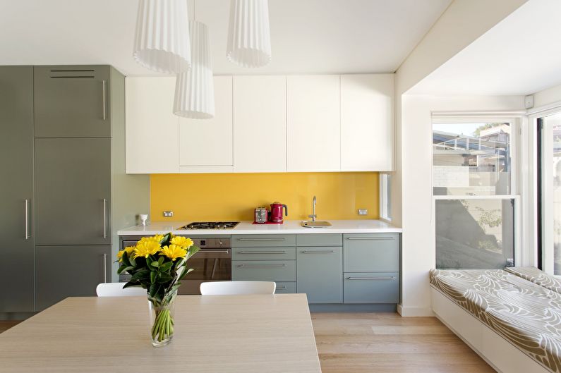
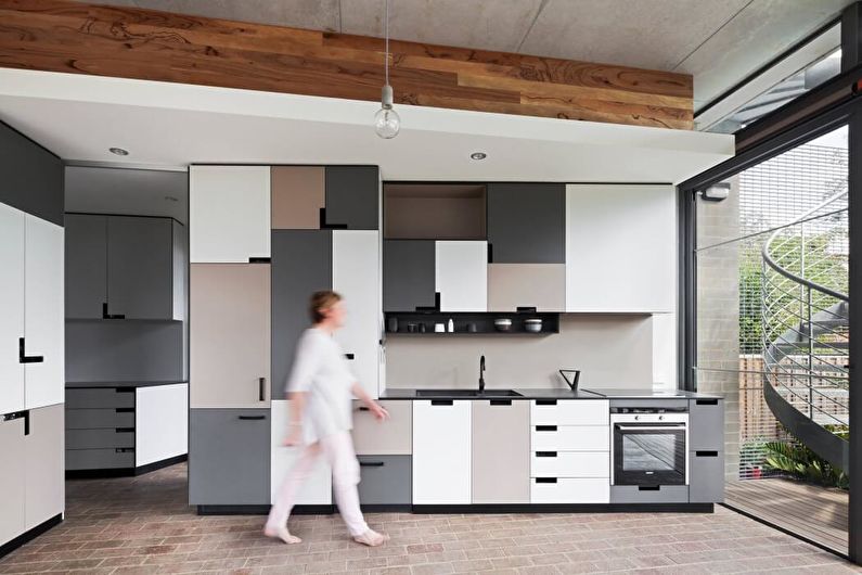
The main feature of achromatic colors is their versatility. Black, white or gray can be used without limitation both as a background and for accents. With their help, it is easy to play in semitones, adjust the brightness and contrast in the interior, lighten or darken individual fragments.
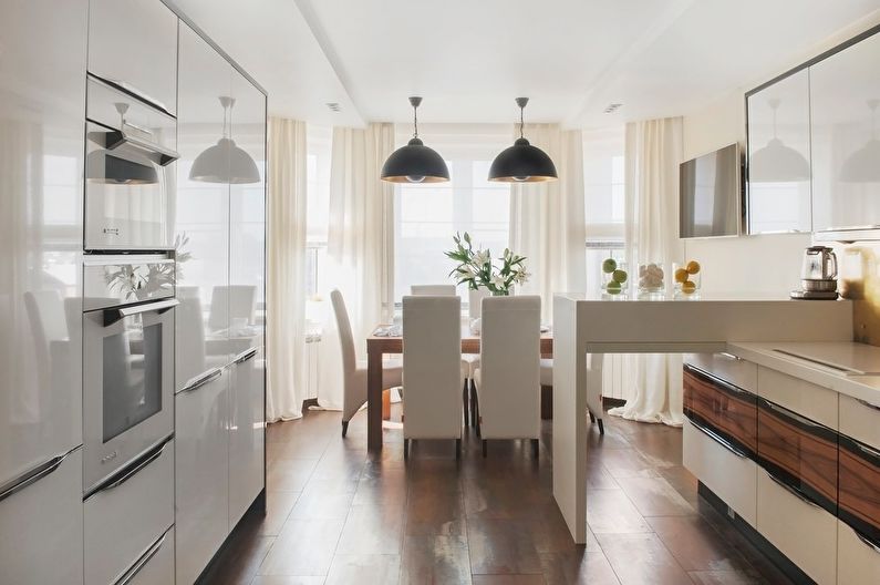
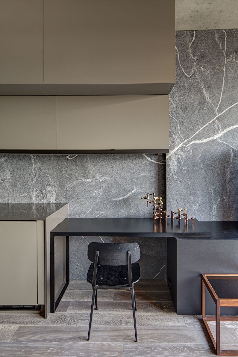
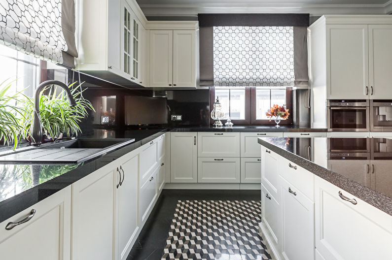
The black and white kitchen design almost always looks modern and thoughtful. Thanks to the abundance of a variety of materials, textures, drawings, decor, it can be adapted to any style, be it an elegant classic, restrained minimalism, serene provence, neat hi-tech or a rude loft.
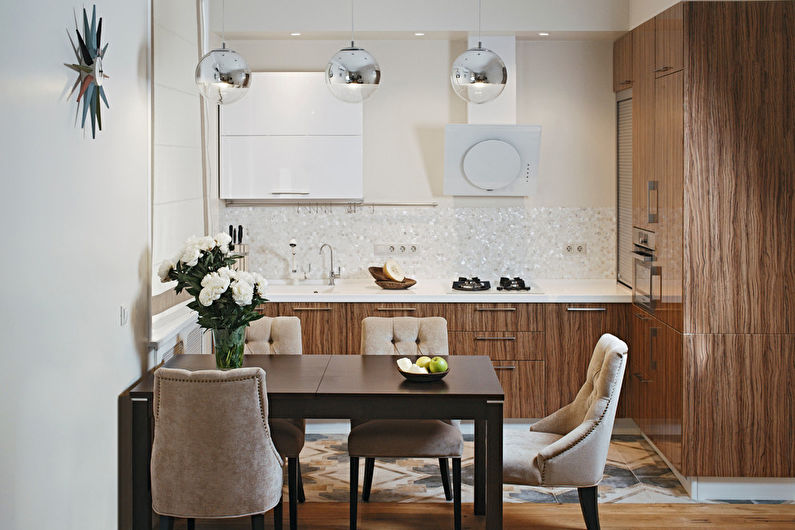
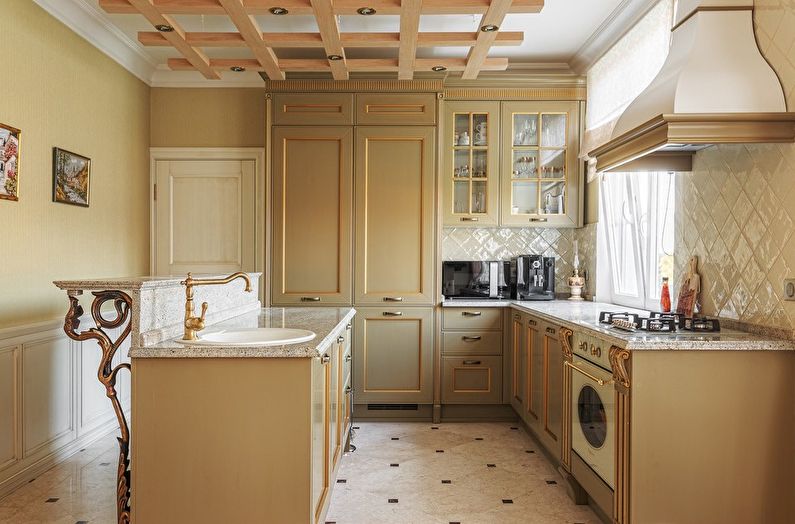
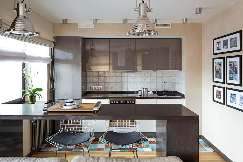
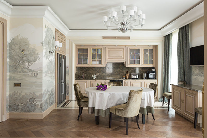
Beige, cream, and most shades of brown also belong to the neutral palette in color. The noble color of the wood in the kitchen is perceived very naturally, regardless of the surrounding textures.
Warm combinations
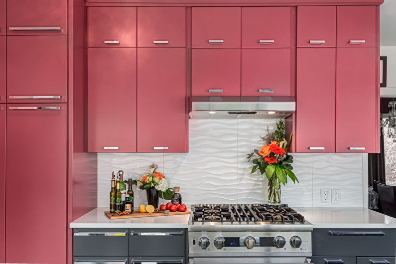
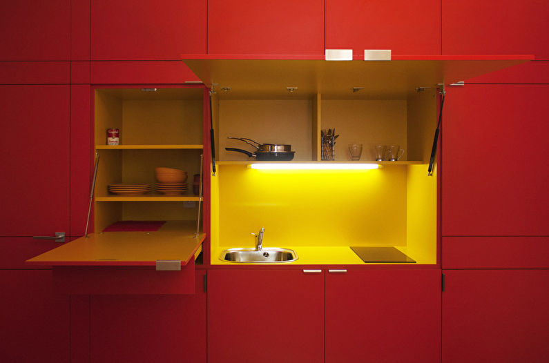
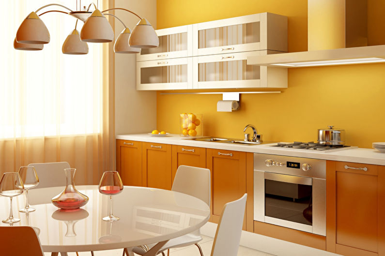
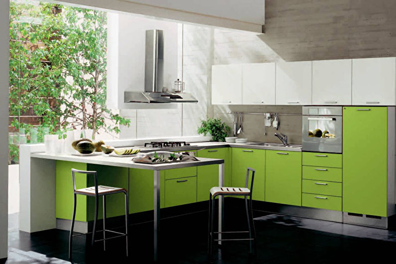
The color temperature of a particular shade can be determined intuitively, without checking the tables. Bright sunny colors fall into the “warm” category: light green, yellow, orange, scarlet, and reddish brown. But they should all be clean, free from impurities. Darkened or whitened to pastels, these colors become dull, cold.
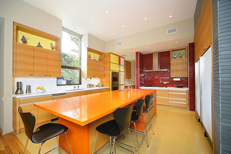
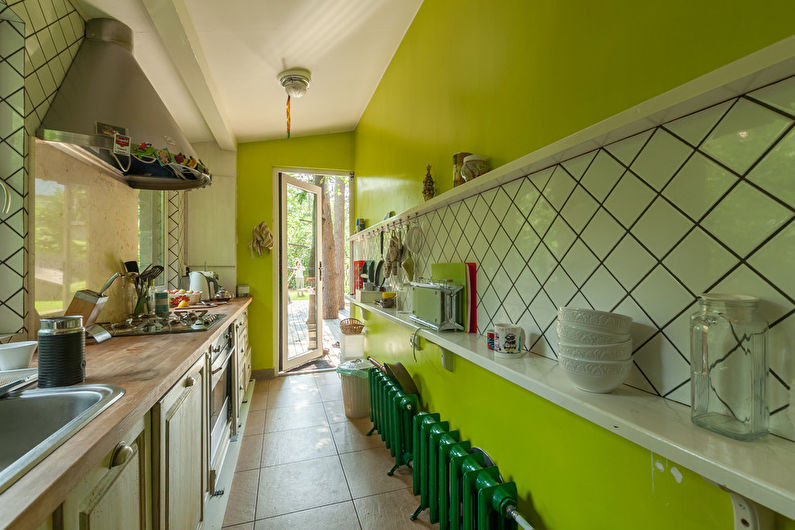
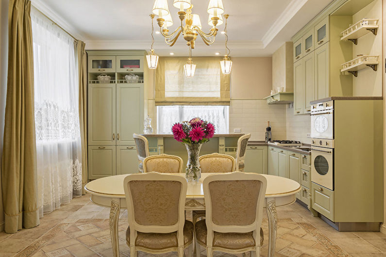
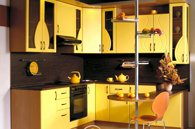
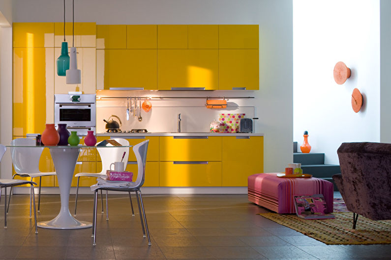
A warm palette is an ideal option for the kitchen, because many people associate this room with a home hearth, the element of fire. Here, delicious fruit and berry tones - orange, lemon, banana, the color of mango, kiwi, strawberries, succulent lettuce, ripe tomatoes, will look their best. White, light green or sand background will create an atmosphere of lightness, and gray or brown will help to slightly damp summer brightness.
Decorating the kitchen in warm colors, you can look for inspiration in the landscapes of golden autumn. Reddish brown, pumpkin, straw tones are an excellent choice for a country style interior. A cozy atmosphere will always reign in such a kitchen, and the air will constantly be filled with the aromas of homemade pastries.
Neutral-warm design will turn out if you recreate coffee motifs. A light milky beige palette will remind you of the exquisite taste of latte, and deep dark chocolate shades will surely appeal to espresso lovers. The brightness of such a kitchen will add a splash of orange, dark red, green.
Cold combinations
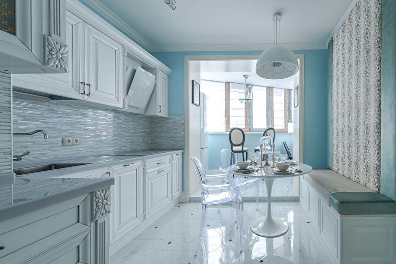
The reason for decorating the kitchen in cold colors may be a desire to slightly lower the ambient temperature or just a love of calm, unobtrusive shades. The violet-blue-green spectrum belongs to the water element, while maintaining its purity, depth and mystery. While warm tones draw closer to themselves, monophonic cool textures visually expand the space, as if moving away from the observer.
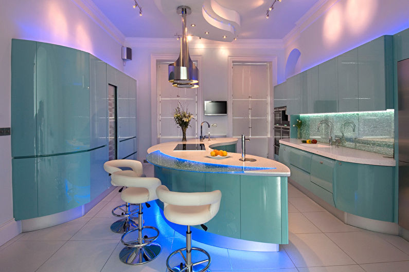
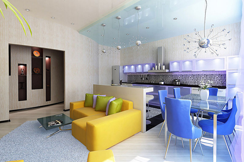
Perfectly smooth surfaces in the colors of electric, cosmic blue, purple - an actual option for a laconic modern kitchen or modern style. They look beautiful in gloss and are perfectly complemented by tinted glass and polished steel.
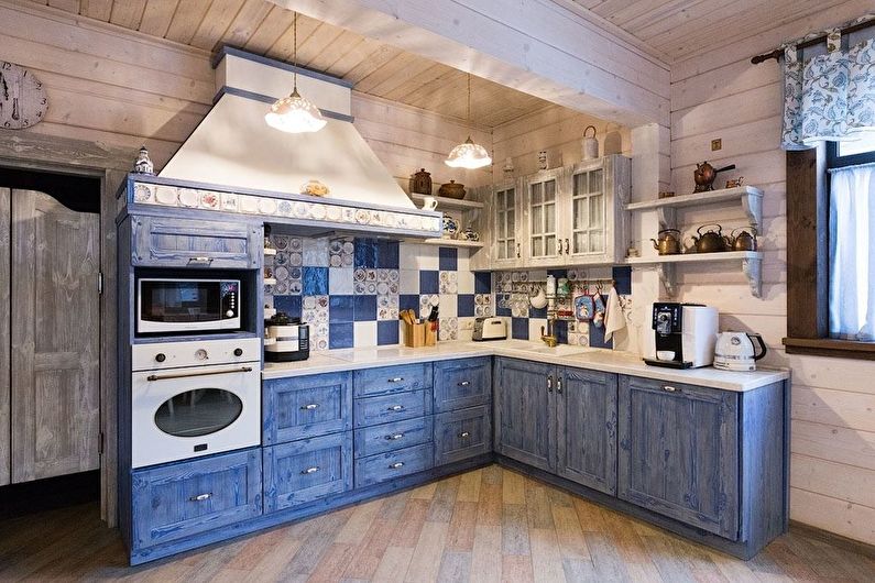
Vintage kitchen furniture painted with a matte paint of turquoise, olive or lavender color is an indispensable attribute of the Provence style. At the same time, the decoration and other elements of the interior are also dim, of delicate pastel colors, sometimes with a rustic print or village etudes.
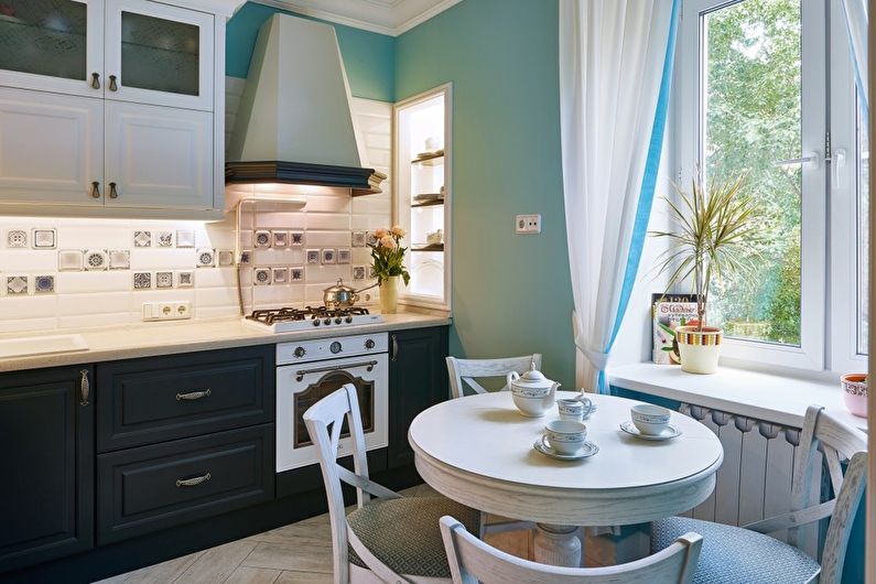
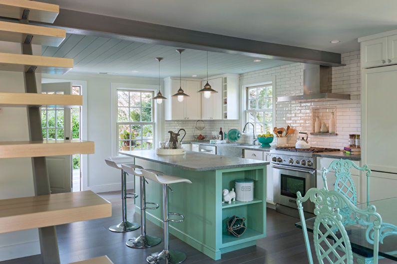
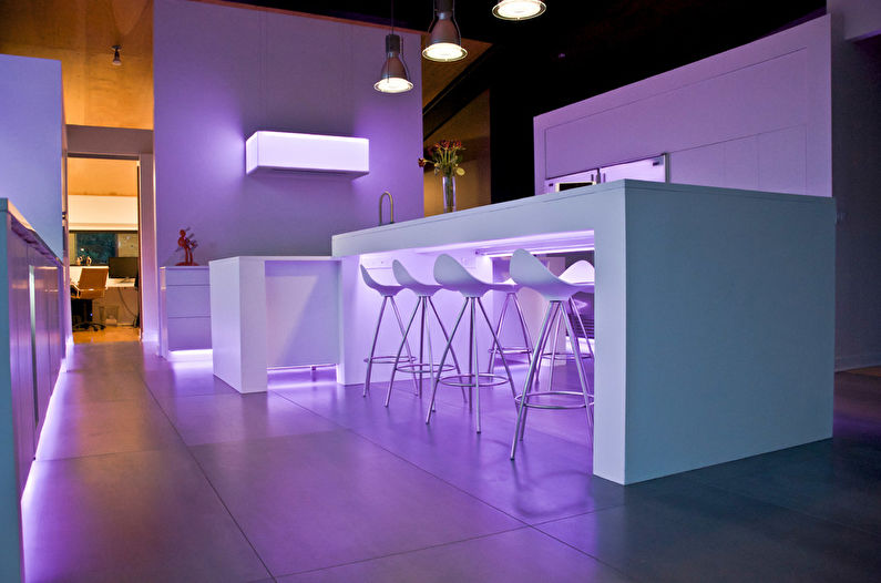
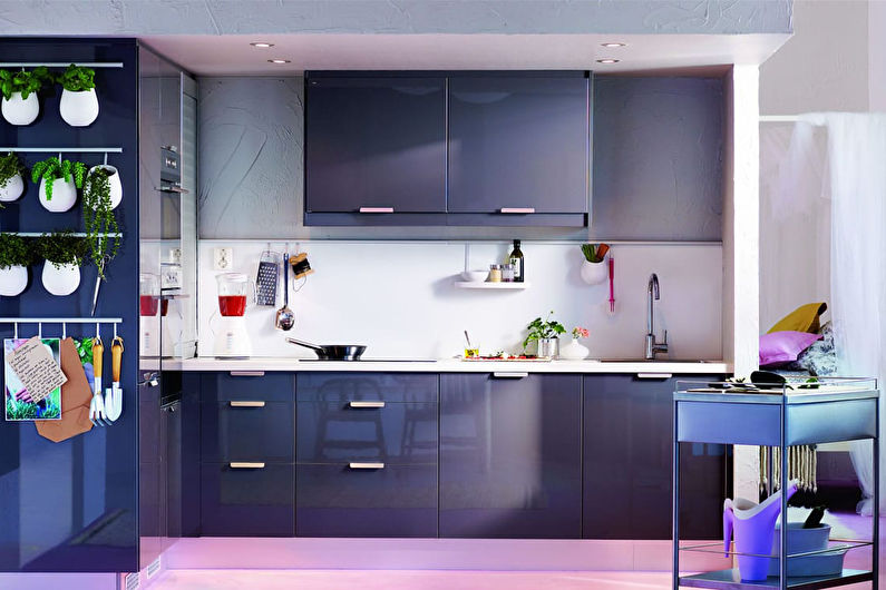
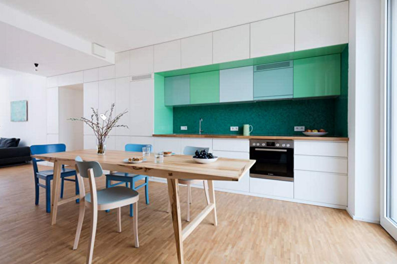
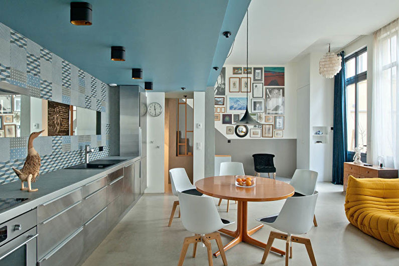
The combination of colors in the interior of the kitchen - photo
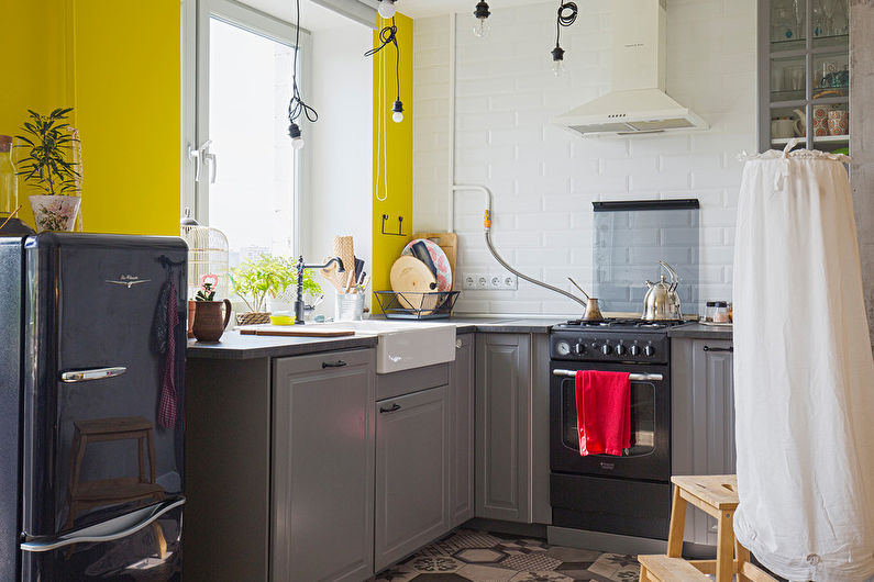
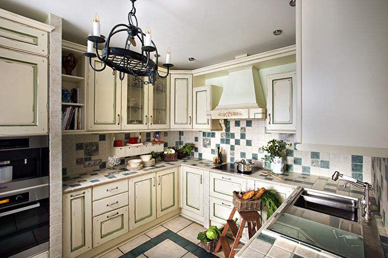
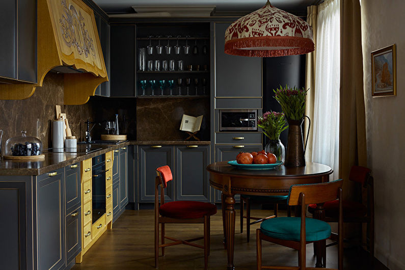
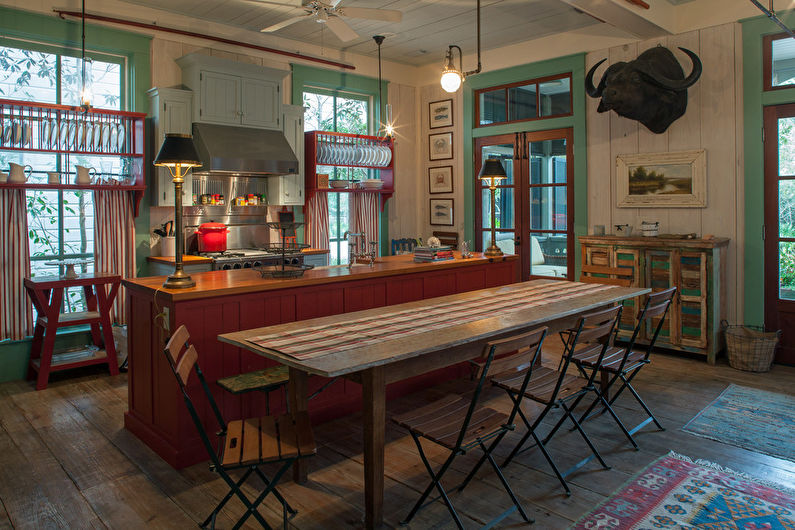
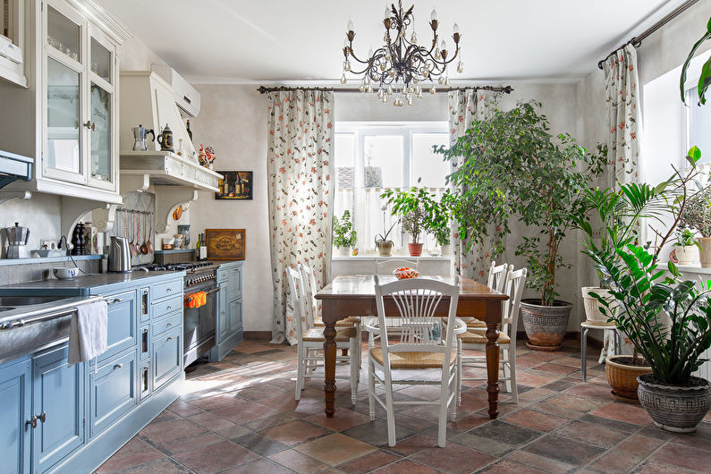
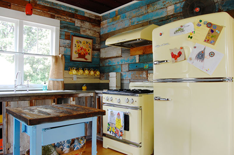
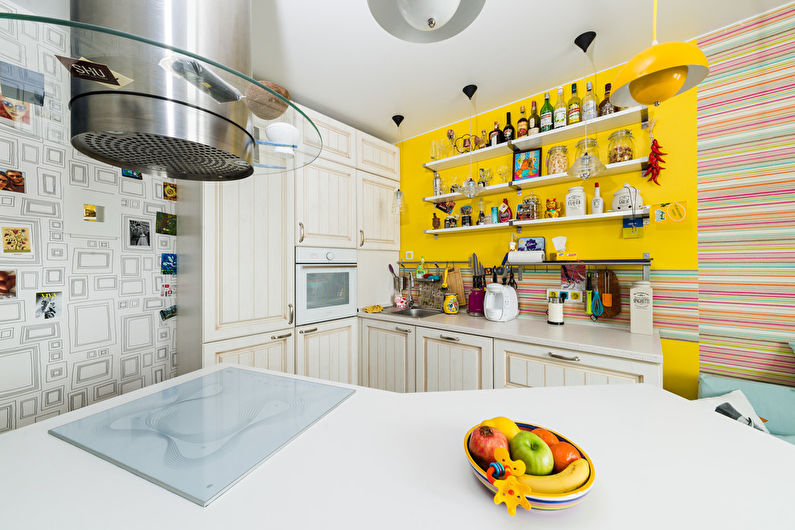
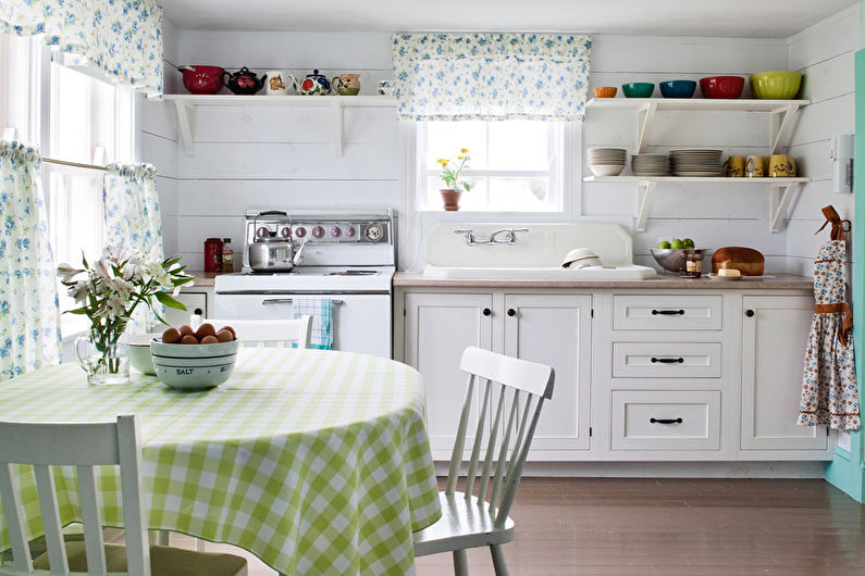
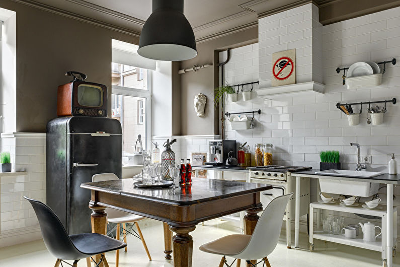
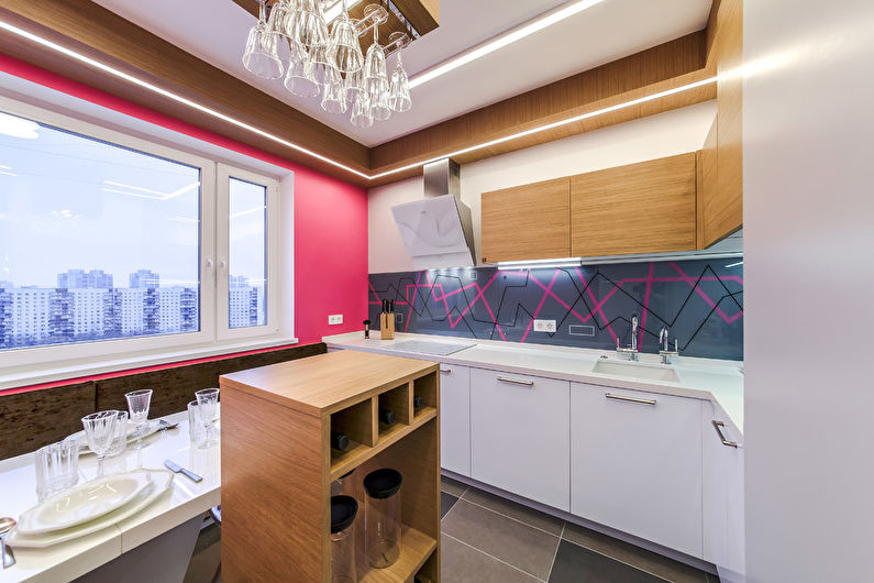
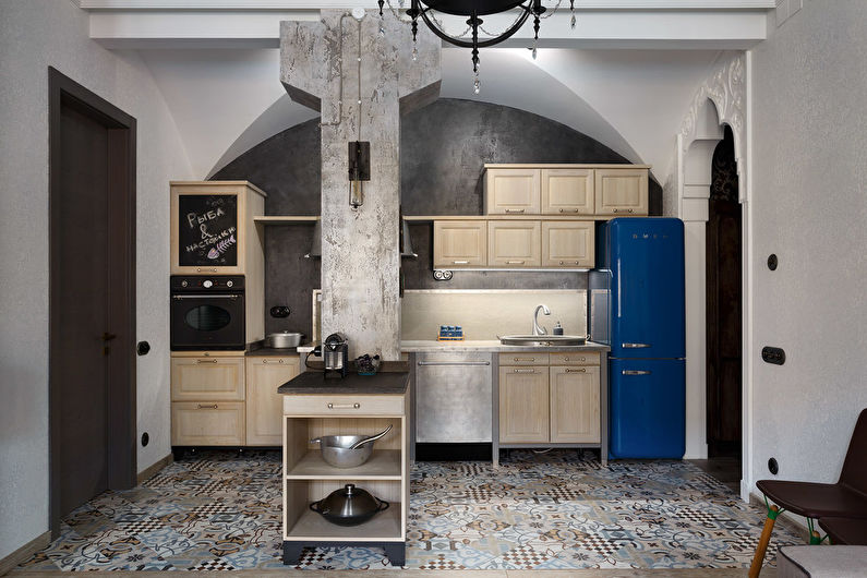
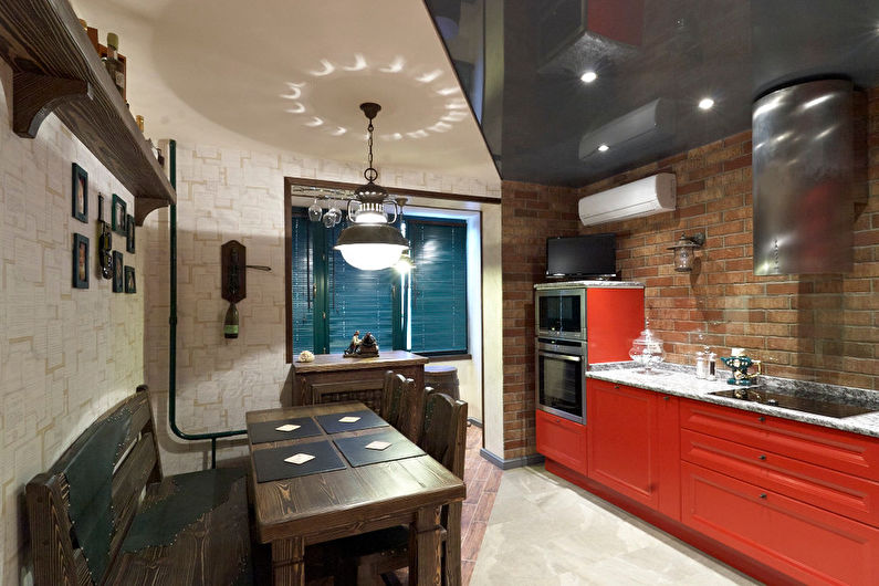
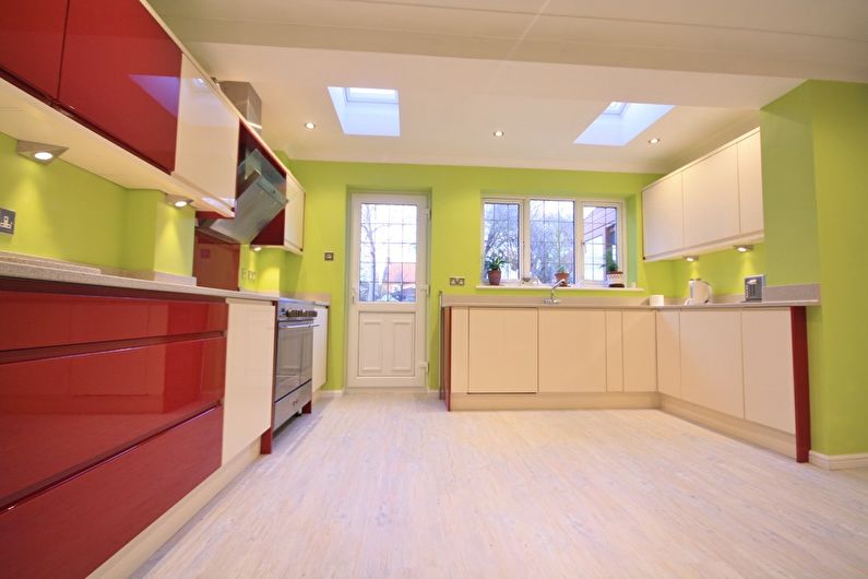
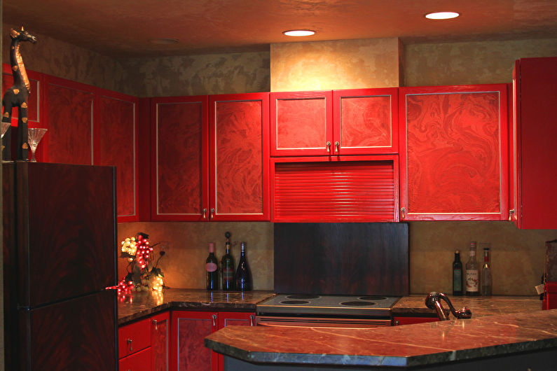
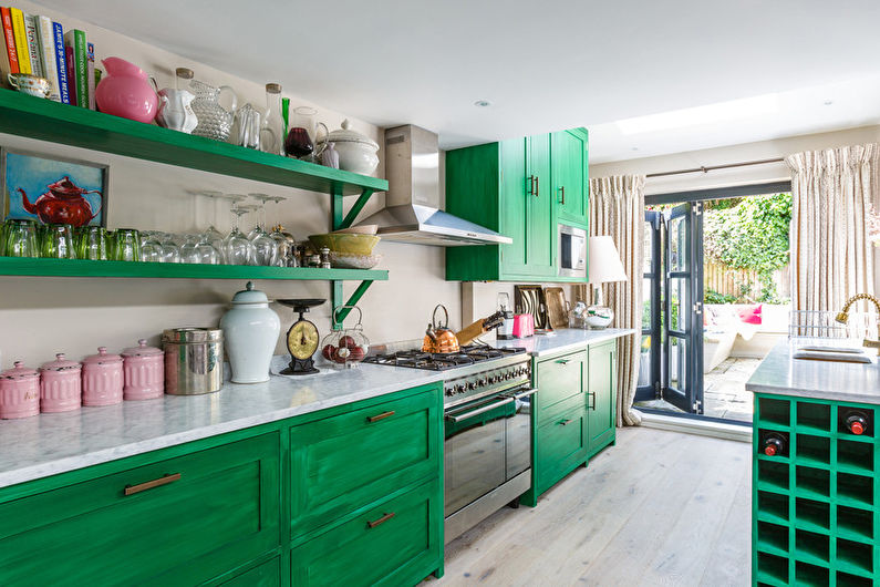
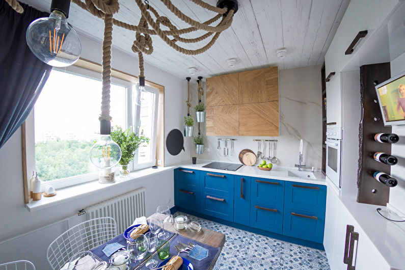
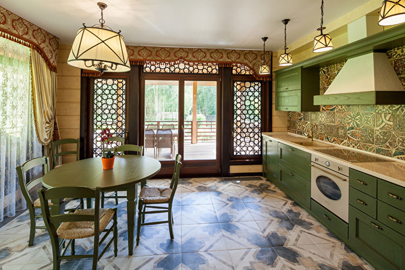
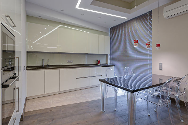
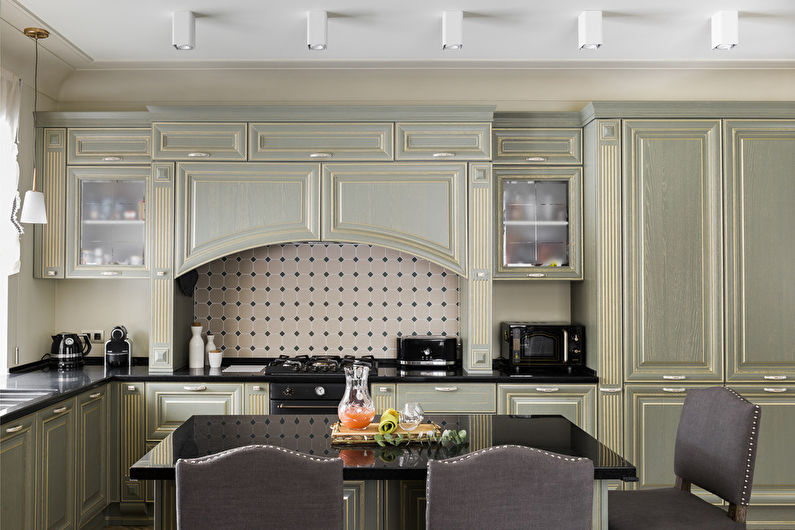
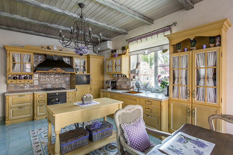
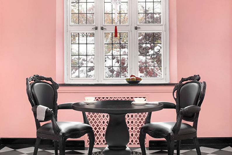
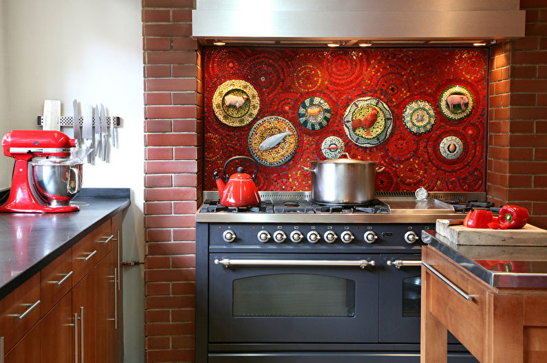
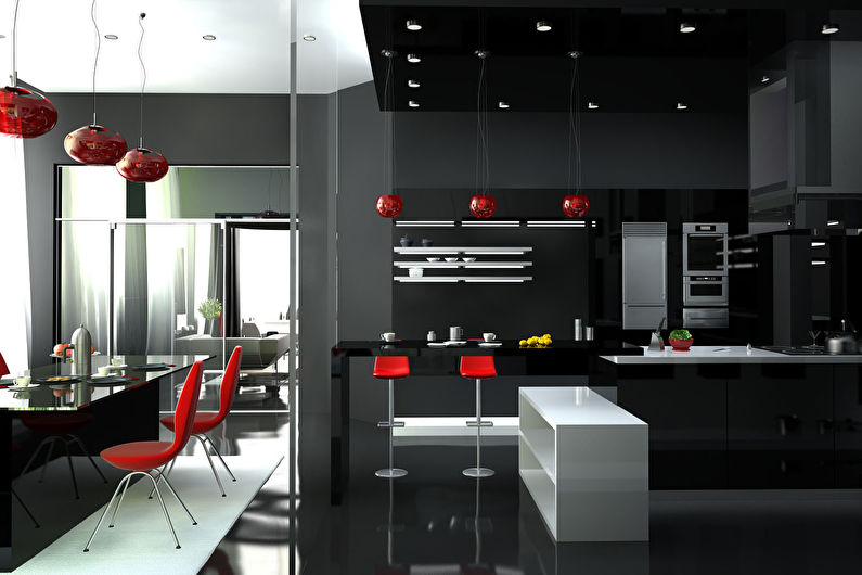
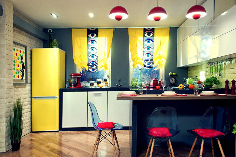
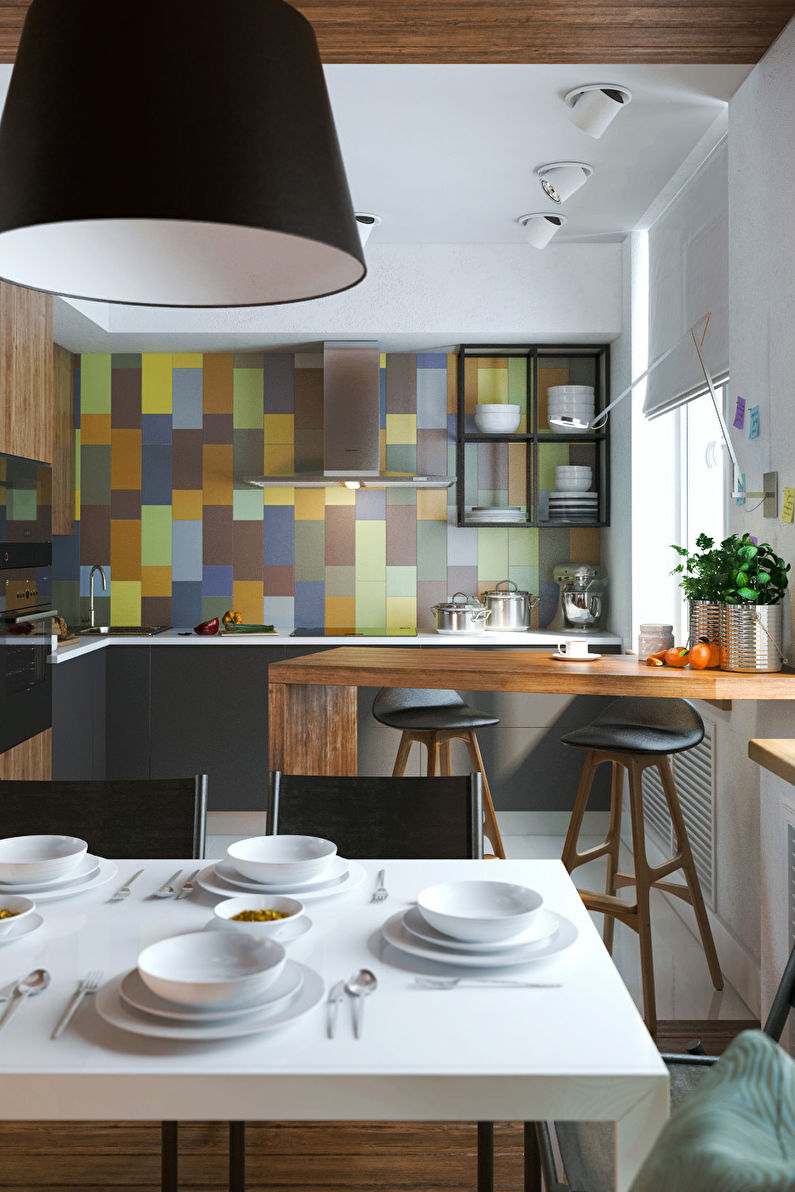
Studying the theory of combining colors in the interior of the kitchen, it is impossible to do without practical experiments. Indeed, sometimes in practice the palette differs from computer graphics. To find out what the combinations of different shades and textures actually look like, it's worth looking at photos taken in real conditions.For this, a large selection of options is presented in the photo gallery, among which you can easily find the optimal color solution for decorating your kitchen!
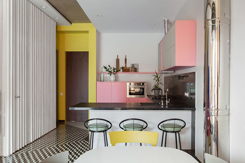
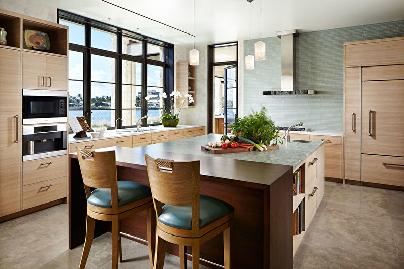
Video: Kitchen color - color combination
