When you have only one room at your disposal, you involuntarily forget about aesthetics, having occupied your head with solving primary tasks: where to put a double bed, how many square meters should be allocated for the living room and where in all this chaos to find space for storage places? Not to mention the free movement. In general, zoning a one-room apartment is not an easy job. The good news is that you don’t need to “reinvent the wheel” - just get ideas from our article!
Basic zoning methods
The owners of one-room apartments can be proud of their housing, since open space, like studio apartments, is very popular today. In them, the number of partitions is minimized, while the emphasis is on space and freedom.
But in order to harmoniously organize the interior, it is necessary to resort to zoning. This is a kind of magic wand in the world of design, which allows you to divide the room into visible living areas, while maintaining its functionality. To do this, you can use anything you want: from fabric to furniture.
Screens
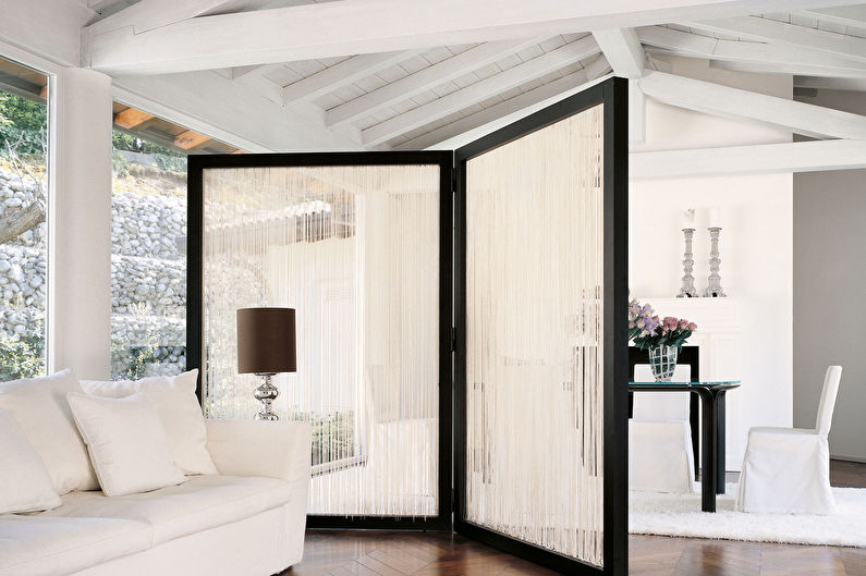
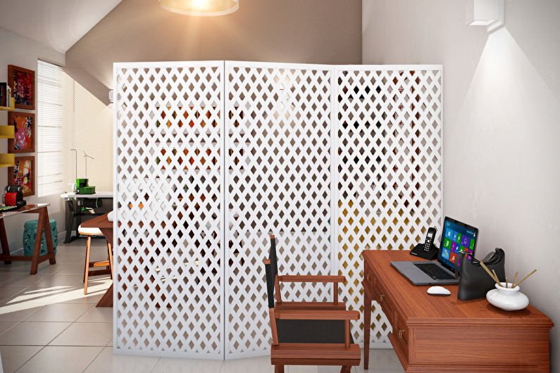
Traditionally, ladies hid behind the screens to change their outfits and maintain their dignity. For a long time this element was forgotten - either because even in the smallest apartment you can find a place for changing clothes, or because of the variability of morals. But in vain, because this is the simplest version of the partition.
Screens are ideal for those cases when you need to divide the space into two areas. At the same time they are mobile, do not require complex installation, do not take up much space when assembled. You can purchase products that fit into any style, hide part of the room from prying eyes or create light shapes, decorating the interior.
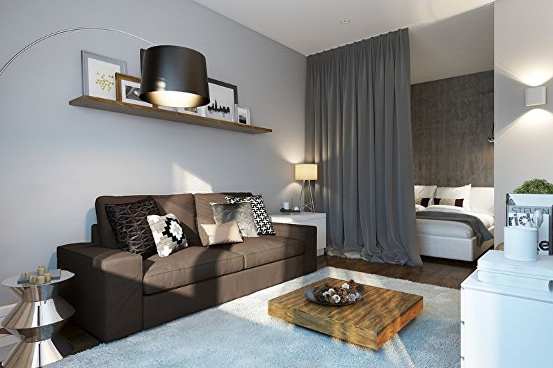
Curtains and curtains
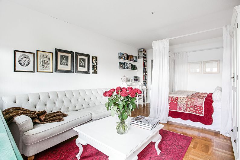
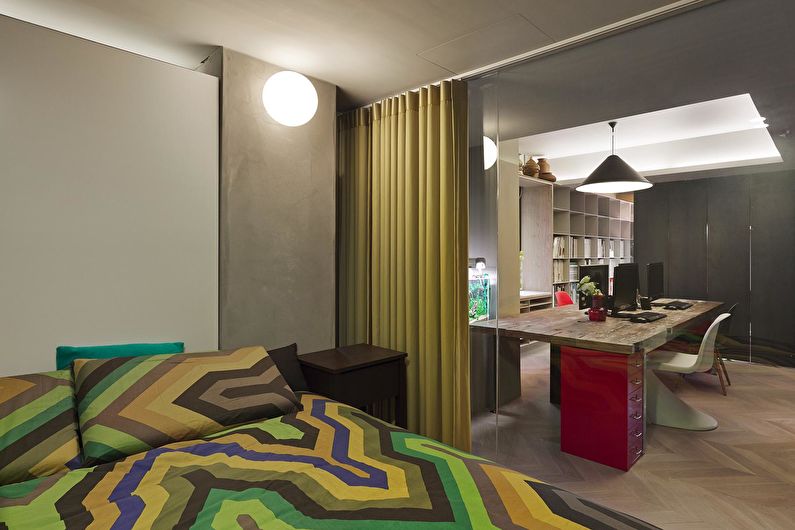
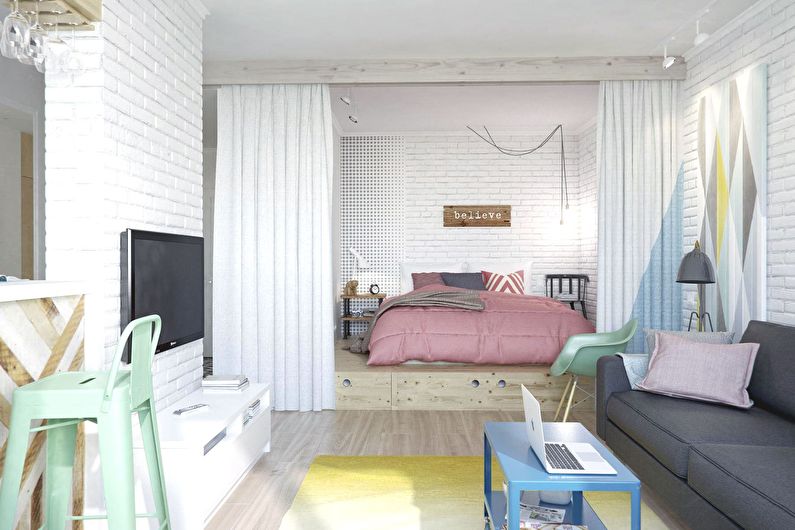
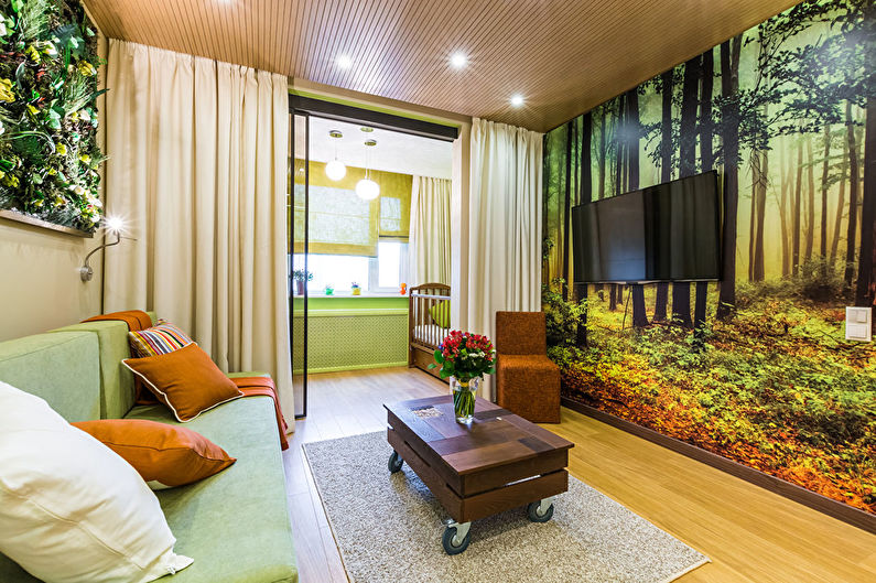
To avoid a clear division of the room into zones, you can use curtains. They are best suited for enclosing the bedroom, creating an intimate, cozy environment that promotes sound sleep.
However, the effect depends on the material. For example, a light tulle will only visually separate the area from the rest of the room, but it will give it a feeling of airiness. More massive curtains do an excellent job of zoning, but for smaller spaces it is better to give preference to light-colored textiles.
You can install the curtain-partition on a regular cornice inside the room or create a structure like holders for canopies.
Drywall partitions
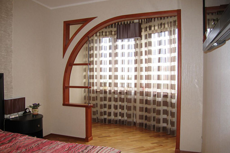
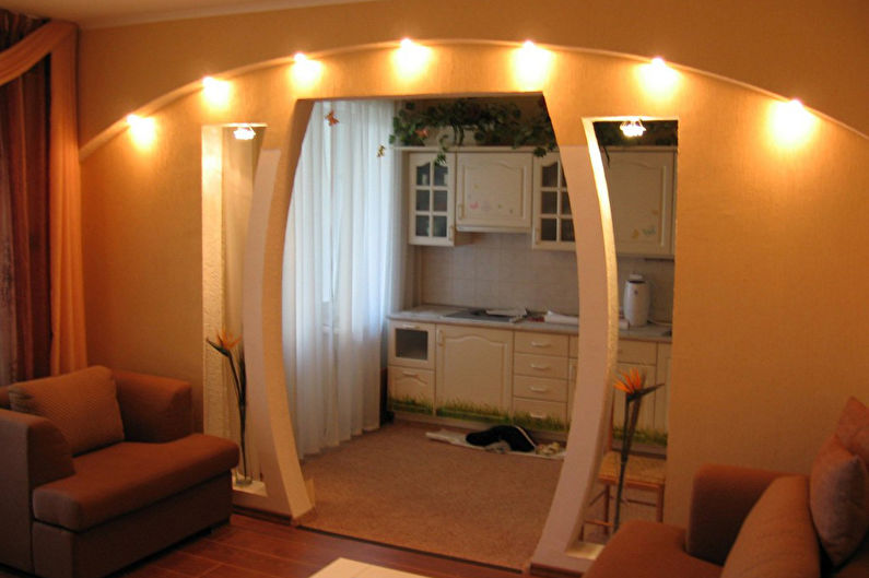
Visually zoning a one-room apartment is also possible with the help of plasterboard partitions. It is problematic to remove them if necessary, such as, for example, a mobile screen, but in appearance they cannot be distinguished from the main wall.
Drywall construction is cheap, lightweight, easy to install and has good sound insulation. It can be flat, rounded, arched, helping to create a unique design. Depending on the needs of the space, it makes a bright accent in the interior or an inconspicuous part of the wall, which in any case will perfectly cope with the zoning mission.
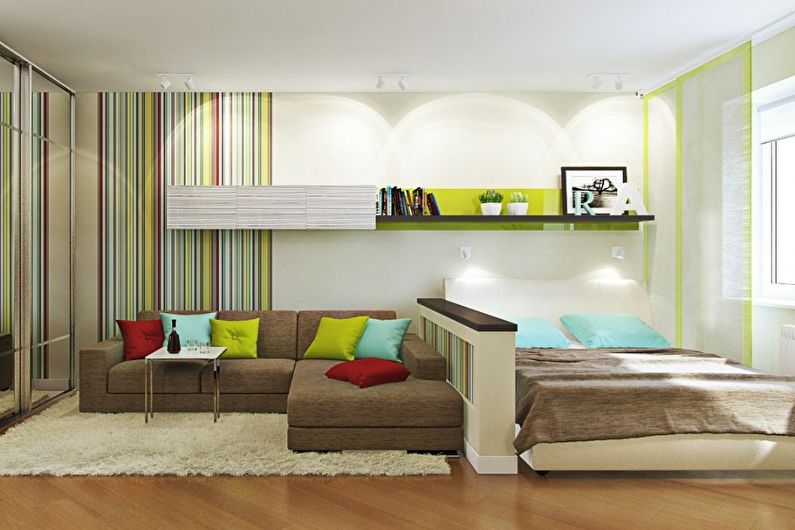
Racks and cabinets
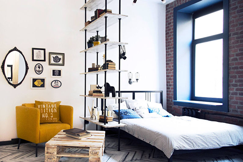
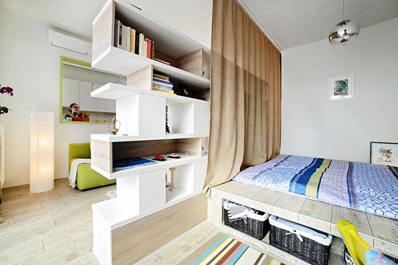
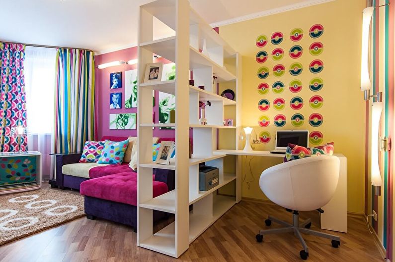
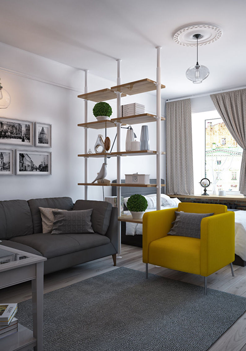
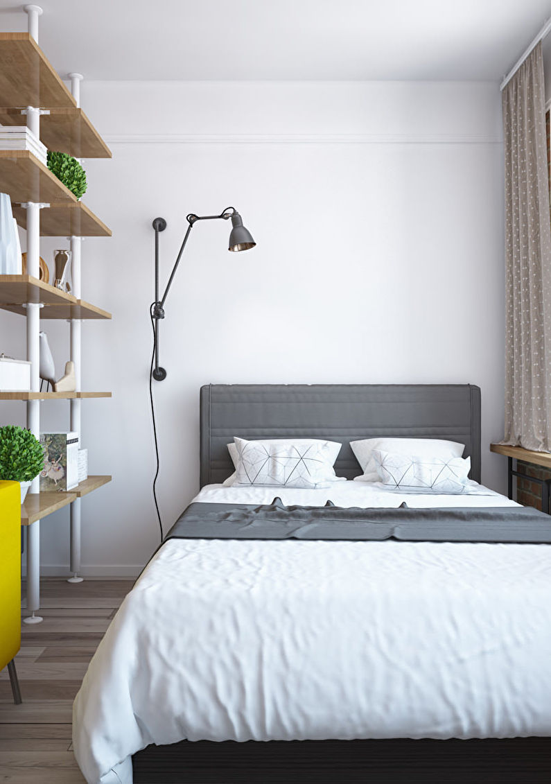
We used to put bookcases and shelves along the wall, "taking" thereby a huge part of the room. To save space and divide it into two zones, it is enough to put such furniture perpendicular to the wall.
For this, closets with through shelves are more suitable, but in the case of a closed design, the back side can be made mirrored or used as a slate board, covered with a special paint.Items combining several functions at once are a modern solution not only for small apartments, but also for spacious rooms.
Catwalks
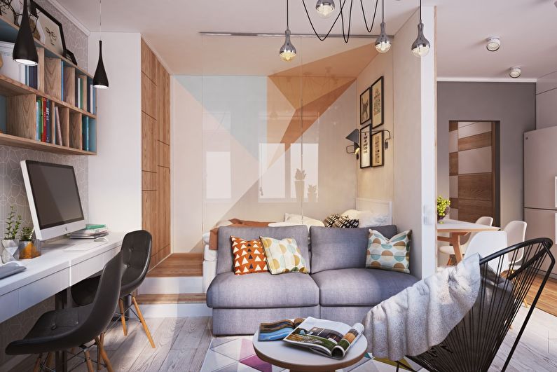
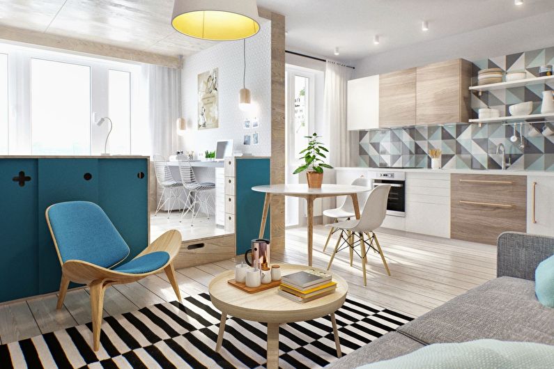
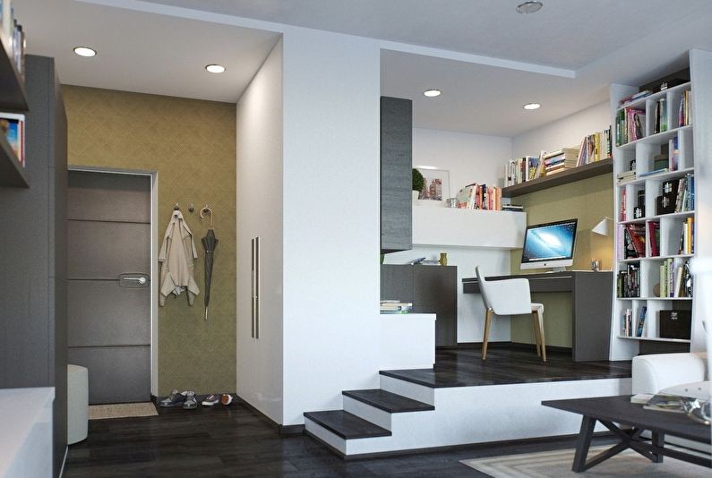
A small podium is another excellent way of zoning a one-room apartment. Holders of high ceilings can place a living room, dining room or office on it. But with low ceilings, you can only afford a bedroom, which involves minimal movement.
Such a hill can serve as an additional place to store things, thanks to drawers. For very high podiums, it is recommended to build steps. The advantage of the catwalks is that they do not take up too much space and help to highlight some zone.
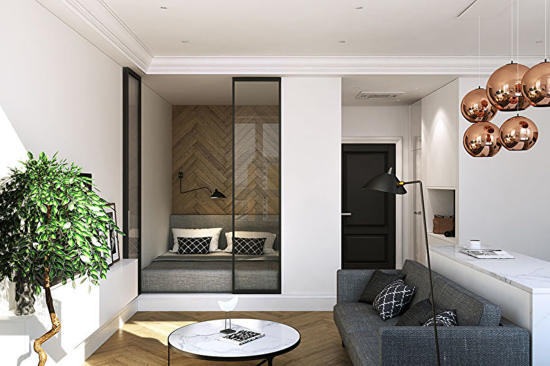
Sliding partitions
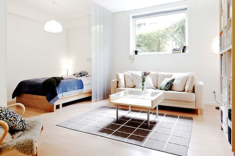
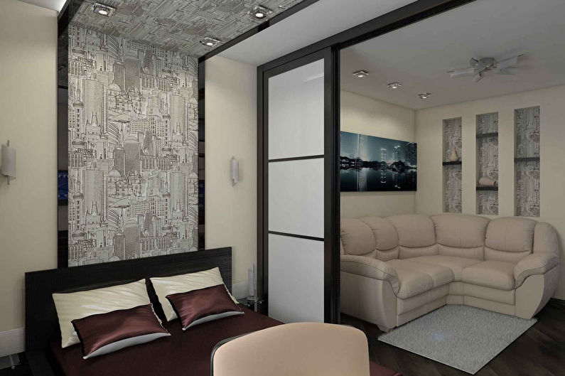
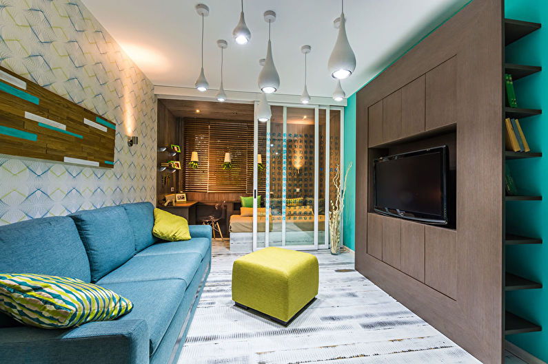
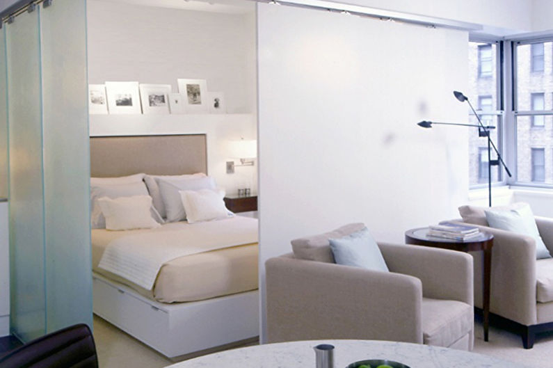
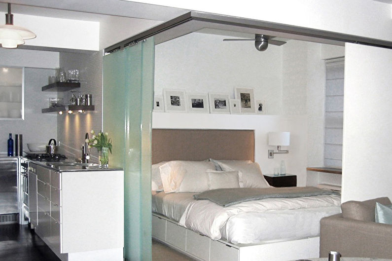
Such partitions created by the principle of sliding doors allow you to completely separate the area or make it open. Modern products in open form occupy a minimum of space, and thanks to different materials, they help to create the right atmosphere.
For example, if there are no windows in the formed zone, it is better to choose a translucent surface that provides privacy, but transmits a little light. Ideally, this solution will fit into Japanese style or minimalism.
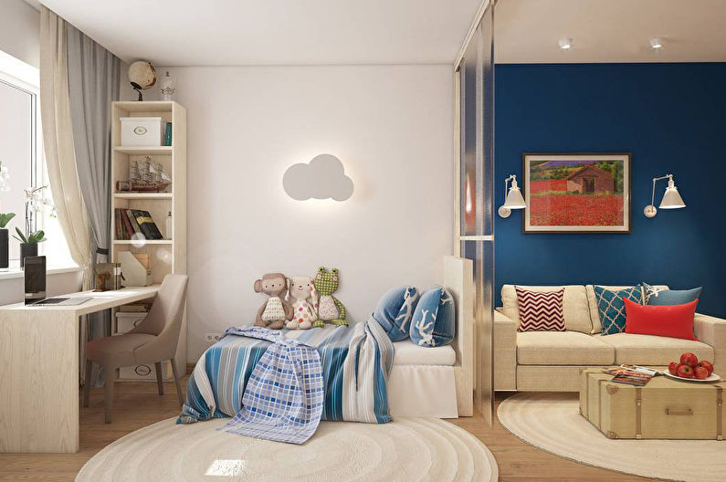
Zoning of the nursery and living room in a studio apartment
One-room apartment is a solution not only for bachelors. A married couple with a child can comfortably stay here if you choose the appropriate zoning option.
For a small child, you need to choose the warmest and brightest part of the room, which over time can be expanded or modified.
To be able to monitor the safety of the child, but at the same time providing him with personal space, you can use an ordinary screen, curtain or sliding partition.
Children of any age will like the children's on the podium, and the higher the better. To do this, you can purchase bunk furniture. Transformer constructions with a table crossing two zones will help control the child's activity.
Visually, you can separate the nursery from the living room in a studio apartment with the help of flowers. Often, children are greedy for everything bright and fun, so that a children's corner will be easy to distinguish from the rest. It is only necessary to ensure that the shades in the interior are combined.
Zoning of the bedroom and living room in a studio apartment
For this typical zoning variant, any kind of partition is suitable. You need to start from the features of planning, design and the desired effect.
In square-shaped studio apartments, it is customary to highlight the bedroom area with dense partitions, which practically create the feeling of a separate room. This can be achieved by combining different types. For example, shelving on one side and curtains on the other.
Zoning ideas for a 1-room apartment - photo
Nothing better illustrates the theoretical material than the realized projects of one-room apartments, in which the principles of zoning are involved. Studying them, you can draw interesting ideas for yourself and see the effectiveness of different solutions.
1. Wooden aesthetics in Moscow
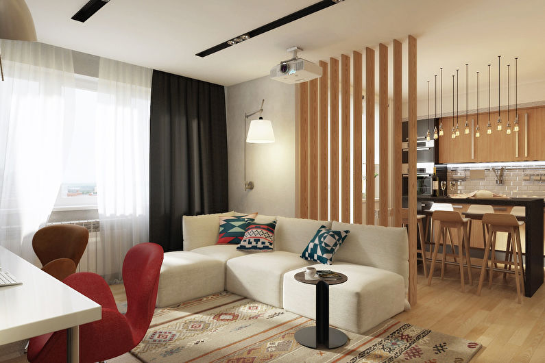
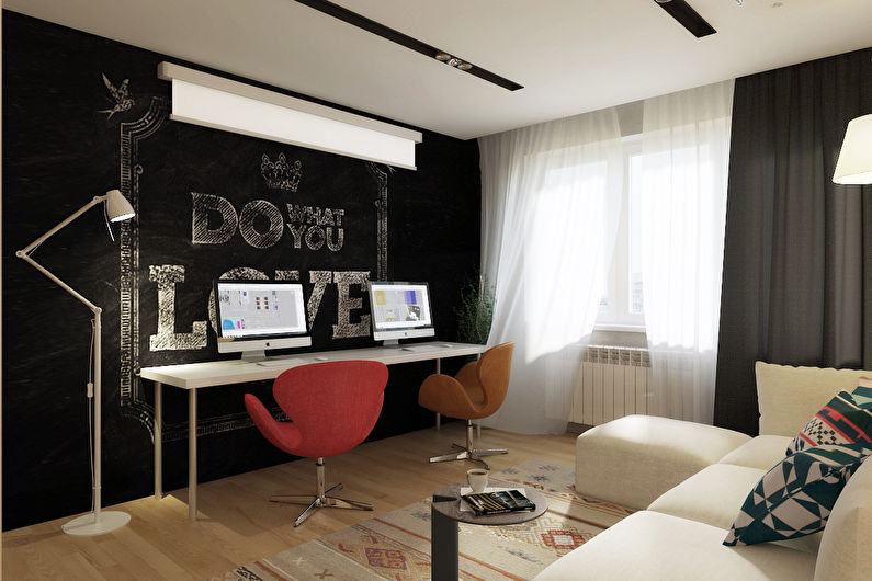
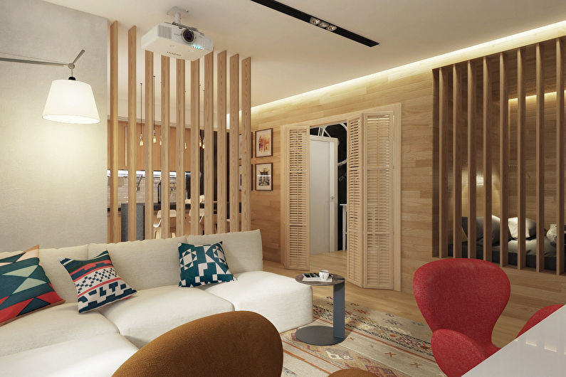
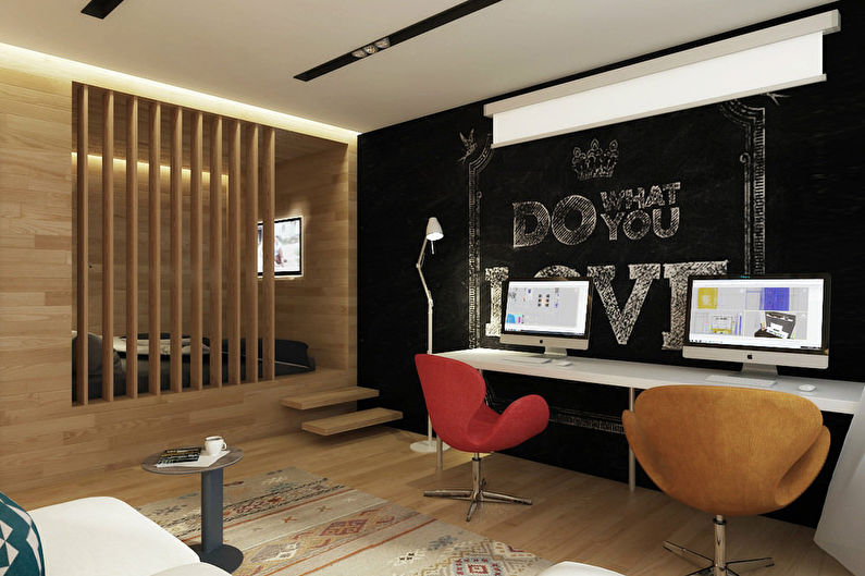
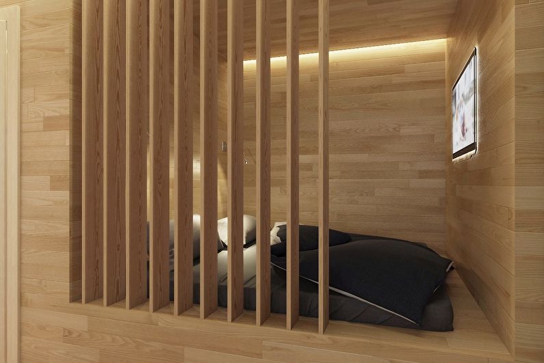
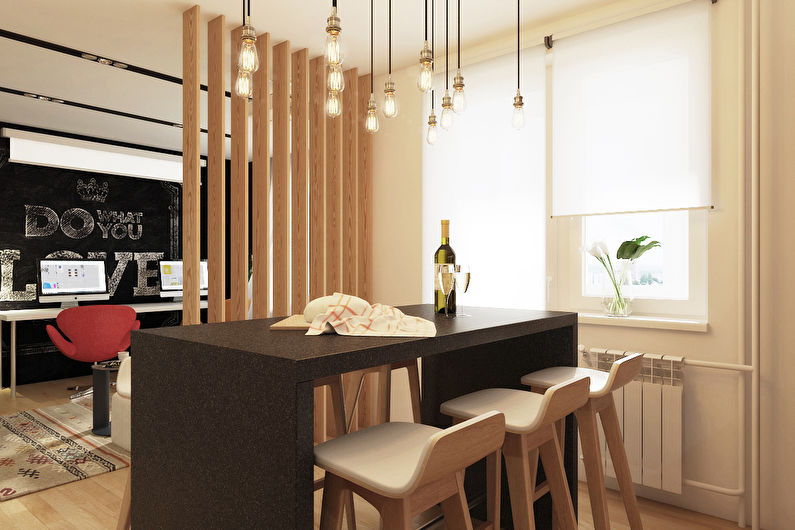
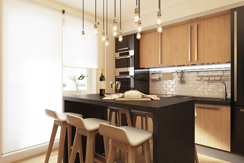
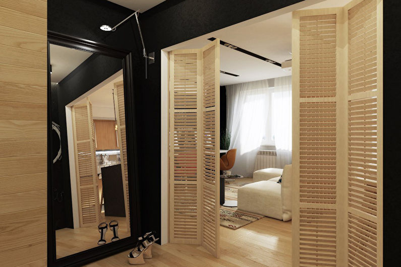
Designers from Welcome Studio in the Wood & Stone project managed to combine two opposite properties - chamberness and openness. Typical odnushka 49 sq.m. turned into a proportional space, divided into convenient squares. The apartment includes the following areas from the mandatory “set for a comfortable life”: bedroom, study, living room and kitchen with a small dining room.
Zoning is carried out using wooden partitions, the design of which resembles blinds. They transmit light and are used everywhere, creating a holistic image, inseparable from the general interior. Natural decoration materials form a light atmosphere in the home.
2. Zoning of a studio apartment in Khrushchev
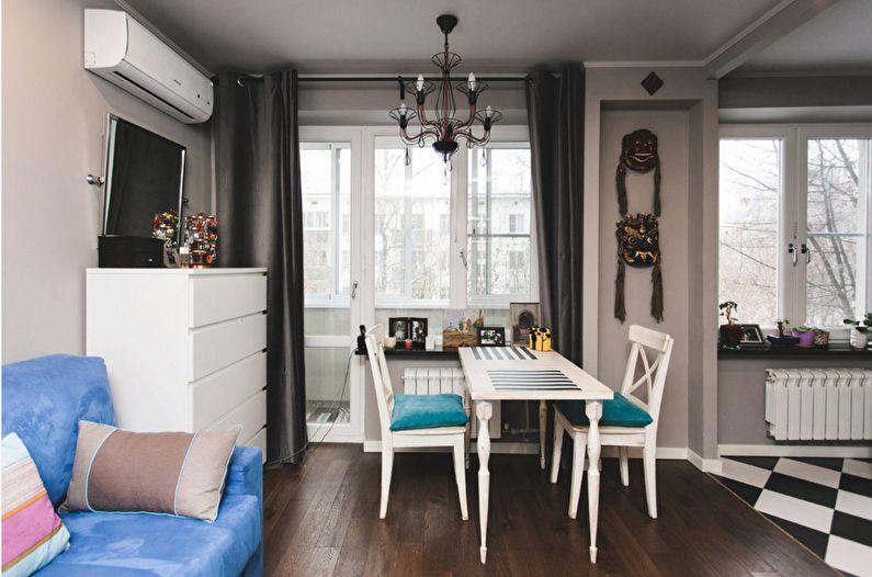
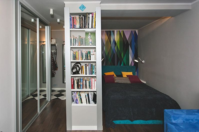
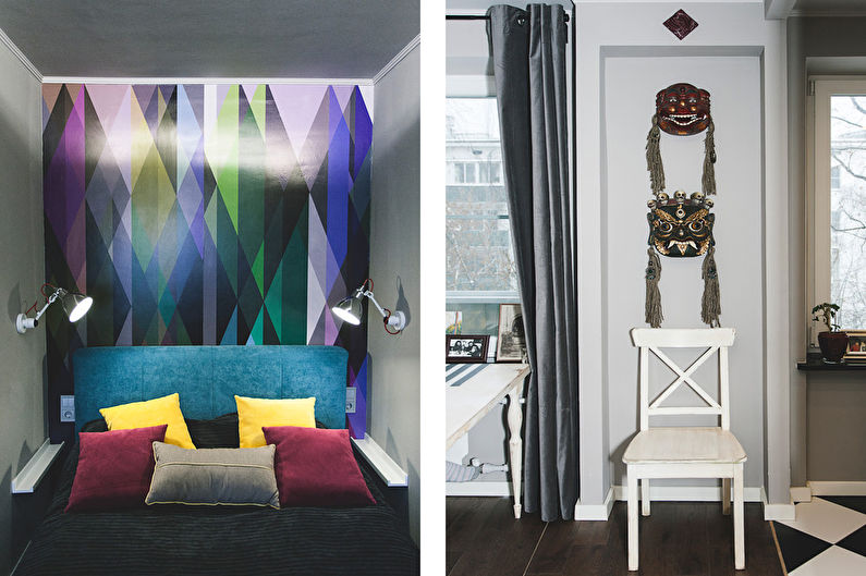
Housing of this type can hardly be called a dream apartment.Small sizes and low ceilings only complicate the redevelopment, limiting the choice of “tools”. But designer Alena Ganko was able to comfortably organize these apartments.
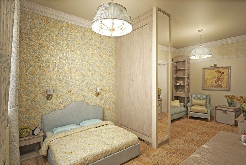
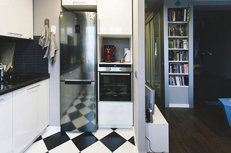
The initial layout required the dismantling of several walls, after which a functional zoning structure was placed between the bedroom and the hallway. It represents at the same time a niche for books, a wardrobe, and also separates the relaxation area, making it as compact and comfortable as possible.
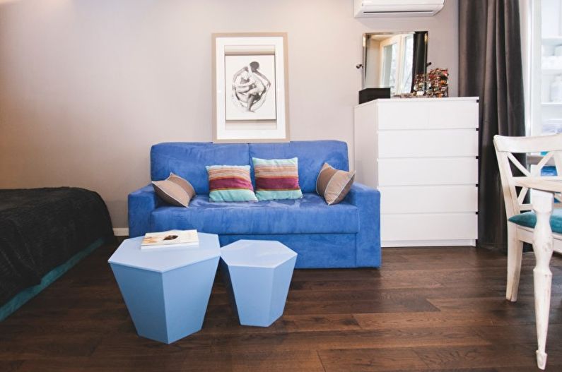
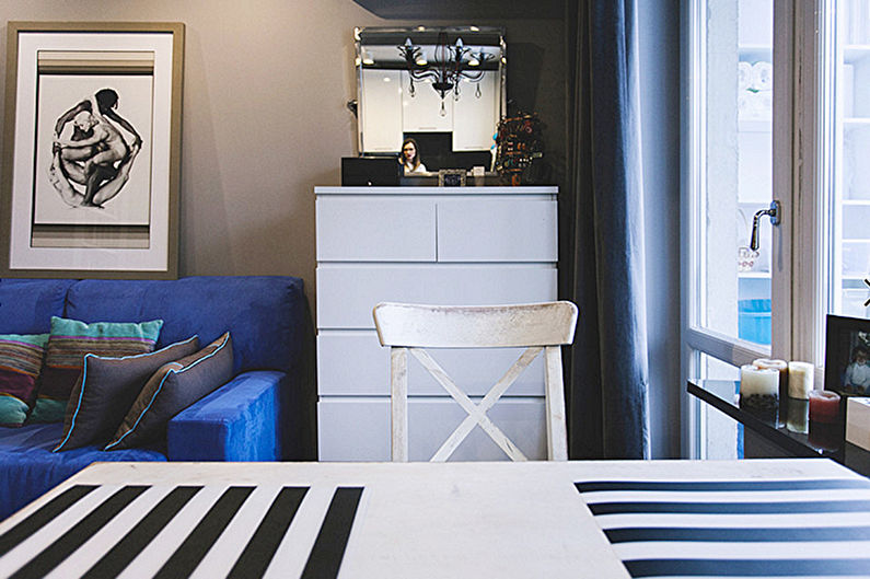
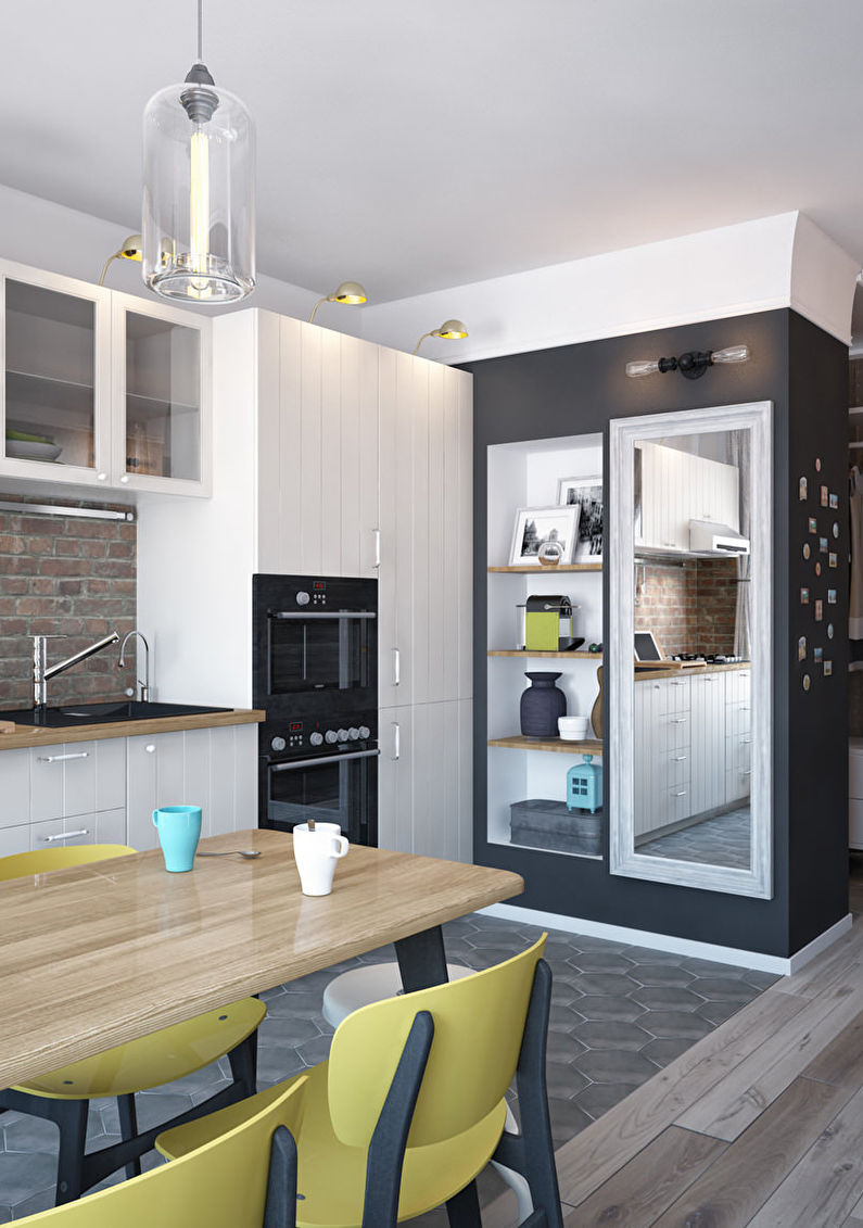
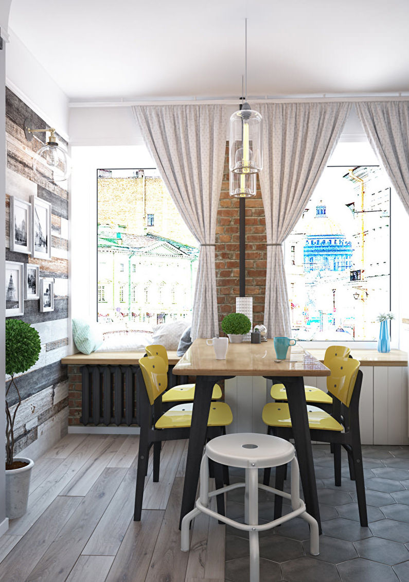
Located in the same space as the living room, the kitchen is visually separated by a narrow dining table. The neutral color scheme of the decoration is a great backdrop for bright furniture.
3. Bright vestibule
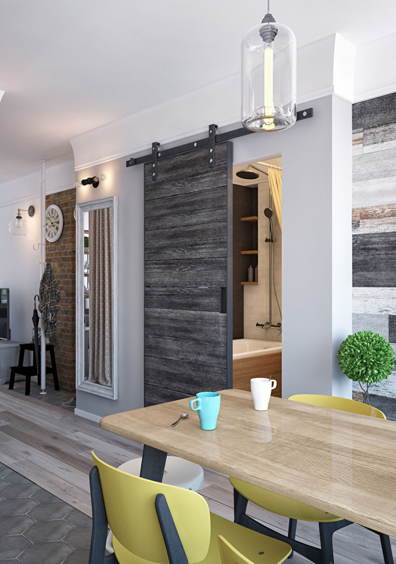
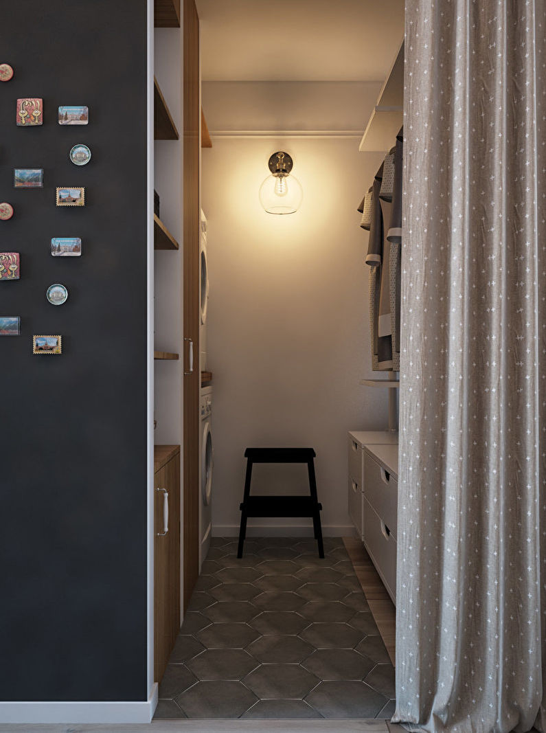
Designer Marcel Kadyrov turned this walk-through long apartment into a stylish studio.
It is difficult to design such an interior without resorting to zoning. After all, even in bachelor housing there should be comfortable borders.
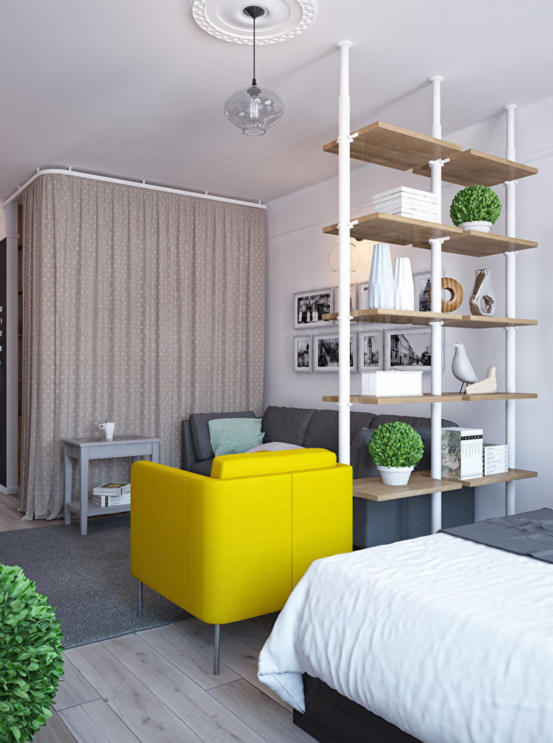
In the center of the space are two wardrobes forming a small dressing room. It, in addition to its main purpose, helps to share the entrance hall with residential areas. For the same purpose, several pipes with shelves are installed between the sofa and the bed - a rack of an unusual design.
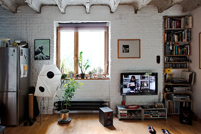
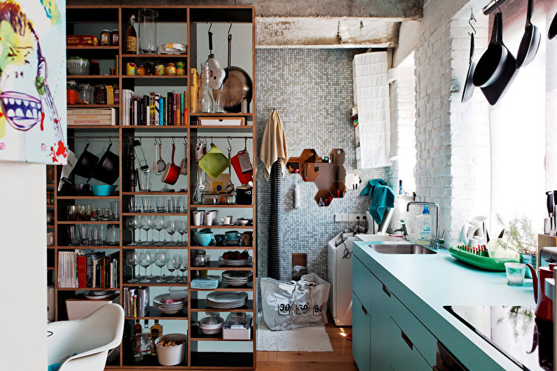
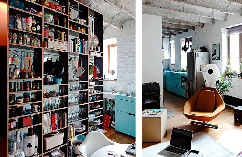
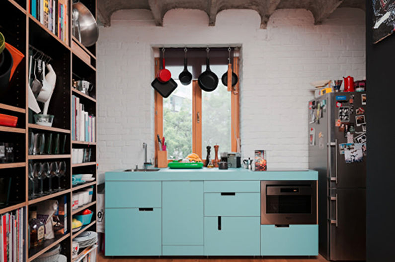
4. A cozy "book" loft
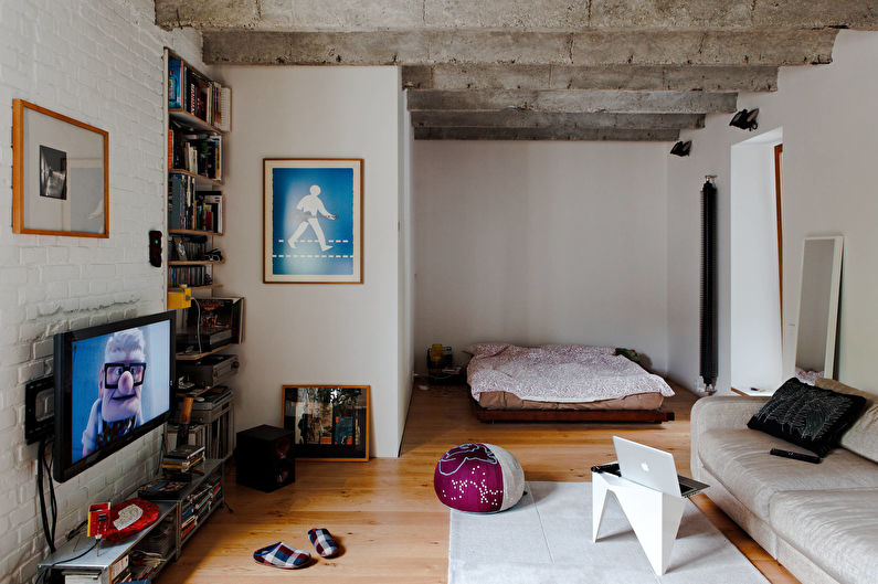
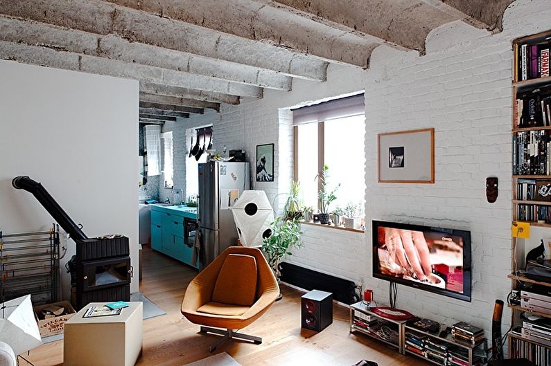
Loft style is better than the rest "perceives" the experiments in the layout. Firstly, because of the industrial nature of the design, and secondly, because of the craving for freedom and space. Designers from Gut Gut Design took advantage of this advantage to rationally organize a small one-room apartment.
What immediately catches your eye - the number of books in the room. Therefore, the rack, dividing the living room and kitchen area, looks more than appropriate, despite the dishes located on it.
Thanks to the dedicated living room - a sleeping place, which is located in a niche, looks apart, while not “falling out” of the design.
5. Minimalist apartments
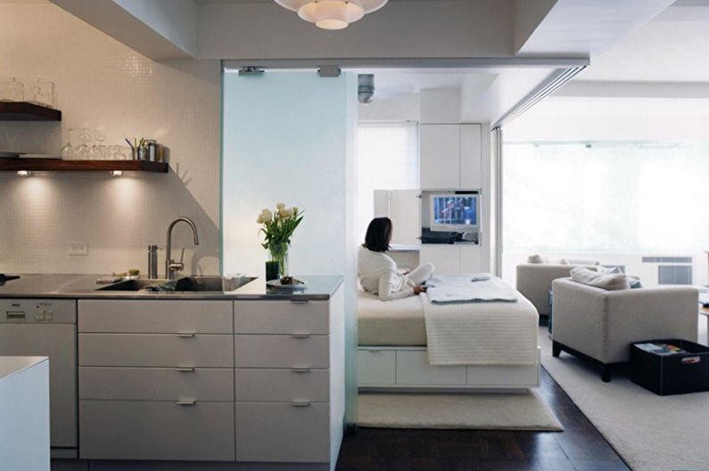
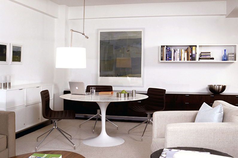
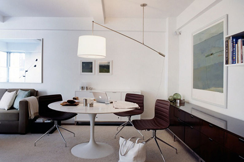
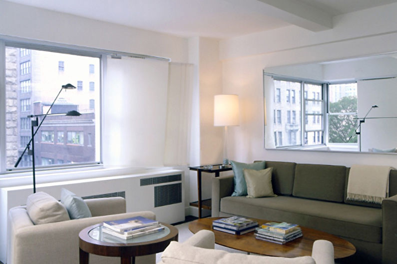
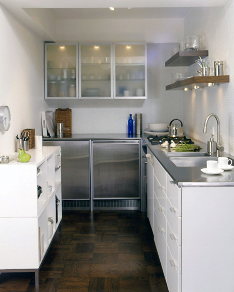
Page Goolrick, an American designer, has a lot to learn about zoning. This snow-white apartment is a great example.
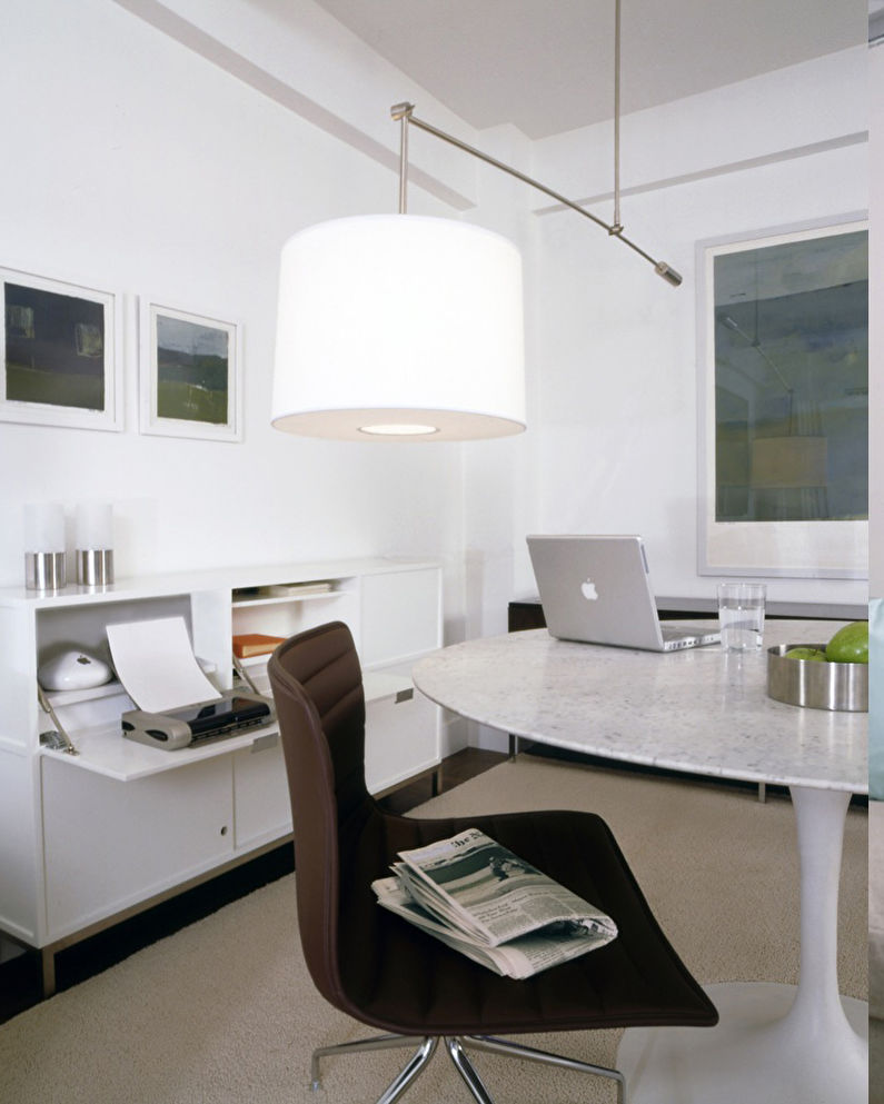
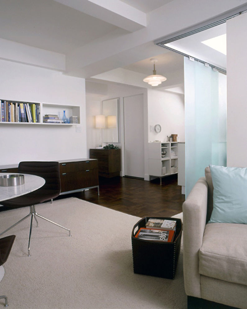
A square layout is not the best option for a one-room apartment, only if you do not correctly divide it into areas. A key role in this interior was played by the bedroom area in the corner, which is separated by sliding translucent partitions on both sides.
Thus, this closed area looks almost like a separate room and delimits the living room from the kitchen, but leaves the connection between the latter and the dining room. A white carpet on a dark parquet floor, like an island allocates living space, creating a feeling of comfort.
Video: One-room apartment - zoning and interior design
